Sidebar Skins
New in 2.1. Every theme decides how the sidebar looks: Frappe's own Plain sidebar, or Tinted, Solid or Gradient, with an optional wave pattern and module icons in their own colours.
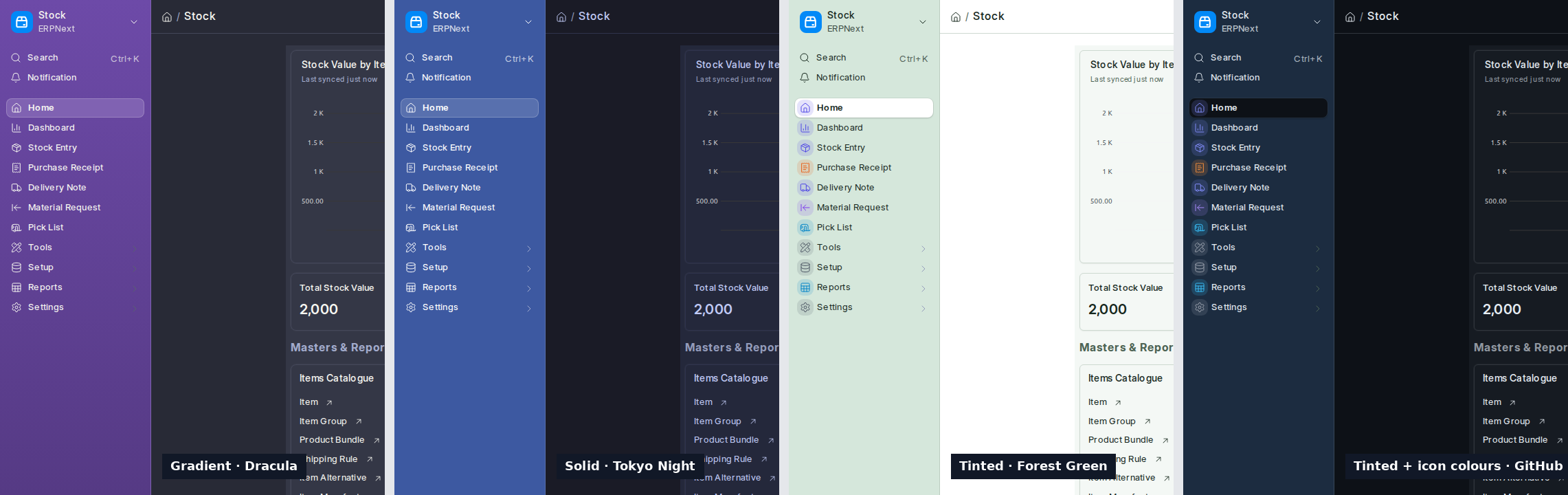
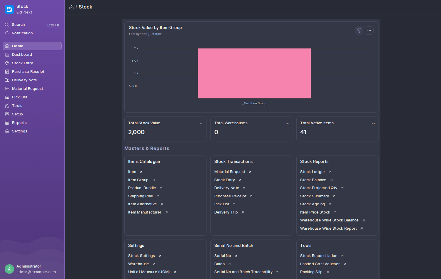
Open Theme Studio, pick a theme, and look under Customize → Sidebar.
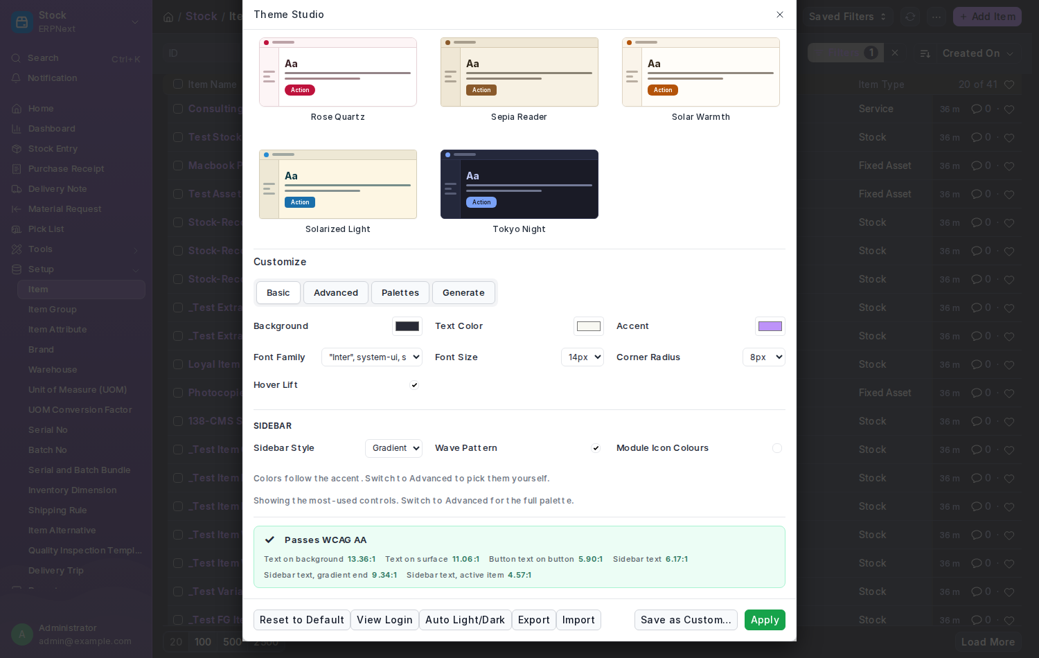
| Setting | What it does |
|---|---|
| Sidebar Style | Plain is Frappe's own sidebar, exactly as before. Tinted washes it with a light shade of the accent. Solid paints it the accent colour. Gradient runs the accent into a deeper shade. |
| Wave Pattern | A faint wave at the foot of a Solid or Gradient sidebar |
| Module Icon Colours | Each sidebar icon in its module's colour: Accounting blue, Selling green, Buying orange, Stock indigo, HR teal, Manufacturing purple, Projects cyan, and so on. Anything else gets a steady colour of its own. |
| Sidebar Background, Sidebar Text, Sidebar Active Item (Advanced) | Pick the colours yourself, or leave them on Auto to have them worked out from the accent. Auto text is whichever of dark or light reads best. |
The contrast check in Theme Studio covers the sidebar too: its text against the background, against the far end of a gradient, and against the highlighted item. A bundled theme that fails is refused; your own theme saves with a warning, so you can fix it.
Most come with a skin: the dark ones Gradient or Solid, several light ones Tinted with icon colours on. GitHub Light and High Contrast stay Plain. Your own themes keep whatever you chose; an upgrade never changes them.
- Frappe's own look, or a Plain theme, leaves the sidebar exactly as Frappe draws it.
- Dropdowns, menus and pop-ups that open from the sidebar keep the theme's normal colours, so they stay readable.
- On Frappe 15, which has a top bar instead of an app-wide sidebar, the skin paints the top bar and tints the highlighted item in a page's side column.
- Works with every density, right-to-left languages and the Mini Rail.
The page carries html[data-sidebar-style="tinted|solid|gradient"] (absent for Plain), data-sidebar-pattern="1" and data-icon-tints="1", and the CSS variables --theme-sidebar-bg, --theme-sidebar-bg-end, --theme-sidebar-text and --theme-sidebar-active-bg, so your own stylesheet can follow the skin. The Theme Definition fields are sidebar_style, sidebar_pattern, icon_tints, sidebar_bg, sidebar_text and sidebar_active_bg, and they travel with export and import.