Theme Studio
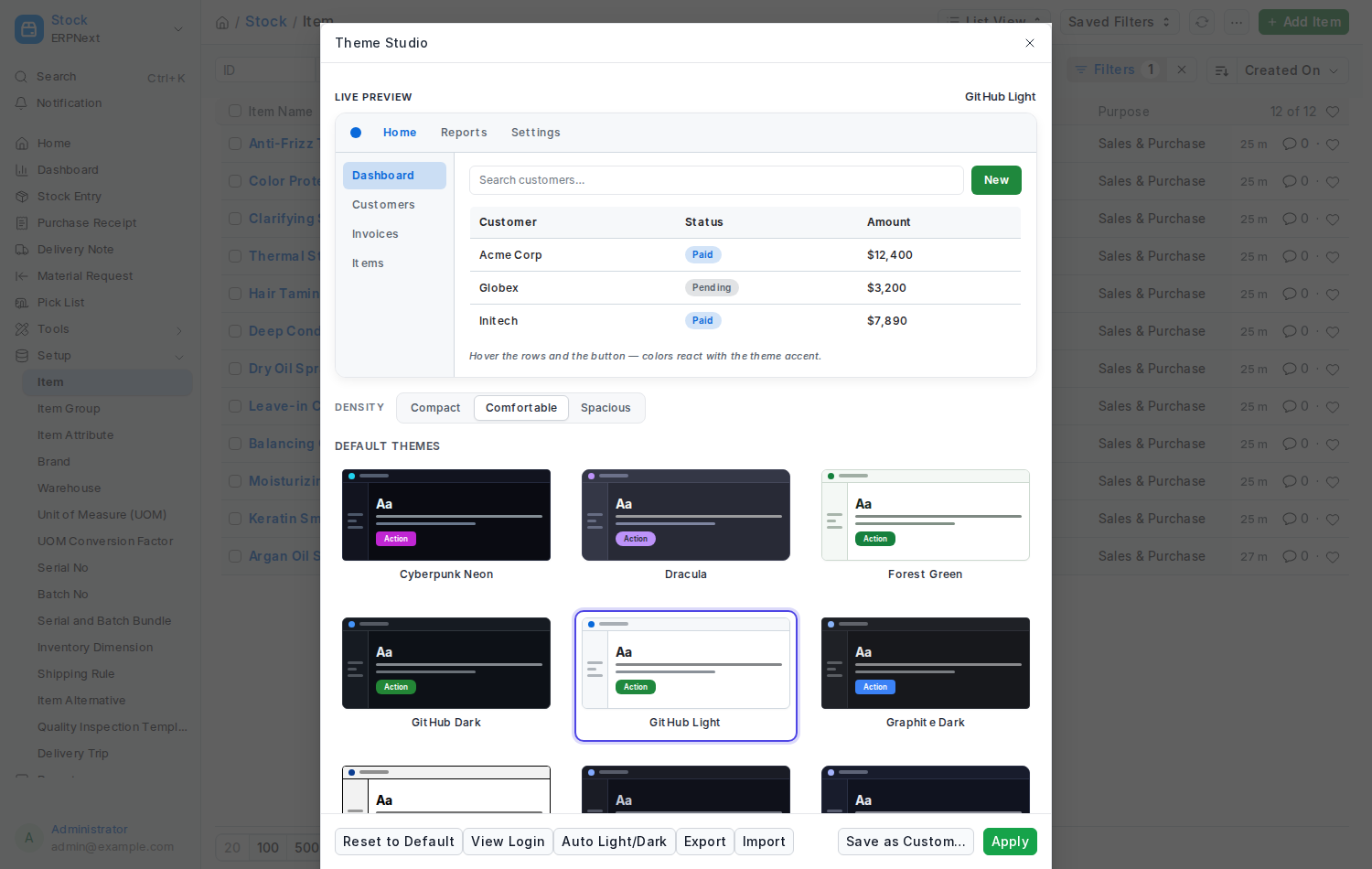
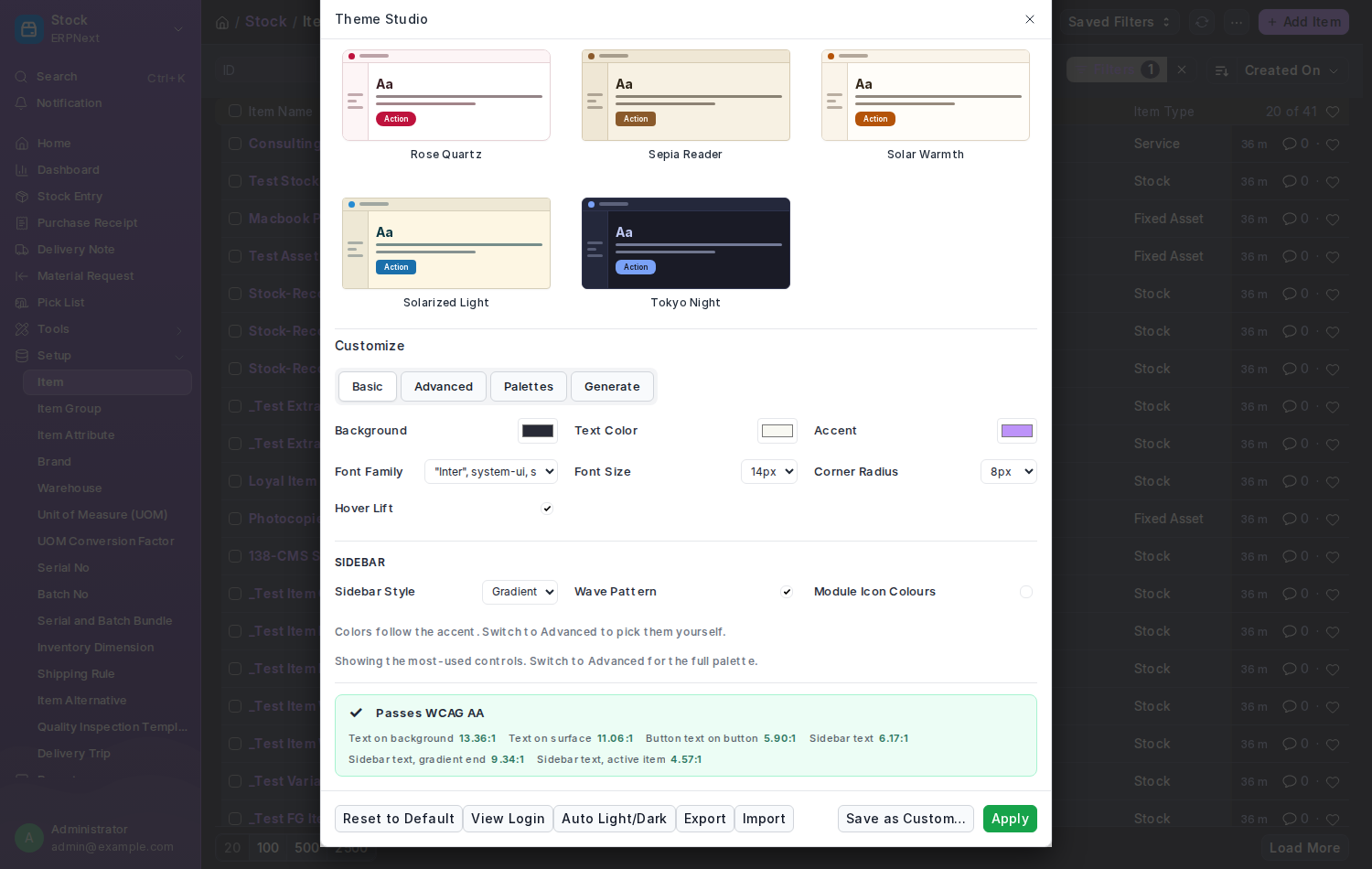
Theme Studio is where you choose how the Desk looks. Open it from the avatar menu (top-right), from the Nexus Theme workspace, or at /app/theme-studio.
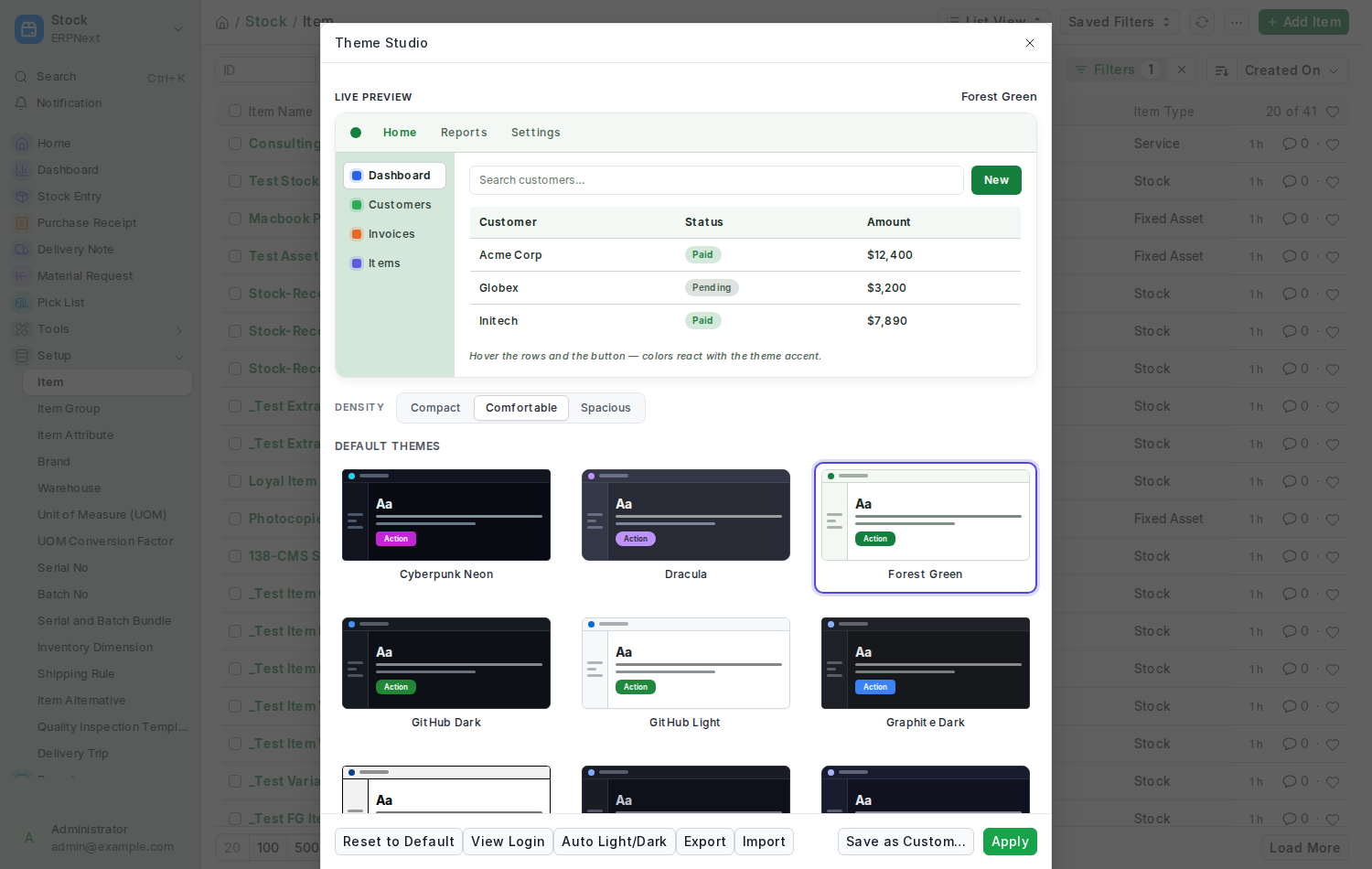
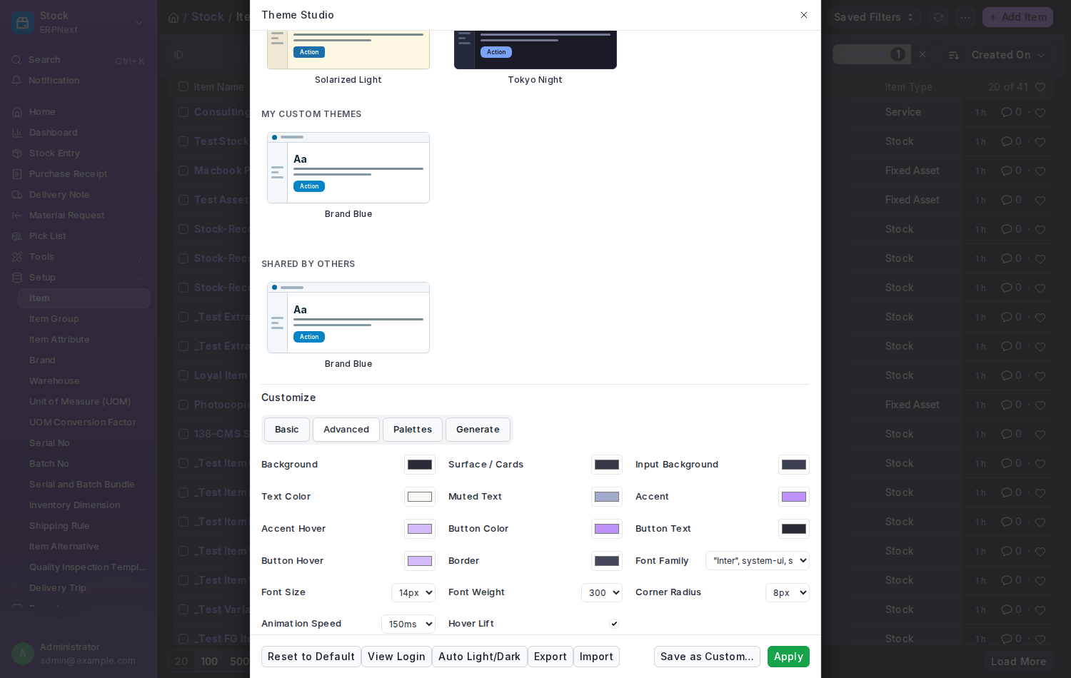
The same studio on a dark theme:
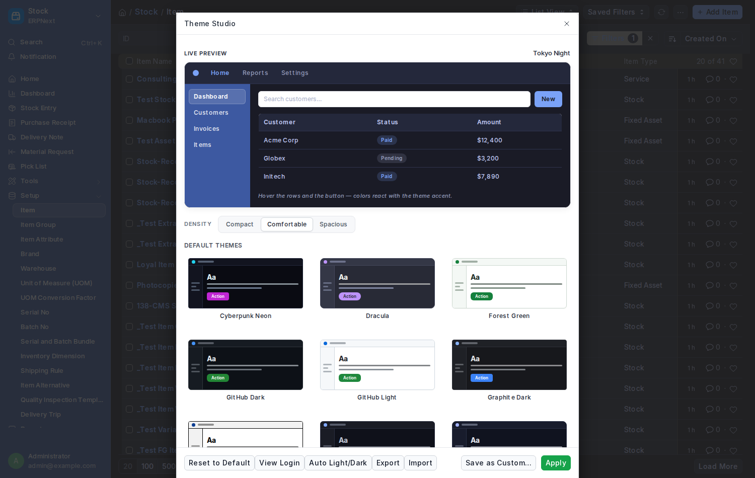
- Click your avatar (top-right) and choose Theme Studio.
- Click any theme card. The Live Preview inside the dialog, a small mock-up of the Desk, shows how it looks.
- Happy? Click Apply and the whole Desk changes at once. Not sure? Click another card. Nothing is stored until you press Apply.
- Want to tweak it? Click Customize and adjust colours; the preview follows every change. Press View Login at any point to see the sign-in screen in the same theme.
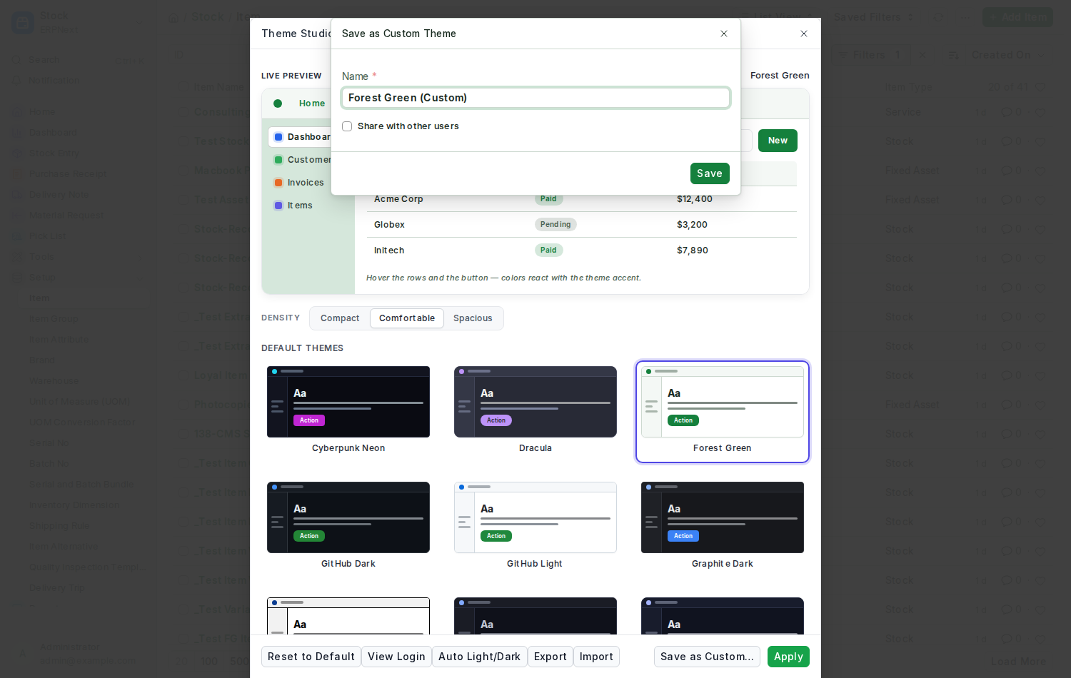
- Want to keep your tweaks? Click Save as Custom…, give it a name and, if you like, tick Share with other users.
Your choice is remembered on every device you log in from.
Click a different card and only the preview changes — the Desk behind it stays as it was until you press Apply:
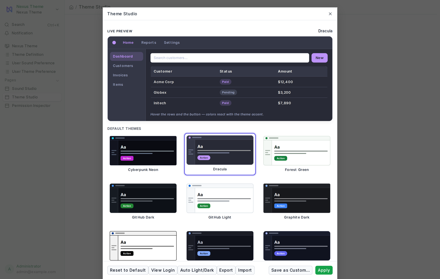
| List | What is in it |
|---|---|
| Default Themes | The 17 themes that ship with the app |
| My Custom Themes | Themes you saved. Only you see them, and you can delete them here. |
| Shared by Others | Themes your colleagues chose to share with everyone |
The 17 bundled themes:
- Dark: Midnight Indigo, Graphite Dark, Nord Frost, Dracula, Tokyo Night, GitHub Dark, Material Ocean, Cyberpunk Neon
- Light: GitHub Light, Solarized Light, Ocean Breeze, Forest Green, Rose Quartz, Mint Fresh, Solar Warmth, Sepia Reader, High Contrast
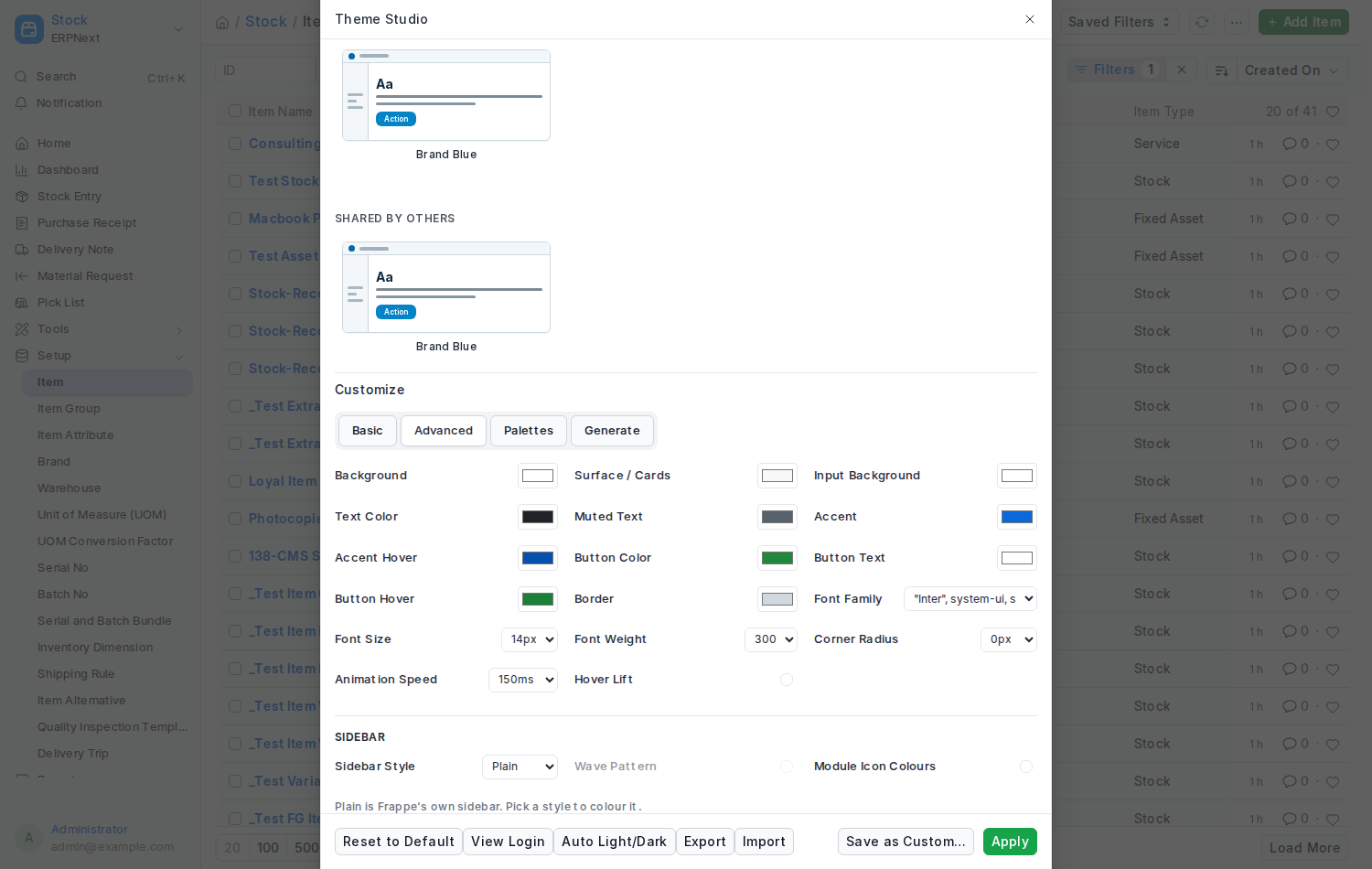
A theme of your own sits under My Custom Themes; one a colleague shared shows under Shared by Others.
Click Customize on any theme. The editor shows a Live Preview card and a set of controls. Every change is applied to the Desk behind the dialog as you make it.
Basic shows the controls most people need:
| Control | What it changes |
|---|---|
| Background | The main backdrop of the Desk |
| Text Color | Text on that backdrop |
| Accent | Links, highlights, the active item |
| Font Family | Inter, system fonts, monospace and more |
| Font Size | The base size everything scales from |
| Corner Radius | How rounded cards, buttons and inputs are |
| Hover Lift | Cards rise slightly when you hover over them |
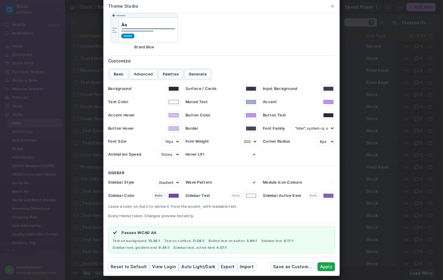
Advanced adds the rest of the 11 colours and the finer settings:
| Control | What it changes |
|---|---|
| Surface / Cards | Cards, sidebars and panels |
| Input Background | Search boxes and form fields |
| Muted Text | Secondary labels and hints |
| Accent Hover | The accent colour when you hover |
| Button Color, Button Text, Button Hover | The primary buttons |
| Border | Lines between sections |
| Font Weight | Lighter or bolder text overall |
| Animation Speed | How fast hover and fade effects run |
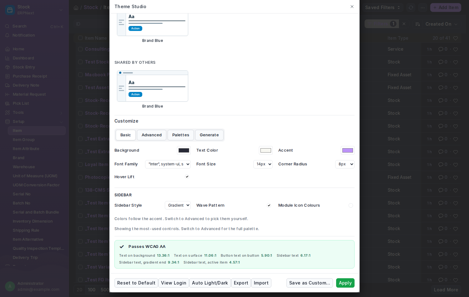
The bar at the bottom is the readability check; it recalculates on every change.
Advanced shows every colour, and the sidebar's own colours with an Auto button each:
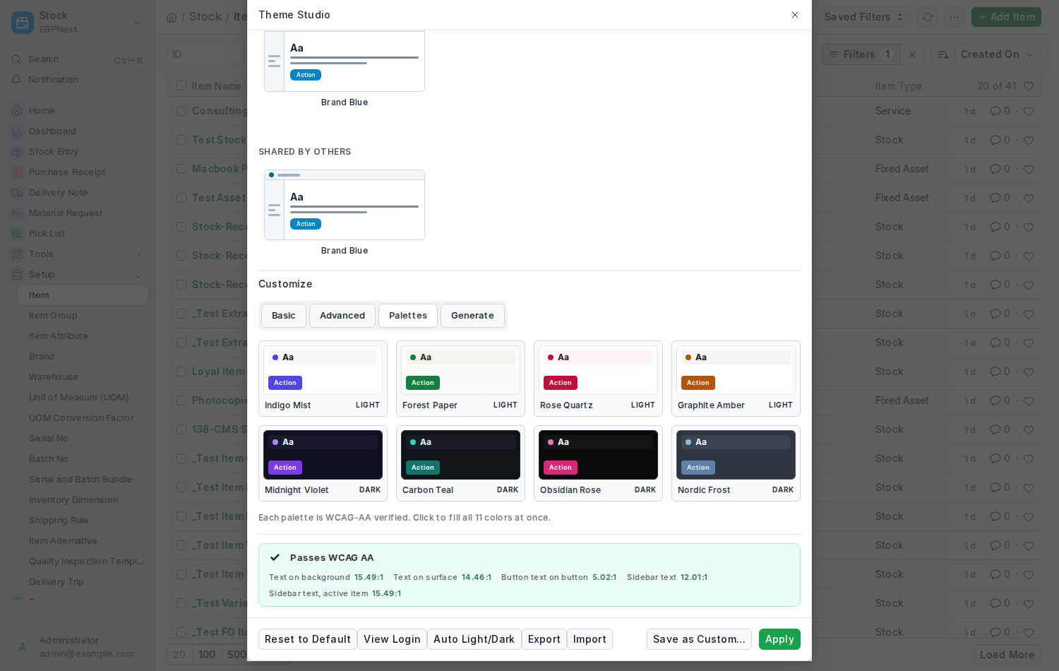
Open the Palettes tab and click a set. Every colour in the editor is filled together, and each set is checked for readability before it ships:
Indigo Mist · Forest Paper · Rose Quartz · Graphite Amber · Midnight Violet · Carbon Teal · Obsidian Rose · Nordic Frost
Use a palette as a starting point, adjust anything you like, then save.
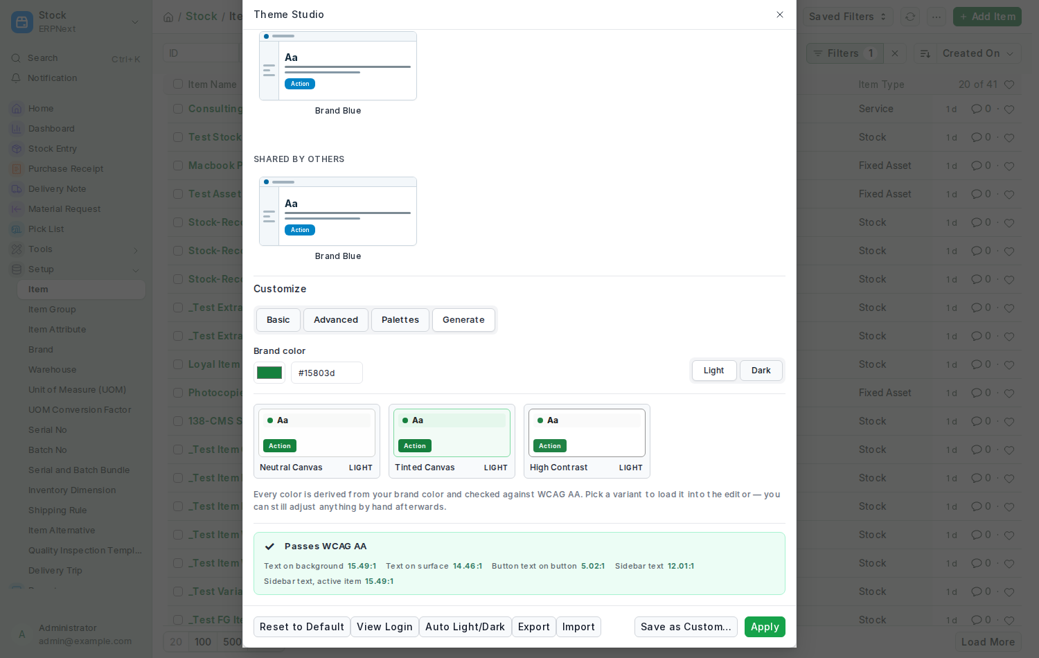
Open the Generate tab, enter your brand colour, choose Light or Dark, and pick one of three readings of that colour:
| Variant | Best for |
|---|---|
| Neutral Canvas | A grey backdrop with your colour only on accents. Calm and focused. |
| Tinted Canvas | The backdrop carries a hint of your colour. Feels branded. |
| High Contrast | Stronger text and borders. Best for accessibility. |
Each card shows its contrast numbers and a Passes WCAG AA badge. The generator solves for readability rather than fixed lightness steps, so it works whether your brand is yellow, navy or anything in between. Click a variant to fill the editor, then fine-tune and save.
Every theme you save is tested first:
-
text on the background must reach a 4.5 : 1 contrast ratio
-
text on cards must reach 4.5 : 1
-
button text on buttons must reach 3.0 : 1
-
sidebar text on a Tinted, Solid or Gradient sidebar must reach 4.5 : 1, against the far end of a gradient and against the highlighted item too
If a check fails you get a clear message naming the pair of colours to fix. You cannot save a theme nobody can read. When one fails in the editor, Auto-fix nudges the colour until it passes.
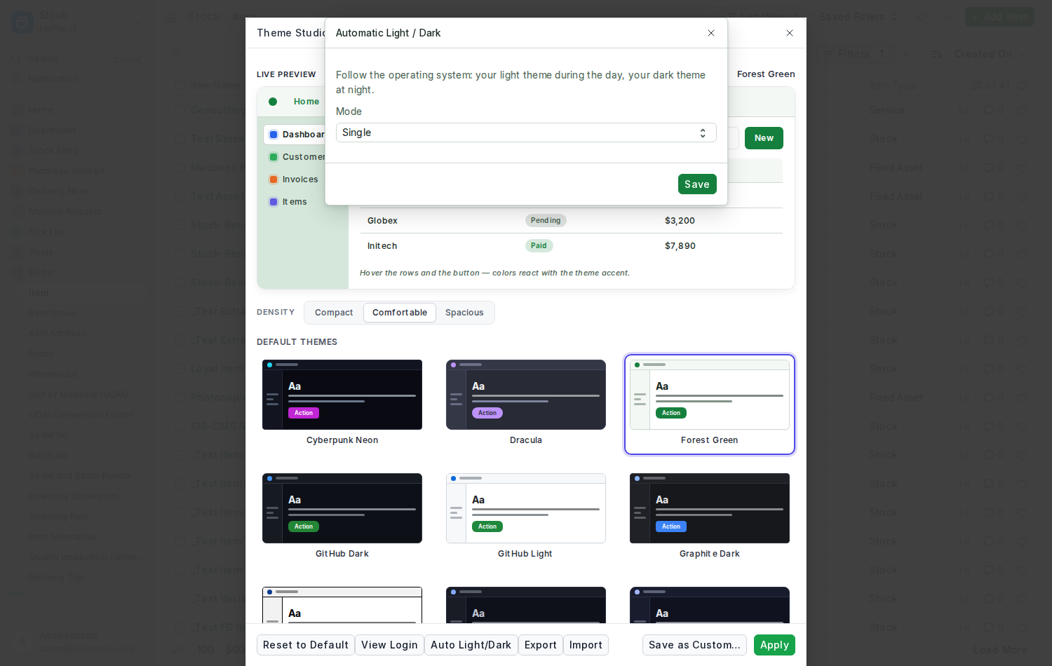
Click Auto Light/Dark in Theme Studio, choose a light theme and a dark theme, set the mode to Automatic and save. The Desk now follows your operating system: switch your computer to dark mode and the dark theme appears by itself.
- Share: tick Share with other users when saving. The theme appears in everyone's Shared by Others list. Untick it by saving again without the tick.
-
Export: select a theme and click Export to download it as a
.jsonfile. -
Import: click Import and choose a
.jsonfile from another site. The file is validated before anything is saved, so a bad or edited file cannot harm your site. - Delete: open My Custom Themes and click Delete on the card. You can delete a theme even while you or a colleague are using it; whoever was using it drops back to the site default, or to Frappe's own look if there is none.
Press View Login at the bottom of Theme Studio. A preview of the sign-in screen opens, painted with the theme you have selected, so you can judge it without signing out. See Login Page.
Just under the preview is a Density switch. It changes how much vertical room the Desk gives rows, fields and buttons — nothing else — and it is independent of the theme. Comfortable is Frappe's own spacing. See Density.
Under Customize → Sidebar: the Sidebar Style (Plain, Tinted, Solid, Gradient), a wave pattern, module icon colours, and in Advanced the three sidebar colours. The preview and the contrast check follow along. See Sidebar Skins.
Click Reset to Default at the bottom of Theme Studio, or choose Frappe Light, Timeless Night or Automatic in Frappe's own Switch Theme dialog. Both record that you want Frappe's built-in look, so an administrator's site default will not come back on your next reload. Pick any Nexus theme again to opt back in.
- Themes style the Desk's own components. A third-party app that paints its own fixed colours is not restyled; the built-in Frappe and ERPNext interface is.
- If an administrator narrows the allowed list, you keep the theme you already have. You just cannot pick others outside the list.
- Custom themes survive updates. New bundled themes never overwrite your own.
See also: Theme Settings for the site-wide options, Recipes for step-by-step tasks.