Review 3890
PR #3890 · author AKnassa · bucket contributor (external) — not in ENGOWNERS/DESIGNOWNERS, permission: read
Head reviewed 829da488 — every claim below was verified at this commit
LOOP VERSION: 1.6.0 · AUDIT RUBRIC: 1.13
Round 2 — after cixzhang's request-changes of 2026-07-21
LANE: full — round two on a prior request-changes; new public config keys, a new Effect, a new module-level registry, an intended visual change, and more than one decisive check. No fast condition holds.
Round one asked for exactly two things: "Animate transform, not width" and "move focus somewhere deliberate first (e.g. the collapse toggle / trigger) and then apply inert, so focus never gets orphaned." It closed with "Once the animation moves to transform and the focus-on-collapse case is handled, I'm happy to approve", and it explicitly accepted the API shape — "the API shape (collapsedWidth incl. 0, isAnimated) reads well and is consistent with the component's existing *Width config."
Both asks are met, driven and screenshotted below, on the path the PR documents. This round extends rather than contradicts: the API shape is not re-opened, and the findings are somewhere round one did not reach — a configuration, and a repo CSS invariant.
Four slots block, and they are one thing:
SideNavdoes not own its own exit. It looks for one in a module-global registry, so whether a hidden nav can be reopened depends on what else happens to be mounted.
The three seams that fail are its instances. Only the default-configuration one reaches the author; the other two are the same root at lower reachability.
- WHY 1 — SideNav can only collapse to a 48px icon rail, so a focused single-pane UI (chat, editor) cannot get the nav off screen.
-
WHY 2 — the person building that UI reaches for
width: 0 !importantoverrides, which fight the component's own width logic and drop out of the theme. - WHY 3 — the end user of that app keeps a 48px strip of chrome in a layout whose whole point is one uninterrupted pane.
USER-FACING PROBLEM: someone building a chat or editor shell wants the nav gone, and today gets a 48px rail they can only remove by overriding the library. PROBLEM SEVERITY: missing capability — the job has no supported path. Not broken task: the rail works, it is just not the shape these UIs need.
Need is demonstrated, not asserted: issue #2331 asks for it directly, and the PR names the override consumers fall back to. Walked end to end, collapsedWidth: 0 plus an outside toggle does reach the job.
VERDICT: clear
The nav learns a collapsed width the consumer picks, and zero is allowed. When it is zero there is nothing left to look at, so the nav also stops being reachable — it drops out of the focus order and the accessibility tree, and anything focused inside it is moved somewhere the person can still see before that happens. Because shrinking a box is layout work, the content instead slides sideways behind the nav's existing clip while the box holds its old width, and the box closes in one step once the slide is over.
SOLUTION (2 decisions · ~170 runtime lines of 854)
  1. collapsedWidth (incl. 0) beats both the rail class and the resizable size;
     at 0 the nav is inert, focus is parked first, and context reports expanded
     so content does not morph                          -> the stated problem
  2. isAnimated slides the content on transform only for collapsedWidth: 0,
     with a delayed zero-duration width snap; the rail never animates
                                                        -> the round-one ask
Decision 1's sub-parts (inert, focus parking, context reporting) cannot ship apart from collapsedWidth: 0 — a hidden nav that stays focusable is a defect, not a smaller step — so they are one decision, not four. Both decisions trace to a written problem; nothing piggybacks.
BURDEN: medium — one added useLayoutEffect, one render-phase state reset, one module-level Set registry, two new public config keys. No timers, listeners, observers or transitionend.
BURDEN MATCH: proportionate — a missing capability plus an explicit review ask; the animation machinery is CSS-only and the focus machinery is one effect.
VERDICT: note — the module-level registry is the one piece of machinery whose reach is wider than the decision it serves.
-
OWNER:
SideNavowns the collapsed geometry and the inert lifecycle;SideNavCollapseButtonowns the toggle affordance. -
TIER 1: reuses
useResizablecollapse state,themeProps,useDevWarning,useTranslator, and the--duration-fast/--ease-standardtokens.MobileNav's drawer is the cited slide precedent. - TIER 2: none.
-
SEAMS: built-in in-nav collapse button · outside
SideNavCollapseButtonvia the controlledcollapsibleconfig · the deprecatedhandleRefwiring · AppShelltopbaranddrawerrender modes ·resizablecomposition. -
BEHAVIOR UNIT: inline — one
useLayoutEffect(SideNav.tsx:537), not two, so the two-Effects-coordinating-machinery threshold is not met. The choreography is pure CSS with no JS coordination.
| seam | driven result |
|---|---|
outside SideNavCollapseButton (documented pairing) |
works — slide, inert and focus park all correct |
built-in in-nav collapse button (hasButton default) |
fails — the toggle hides and goes inert with the nav; focus lands on <body>; nothing can reopen it |
no SideNavCollapseButton at all (consumer's own control) |
degrades — focus is explicitly blurred to <body> at collapse |
| two hidden-collapse navs, one registry | wrong target — collapsing nav B parked focus on nav A's toggle |
resizable + collapsedWidth: 0
|
works — collapsedWidth wins, pinned by test |
The behavior lives with its owner, but the exit does not: SideNav searches a module-global Set<HTMLElement> (SideNavCollapseContext.ts:103) and takes the first connected element outside itself (:116-125). The registry is internal — not in the core barrel, 3 call sites, all under SideNav/ — so it ossifies nothing public.
VERDICT: BLOCKS — on the component's own default (hasButton: true), collapsing to zero leaves no reachable way to expand.
Nobody until someone opts in: both keys are new and optional, defaults are untouched, and the rail path renders byte-identically (isAnimated without collapsedWidth: 0 changes neither class list nor child count — pinned by test and confirmed here).
For the builder who does opt in: writing collapsedWidth: 0 and leaving hasButton alone gives them a sidebar that collapses once and never comes back — in their app, not in a story. For the end user of that app, the nav vanishes, focus lands on <body>, and there is no control, no key and no timeout that brings it back.
Newly exposed by landing: nothing in a sibling. The rail collapse is untouched and no existing surface changes.
VERDICT: BLOCKS — carries the ARCHITECTURE finding's user consequence.
// the documented pairing, from apps/storybook/stories/SideNav.stories.tsx
const collapsible = {isCollapsed, onCollapsedChange: setIsCollapsed};
<SideNavCollapseButton collapsible={collapsible} size="sm" />
<SideNav collapsible={{...collapsible, hasButton: false, collapsedWidth: 0, isAnimated: true}} />

// the spelling that traps — nothing stops it, nothing warns
<SideNav collapsible={{isCollapsed, onCollapsedChange, collapsedWidth: 0}} />| change | public? | class | doc'd? | verdict | |
|---|---|---|---|---|---|
+ |
collapsible.collapsedWidth?: number (no default; rail when absent) |
yes — SideNavCollapsibleConfig, core barrel |
resizable.defaultWidth, minWidth, maxWidth — the component's existing *Width axis |
en (SideNav.doc.mjs:99) |
ok — accepted by the prior review |
+ |
collapsible.isAnimated?: boolean = false |
yes — same |
SideNavCollapseButton chevron, MobileNav drawer — existing motion opt-ins |
en (same row) | finding — no-op unless collapsedWidth === 0
|
~ |
SideNavCollapseState.isCollapsed now reports false while hidden-collapsed |
yes — returned by useSideNavCollapse()
|
— | interface JSDoc, not doc.mjs
|
note |
OSSIFICATION. collapsedWidth is a new instance of the existing *Width axis; isAnimated a new instance of the existing motion opt-in class. Neither is a new concept, so neither needs human judgement. Cost of being wrong on isAnimated: it silently does nothing outside hidden mode, so removing it later is breaking while its meaning today is already narrower than its name. The PR does state why it is a no-op on the rail ("animating it would mean animating width"), so this is argued, not unrecorded.
VERDICT: note — isAnimated is a config a builder can set truthfully-looking and get nothing from; not worth blocking on its own.
No new theme targets. themeProps('side-nav') is unchanged and still lands on the same <nav>; the new slide layer carries no target and no astryx-* class, so no theme selector's element moves. Tokens used are all existing and all already used by SideNavCollapseButton. No raw colours, radii or shadows added (grepped the changed style blocks: 0 hits).
One value is hardcoded and is not a token candidate: transitionDuration: '0s' (SideNav.tsx:192). 0 is on the exemption list, so it is not a token finding — but the repo's CSS build test rejects it for a different reason (see JUDGEMENT).
VERDICT: clear
-
BEHAVIOR: no change on any existing path. Walked the reachable states — expanded (unchanged), rail-collapsed (byte-identical render), controlled and uncontrolled,
resizable+ collapsed (precedence pinned), AppShelltopbar/drawer(early-return before any new code).empty / loading / error / disabledare not reachable: the diff adds no state, default or prop on those paths. The new behaviour exists only whencollapsedWidthis set, which nothing does today. - API: no — both keys are optional additions to an existing object type; no call site stops compiling.
-
VISUAL: yes, opt-in only. Nothing already on screen moves. The nav's outer box does not grow in any state (expanded 260 → 260, rail 48 → 48), and the slide layer is
width: 100%inside the existingoverflow: hidden, so it adds nothing to the flow. The shrink was measured with a real constrained neighbour: the sibling holdsx=400 w=460for the whole 125ms slide, then moves tox=140 w=720in one step. - THEME: no — existing targets, tokens and overrides all still resolve.
VERDICT: clear
+ useLayoutEffect [isFullyHidden, isInertApplied]   SideNav.tsx:537   parks focus, then sets state
~ render-phase setState (not an Effect)             SideNav.tsx:533   React's reset-on-prop-change pattern
One added Effect — not two, so the inline-state-machine architecture block does not apply.
| Effect + deps | external system | why render/handler cannot do it | measured render cost | lifetime + cleanup | focused test |
|---|---|---|---|---|---|
useLayoutEffect [isFullyHidden, isInertApplied] SideNav.tsx:537
|
DOM focus — document.activeElement is browser state React does not own |
collapse can be app-driven (a route change, a shortcut) with no handler in the loop; when a handler is the trigger, focus is already outside and the effect no-ops |
+1 commit per fully-hidden collapse — nav mutations are class, style, then inert as a separate commit |
no listener, observer or timer; reads activeElement and calls focus()/blur() once |
yes — a focus() spy proves inert is absent at that moment, and a mutation test pins "inert in the first render" as a failure |
-
RENDER — one collapse cycle, Chrome CDP
Performance.getMetrics: layout 2, recalc 10 with focus inside the nav (the effect does its work); layout 2, recalc 6 with focus outside (state only). The focus park costs 4 style recalcs, once per collapse, never per frame. -
LISTENERS/OBSERVERS — none added. The registry is a
Setmutated on mount/unmount by the button's ref callback with the unregister returned;findExternalCollapseToggleadditionally guards onisConnected. -
LAYOUT — no forced reflow. Nothing reads
offsetWidth/getBoundingClientRect/getComputedStylein render, in the effect, or anywhere in the diff (0 hits). The animation is a compositortransform; the onewidthchange is a single delayed snap, not a tween. - BUNDLE — no new dependency, ~170 runtime lines.
- Realistic N — one SideNav per page shell. Per-instance scaling is not a live concern; N>1 cost was not measured (two navs were driven only for the registry behaviour).
Nothing degrades. No number goes up and stays up.
VERDICT: clear
VISUAL CHECK: manual frames required
WHY: pixels are intended to change (a new slide and a new collapsed geometry), and the changed endpoint — a nav at collapsedWidth: 0 — is absent from the visual gate's stories on main. Stable visual regression passed at this head but cannot cover a story that did not exist before this PR.
| Before (expanded) | After (collapsed) |
|---|---|
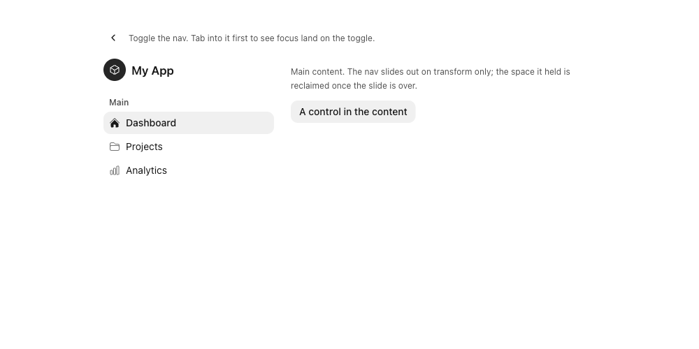 |
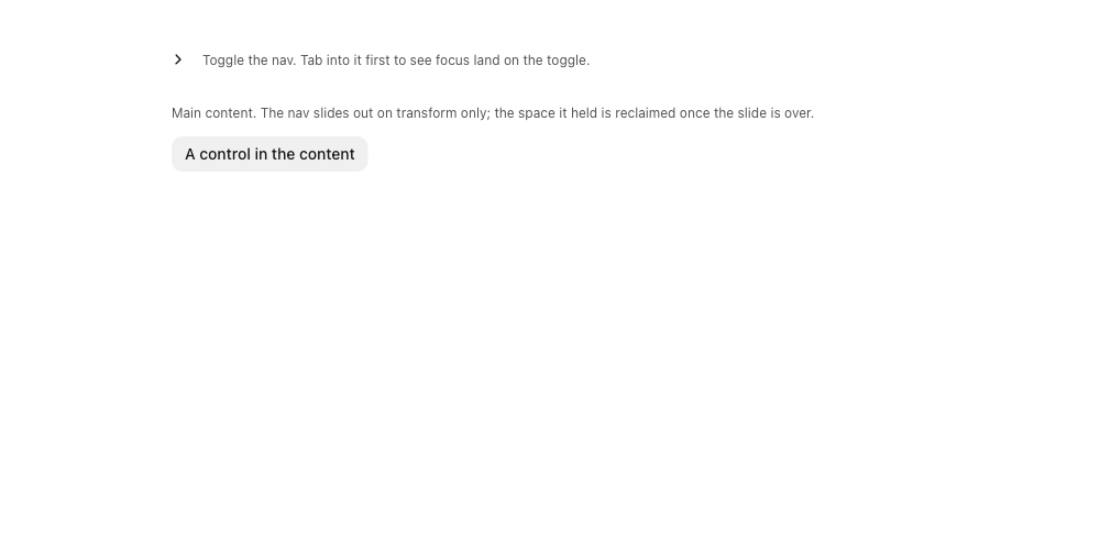 |
Difference by difference. The nav is gone and the content column has moved to the left edge — intentional, sourced from the PR body: "0 hides the nav entirely, which is what focused single-pane UIs (chat, editors) want but the rail could not express." The outside chevron flips from ‹ to › and its label from "Collapse sidebar" to "Expand sidebar" — intentional, pre-existing SideNavCollapseButton behaviour, unchanged by this diff. No other difference.
SENSOR RECEIPT — build 829da488 (observed = expected) · story core-sidenav--hidden-collapse · theme neutral · mode light · dir ltr · viewport 1000×500@1 · media {forcedColors:false, reducedMotion:false, coarsePointer:false, hover:true} · semantic state authored before capture and matched: expanded {navWidth:260, inert:false, togglesTotal:1, togglesReachable:1}, collapsed {navWidth:0, inert:true, togglesTotal:1, togglesReachable:1} · fonts loaded · zero page or Storybook errors after excluding the dev server's own /favicon.ico 404, which reproduces on the untouched core-sidenav--default story. Before and after match on every sensor except the semantic state under test.
Receipts: expanded · collapsed
Before (expanded; the only toggle is the ‹ at bottom-left) |
After (collapsed — no toggle anywhere on the page) |
|---|---|
 |
 |
SENSOR RECEIPT — same build, theme, mode, direction, viewport and media as above · story scratch-sidenav3890--built-in-button (a scratch story in the review worktree, banked below; not part of the PR) · semantic state authored before observation and matched: before {navWidth:260, inert:false, togglesTotal:1, togglesReachable:1}, after {navWidth:0, inert:true, togglesTotal:1, togglesReachable:0}. togglesReachable: 0 is the finding, asserted fail-closed by the receipt rather than read off the picture.
Receipts: before · after
| claim | result |
|---|---|
| transform-only | 3 running transitions on collapse: transform 125ms (slide layer), transform 125ms (button chevron), width 0ms duration / 125ms delay (nav). The nav box never tweens. |
| box holds, then snaps | navW 260 at t=30/56/89ms; navW 0 at t=140ms |
| constrained sibling reflow | sibling x=400 w=460 held for the whole slide, then x=140 w=720 in one step |
| RTL | layer slides positive: x 713 → 832 → 859 (mirrored), same timings |
| reduced motion |
document.getAnimations() empty; navW already 0 at t=21ms — slide and delayed snap both collapse to 0s
|
| focus-inside collapse | link (in nav) → button[Expand sidebar] (outside nav) at t=12ms; never <body>
|
| inert timing |
inert lands at t=15ms with activeElement = the outside toggle, i.e. after the park |
| interrupt mid-slide | re-expand at 60ms: navW never left 260, inert dropped, transform reversed −111 → 6 → 140, nav usable. No stranded state. |
| re-expand | navW 260, inert gone, links tabbable |
Reproductions banked beside the frames: probe-behavior.cjs · probe-edge.cjs · probe-perf.cjs · probe-frames.cjs · scratch stories
VERDICT: BLOCKS — frame pair 2 shows a state with no exit.
REMEDY SEARCH: not triggered — author owns HOW; acceptance criteria are sufficient. Ownership (SideNav), public shape (collapsible) and constraints were all settled by the prior review; the open question is only how to guarantee the exit.
Automated half. pr-a11y green at this head with no baseline growth (.github/a11y-baseline.json untouched). pr-rtl green. No hardcoded AT strings added — the nav's accessible name is t('@astryx.sideNav.label') and the button labels are @astryx.sideNavCollapseButton.*.
Browser half — driven, not read.
-
Focus never dropped to
<body>— checked, and it FAILS on two paths. On the documented pairing focus parks correctly (t=12ms, beforeinertat t=15ms). With the defaulthasButton, or with noSideNavCollapseButtonanywhere, the explicit blur runs anddocument.activeElement === document.body. -
Focusable element removed to express state — the nav is kept mounted and made
inertrather than unmounted. Correct, and round one said so. -
Keyboard, RTL arrow flipping — no keyboard handling added; the slide is CSS and mirrors under
[dir="rtl"](driven). -
Entry/exit animation guarded by
prefers-reduced-motion— checked: both the slide and the delayed snap go to0s, driven under emulated reduced motion, zero running animations. -
Accessible name — unchanged, translated. State exposed via ARIA — collapsed state is carried by
inertplus the toggle's own label flip, not colour or shape alone. -
forced-colors: active— not looked at. The diff paints nothing, only a transform and a width, so it was judged out of reach; saying so rather than claiming a pass. - Target size, hover-only reveals, focus ring — not reached: no new interactive element, no hover affordance, no ring change.
Direction. No new strings, so the catalog rules do not arise. The slide uses translateX with an explicit :is([dir="rtl"] *) flip rather than a logical translate — the one shape lint cannot catch — and it is handled correctly: the flip is declared and driven green in RTL, with MobileNav's drawer as the cited precedent.
The blocking sentence, plainly: a keyboard user whose focus is inside a collapsedWidth: 0 nav that uses the default hasButton loses focus to <body> and cannot reach the nav again by any key. No control, no key, no timeout.
VERDICT: BLOCKS — focus lost to <body> and no exit, on the component's default configuration.
| slot | verdict |
|---|---|
| PROBLEM | clear |
| SOLUTION | note — registry reach wider than its decision |
| ARCHITECTURE | BLOCKS — no reachable exit on the default hasButton
|
| IMPACT | BLOCKS — carries that consequence |
| API | note — isAnimated is a no-op outside hidden mode |
| THEMING | clear |
| BREAKING | clear |
| PERFORMANCE | clear |
| VISUAL | BLOCKS — frame pair 2 |
| A11Y & I18N | BLOCKS — focus to <body>, no exit |
Do the findings share a parent? Yes — the parent finding at the top of this page. The review is written at that level; the failing seam rows are its instances, and only the default-config one is stated to the author.
Unrecorded changes: none. Every decision and both API keys carry a stated rationale in the PR body; no reviewer-supplied rationale was constructed.
Did the author already do it? Grepped the diff for a hasButton + collapsedWidth guard and for a useDevWarning on that pair: absent. The changeset documents the pairing; nothing enforces or warns.
GOAL: partly met — the stated problem is solved and both round-one asks are met on the documented path, driven and screenshotted. It is not met for the component's own default configuration, where the same feature produces an unrecoverable nav. The uncovered member is hasButton left at its default, and it cannot follow separately: it is the default spelling of the feature this PR ships.
DISPOSITION
| finding | disposition |
|---|---|
no reachable exit on collapsedWidth: 0 + default hasButton (focus to <body>) |
blocks now |
CI test red on scripts/build-css.test.mjs — "no transition-duration:0s rules appear outside @media blocks"; SideNav.tsx:192 is the only unconditional transitionDuration: '0s' in packages/core/src (1 hit), reproduced locally at head (1 failed / 7 passed) |
blocks now |
| focus parks on the first registered toggle globally, so with two hidden-collapse navs the wrong nav's toggle takes focus | follow-up — same root as the block, needs no separate fix if the exit is owned rather than searched for, and unreachable in a one-nav app. Raised only if the registry survives. |
isAnimated silently does nothing unless collapsedWidth === 0
|
accepted — the PR states the reason, a test pins the no-op, and the cost falls on a builder reading the doc line rather than on a user. The author's call to keep. |
ADVICE: proven existing pattern. SideNav.tsx:480 already calls useDevWarning to name a contradictory collapse config (collapsible.* versus resizable.* addressing the same state); 16 files in packages/core/src use the hook. Same file, same class of problem, landed. The CSS fix is deliberately not prescribed: the 0s duration is load-bearing for the delayed snap, so wrapping it in @media would break the choreography, and choosing the mechanism is the author's.
AUTHOR CAN PROCEED: yes — acceptance criteria, no implementation prescribed:
- Collapsing a
collapsedWidth: 0nav always leaves a reachable way to expand it, or the component says so at dev time in the configuration where it does not. Verified by: withcollapsible={{isCollapsed, onCollapsedChange, collapsedWidth: 0}}and nothing else, either a control remains reachable after collapse, or a dev warning fires. -
scripts/build-css.test.mjsis green, and the CItestjob with it.
WORST OUTCOME: "a keyboard user whose focus is inside a collapsedWidth: 0 nav that uses the default hasButton loses focus to <body> and cannot reach the nav again by any key" → request changes. That sentence cannot coexist with note or approve.
JUDGEMENT NEEDED: none — a defect against the contract the prior review already settled. The API shape was accepted on 2026-07-21; nothing here re-opens it, and no new concept is added.
-
collapsedWidth: 0withhasButtonat its default hides the only toggle inside the nav it hides → a builder who writes the shortest form of the new feature ships a sidebar that collapses once and can never be reopened; the user's focus lands on<body>with no control, key or timeout to get back ·SideNav.tsx:686-688,:764 -
The new
transitionDuration: '0s'is the only unconditional one in core, and the repo's CSS build test rejects it → CI'stestjob is red at this head, so this cannot merge whatever else is right ·SideNav.tsx:192,scripts/build-css.test.mjs:172
Both round-one items check out — I drove it in Chrome: transform only, RTL mirrored, reduced motion snaps, interrupts reverse cleanly, and focus parks on the outside toggle before
inertlands.Two things first.
collapsedWidth: 0on the defaulthasButtontraps the nav: the only toggle hides and goes inert with it, focus lands on<body>, and nothing can expand it again. The changeset says to pair0with an outside button, but the default doesn't and nothing warns —SideNavalready warns on a contradictory collapse config throughuseDevWarning. And CI is red: the zero-duration width transition trips the repo's own CSS check.Keep the built-in button out of the hidden region, or warn?
If you'd rather talk it through with someone, we're in Discord.
[Reviewed by Robohands]
123 words.
Inlines (drafted, not posted):
-
packages/core/src/SideNav/SideNav.tsx:688— WithcollapsedWidth: 0this button hides with the nav, so nothing is left to expand it. -
packages/core/src/SideNav/SideNav.tsx:192— Only unconditionaltransition-duration: 0sin core;build-css.test.mjswants them inside@media.
- The focus-park target comes from a module-global
Set, so with two hidden-collapse navs on one page, collapsing the second parks focus on the first one's toggle. Driven and real, but unreachable in a one-nav app and the same root as finding 1. - With no
SideNavCollapseButtonanywhere — a consumer driving collapse from their own control — focus is explicitly blurred to<body>. Same root again. - 213/213
SideNav.test.tsxpass locally at this head, and CI reports 12802/12808 across the repo. The author's test-plan numbers hold; the single failure is the CSS invariant above, not a component test.
TIME  total 21m
  setup       3m   worktree already cut and clean; storybook dev on a fresh port
                   (warm main reused: n/a — no BEFORE needed, the feature is new)
  reading     4m   protocol, six wiki pages, prior review, diff, source
  measuring  10m   4 probe runs (behaviour, edge cases, frames, perf), 2 re-measures
  writing     4m   draft + critic passes
  waste       2m   the first probe clicked a Storybook UI button instead of the
                   toggle, so the whole behaviour run measured nothing and had to
                   be retaken; a further minute went on a vitest filter path and a
                   reporter name that does not exist in vitest 4
  CI wait     0m   completed runs read at head; nothing waited on
-
forced-colors: active— not driven. The diff paints nothing, so it was judged out of reach rather than checked. - Cost at N>1 navs — two navs were driven for the registry behaviour but not measured for render cost; realistic N for a page-level nav is 1.
Nothing was posted to the PR. The loop is read-only on public PRs — Reviewer Brief, Absolute rules: "Never post, comment, push, or approve. Draft text only" — and under Critic Rules R2e request-changes is the last permission the loop earns, which it has not been granted for this run. This is a delivery-policy hold, not a Needs human verdict: AUTHOR CAN PROCEED is yes and JUDGEMENT NEEDED is none. The verdict and both acceptance criteria are ready to post as drafted.
Not yet posted — awaiting the maintainer's ship / edit / kill.