Review 5458
#5458 docs(storybook): show how to theme a toast's chrome and its content by cixzhang (the maintainer)
0ca75baa1ef79ca9c966756eb789612bd72bab6f
38e58e4026a08475280ba6d5737708c8cce5140c
LOOP VERSION: 1.5.0
AUDIT RUBRIC: 1.13
LANE: full — the branch had a merge conflict and adds two rendered documentation endpoints whose light/dark output is the acceptance evidence.
Toast had no runnable theming story. A theme author had to reconstruct whether the root target reaches content, which variant key styles errors, and where the Theme scope must sit. A wrong reconstruction can silently produce an unthemed toast or unreadable text.
VERDICT: clear
The root Toast target paints the card and lets inherited typography reach its content. One story holds default and themed examples still for comparison; the other wraps a real viewport and fires toasts normally. The nested theme follows the app's effective light/dark mode.
SOLUTION (1 decision · 0 runtime lines of 157)
- Add static and live Toast theming stories demonstrating the existing target, inheritance, viewport scope, and automatic media contrast.
BURDEN: low — Storybook only; no runtime state, effects, listeners, public surface, or package output.
BURDEN MATCH: proportionate.
VERDICT: clear
OWNER: Toast owns its painting target and media-surface behavior; Storybook owns the runnable documentation.
TIER 1: existing Theme, defineTheme, themeProps('toast', {type}), and automatic media mode.
TIER 2: none.
SEAMS: inline Toast, viewport + useToast(), nested theme, light and dark.
BEHAVIOR UNIT: inline story composition; no behavior added.
Both inline and live paths were driven in light and dark. Live toasts resolved under toast-brand-demo; no composition seam claimed by the story failed.
VERDICT: clear
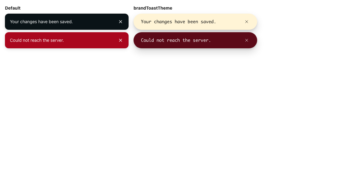
No installed consumer changes. Builders opening Core/Toast gain a side-by-side explanation and the real viewport shape. Themed info and error toasts resolve 9999px radius, 24px inline padding, and ui-monospace; text remains dark on cream and light on deep red in both modes.
VERDICT: clear
No API change. No prop, export, value, default, theme target, token, variable, or behavior is added or changed.
VERDICT: clear
The example matches the existing contract:
-
toastis documented and rendered on the painting root withtypeas its visual prop. - The theming convention says to prefer inheritance over child targets; the story applies
fontFamilytotoastrather than inventing a body target. -
baseandtype:erroruse the documented key syntax. - Literal colors are the theme author's input in a theming demonstration, not component styling.
- In light mode cream keeps ambient dark text and deep red chooses the dark-surface side. In dark mode cream chooses the light-surface side and deep red keeps ambient light text.
VERDICT: clear
BEHAVIOR: no runtime behavior change.
API: no.
VISUAL: no existing output changes; two new documentation endpoints appear intentionally.
THEME: no target, token, variable, or override changes.
VERDICT: clear
EFFECTS: zero added, removed, or moved.
RENDER: no shipped render path changes.
LISTENERS/OBSERVERS: none added.
LAYOUT: no new measurement or layout work.
BUNDLE: no published package output changes.
VERDICT: clear
VISUAL CHECK: manual frames required
WHY: the PR adds rendered documentation and makes explicit light/dark claims; the new story ids were not existing visual-gate endpoints.
| Light | Dark |
|---|---|
 |
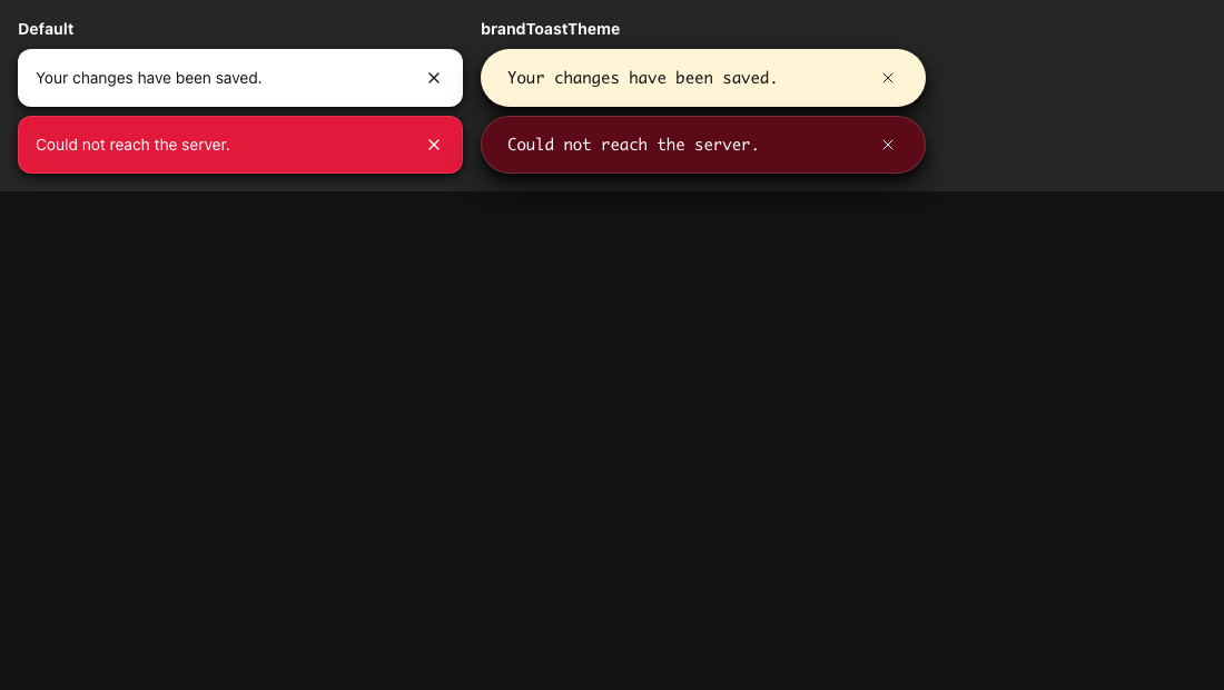 |
Sensor receipt: exact head; stories core-toast--themed-toast and core-toast--themed-toast-live; neutral outer theme; matching light/dark mode; LTR; 1100×620 @1; forced colors and reduced motion off; four static toasts and two live toasts; visible non-zero geometry; fonts loaded; no running animation; no page or Storybook errors.
| light | dark | |
|---|---|---|
| themed info contrast | 16.4:1 | 16.4:1 |
| themed error contrast | 13.9:1 | 13.3:1 |
Static and live stories produced the same themed values in each mode.
VERDICT: clear
No component semantics or strings change. All static Toast specimens retain their existing status/alert roles and dismiss controls; live toasts use the normal useToast() path. Story strings are fixtures, and no catalog changes.
VERDICT: clear
| slot | verdict |
|---|---|
| PROBLEM | clear |
| SOLUTION | clear |
| ARCHITECTURE | clear |
| IMPACT | clear |
| API | clear |
| THEMING | clear |
| BREAKING | clear |
| PERFORMANCE | clear |
| VISUAL | clear |
| A11Y & I18N | clear |
GOAL: met — both story paths produce the documented theme values in light and dark, with contrast at 13.3:1 or higher.
DISPOSITION: no negative findings.
ADVICE: omitted — no correction needed.
AUTHOR CAN PROCEED: yes — merge after required checks are green on this head.
WORST OUTCOME: none found → approve and merge.
JUDGEMENT NEEDED: none — the existing docs-only direction applies and the behavior is verified.
approve and merge
Thanks, this is good. The light and dark stories demonstrate the current Toast theming contract.
[Reviewed by Robohands]
16 minutes; one critic pass.
Posted as drafted.