-
Notifications
You must be signed in to change notification settings - Fork 0
Review 5491
cixzhang (Night Watch Component Auditor, self-review) · merged cac77bcd963 · view on GitHub
Verdict: approve — merged by the loop after three rounds
The nightly component auditor's own PR, so this is the weakest form of the loop: nobody outside checked it. It is also the counter-example to that being worthless — rounds 1 and 2 each returned a finding that changed what merged.
A theme author who wants Card's four shadow tiers to look different in their theme cannot reach them. elevation picked a StyleX style object but never reached the DOM, so astryx-card published data-variant and nothing for elevation. Measured on main at all four values: the box-shadow changes, data-elevation is absent every time.
Second problem, and its person is a builder: the docs said padding defaults to 4, so someone writing the documented default explicitly got a different card from the one they would get by leaving the prop out — 15px against 11px in the default theme.
(4 decisions · ~1 runtime line changed of 140 added)
-
elevationjoinsthemeProps('card', {variant, elevation})— the fix. - The documented
paddingdefault becomes the theme chain, in the JSDoc, both prop docs, the dense doc and the playground default; the foureffectivePadding !== 4style branches that encoded the same wrong default in code are deleted. -
CardPropsstops re-declaringclassName/style, whichBasePropssupplies. Type-only. - Eight resolved Card entries deleted from
.github/a11y-baseline.json.
Tests (5 → 8), three new stories and two missing docsZh entries are how those decisions are evidenced, not further decisions.
Nobody looking at an app sees anything change, established two ways. Theme authors gain reach they did not have: astryx-card[data-elevation="high"] now selects something. Builders reading the docs stop being told a default that was wrong.
- CardProps.className?: string            (identical to BaseProps → React.HTMLAttributes.className)
- CardProps.style?: React.CSSProperties   (same)
No prop, export, type, default or accepted value added. BaseProps.ts extends React.HTMLAttributes<T> and its Omit list names neither, so both removals are type-identical rather than merely type-compatible.
~ astryx-card   visualProps ['variant'] → ['variant', 'elevation']
     → the card root <div>; emits data-elevation="none|low|med|high"   (public, permanent)
No new target name. data-elevation is produced by themeProps' own kebab-caser, so it cannot drift from the prop.
The one thing that freezes is data-elevation, and the class has a merged member: ButtonGroup.tsx:207 passes themeProps('button-group', {size, orientation, elevation}) and ButtonGroup.test.tsx:625 asserts the attribute. themeProps.ts:22-26 declares in source that reflecting visual props as data attributes is what themeProps() is for, so this is repair against a landed contract rather than new surface. themeProps( has 314 non-test call sites in packages/core/src; 35 pass two or more visual props; 1 already passes elevation.
-
API — no. Nothing stops compiling; both removed declarations resolve identically through
BaseProps. -
Visual — no, twice over. Mechanism:
grep -rn "data-elevation"acrosspackages/andapps/returns only test assertions, no CSS defines a bare.none/.low/.med/.highrule, and no shipped theme selects on elevation. Pixels: 38 frames captured againstmainare byte-identical to the same 38 at the merged head, re-checked after each fix commit, and the review loop reproduced the conclusion independently by comparing computed geometry on 38 elements across 14 stories. - Theme — no. Purely additive.
-
Behaviour — no. Deleting the four padding branches is identical across all eleven padding steps on a bordered and a borderless card: 24 rows of resolved padding, four
--container-padding-*variables, two--layout-padding-*variables and rendered height.
Zero effects, zero state, zero observers. One extra attribute per Card, four fewer style arguments per render after round 1's deletion. Nothing else.
| what it shows | frames | path |
|---|---|---|
| all 45 states, neutral + matcha, light + dark, 320px, RTL | after | Card__contact-sheet.png |
variant="muted" invisible on the page background |
before (pre-existing) | Card__callout-muted-light.png |
| fixed-height card, content unreachable by keyboard | before (pre-existing) | Card__fixed-height-overflow.png |
| long unbroken token clipped out of existence | before (pre-existing) | Card__long-word.png |
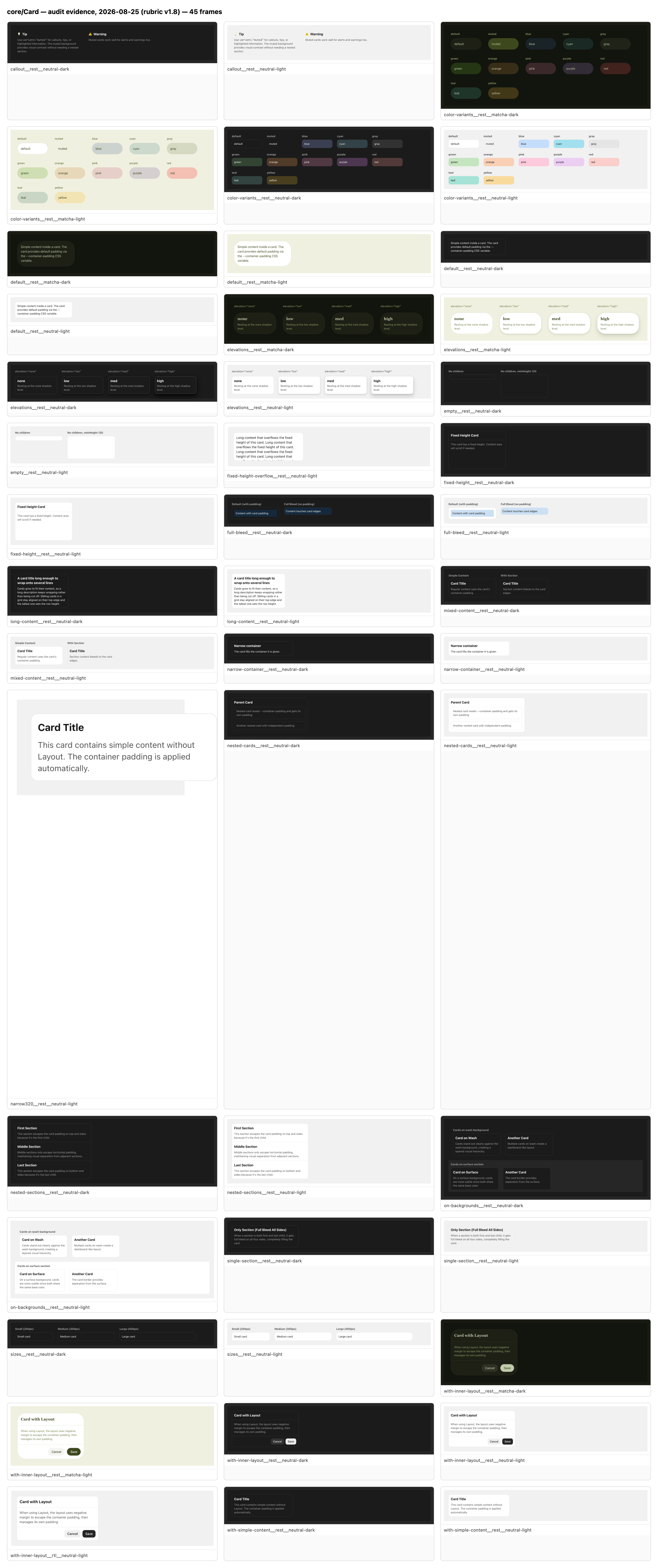

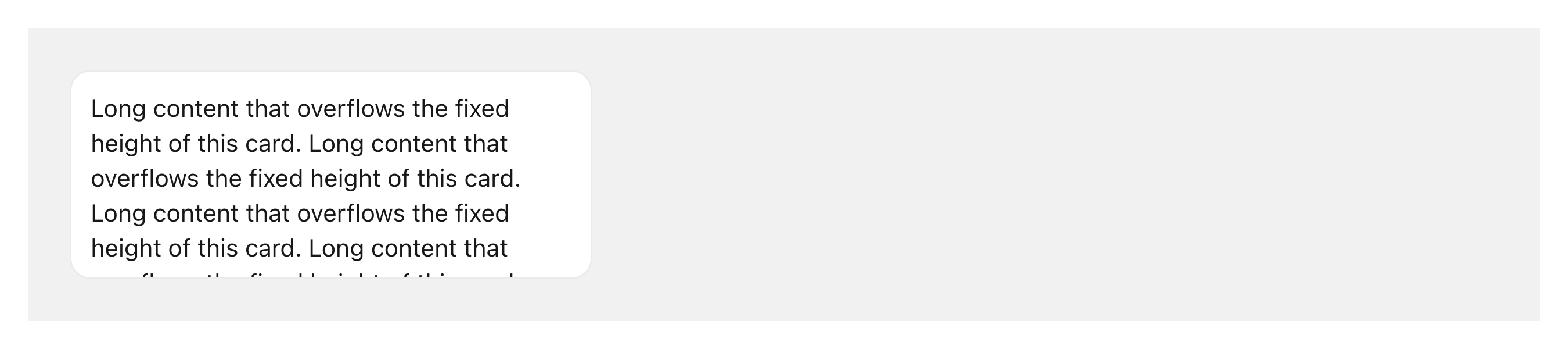

low-risk — no new API surface (repair against a declared contract), no behaviour regression (measured, 24 rows), no performance regression (counted), nothing grew (measured; the outer box does not move).
JUDGEMENT NEEDED: none — repair against a contract themeProps.ts:22-26 declares, with ButtonGroup as a merged member of the class.
approve
1. [not blocking] ClickableCard and SelectableCard document and pre-fill the
   padding default this PR proved false
   → a builder starts from either playground, which seeds padding={4}, and
     ships a card inset differently from the Card beside it
     · ClickableCard.doc.mjs:29,45 · ClickableCard.tsx:189,305
     · SelectableCard.doc.mjs:29,45 · SelectableCard.tsx:225,354

2. [not blocking] Button, Banner and ChatComposer declare `elevation` and none
   reflects it
   → a theme author reads Card's changelog line, writes the same rule for
     Button, and gets a selector matching nothing, with no error
     · Button.tsx:293/692 · Banner.tsx:147/569 · ChatComposer.tsx:95/460
Finding 1 was not taken into the PR despite being four lines: both files are open ground for #5487, and a finding on ground an open PR already covers is an escalation, not a fix. Both findings went to the maintainer in the PR's Needs review section.
The system question, raised separately. Two guards look like they should have caught this and by written policy cannot. themingTargets.test.ts:20-24 is a subset policy — every rendered class must be documented and every prop passed must be listed, but docs may list more than source passes. Card's doc said ['variant'] and Card's source passed {variant}, so both sides agreed and the guard was green for the component's whole life while a public visual prop reached nothing. Separately, nothing checks a .doc.mjs default field at all: docPropLiterals.test.ts and docPropReferences.test.ts both derive type from the TypeScript sources at test time, and git grep "\.default\b" across those two plus docs-drift.test.mjs returns 0 hits. A default sourced from a CSS custom-property chain can never be right by hand. Four components carry a false one today.
Thanks — 38 elements across 14 stories, only
data-elevationmoves. ClickableCard and SelectableCard still pre-fillpadding={4}in their playgrounds and document it as the default.[Reviewed by Robohands]
Two non-blocking findings. The one that changed the PR: padding ?? 4 and four effectivePadding !== 4 guards still encoded 4 as the default, so the code contradicted the doc the PR had just corrected — and the ?? 4 branch was unreachable, since effectivePadding is only read when padding is non-null. Fixed in df10143 after proving the four guarded style objects dead: container() already sets every variable they set. The other finding was the Button/Banner/ChatComposer gap, escalated.
Two candidate findings were killed by grep before they were written: the new bare none/low/med/high classes (ButtonGroup already ships exactly those four), and docsZh's English default prose (every docsZh var description is already English, and the docsite renders no props table on that page).
One finding that changed the PR: the padding docs named butter as the one theme out of step — true on the day, in three files, with nothing failing when it stops being true. Reworded in 04e9ad1 to say what stays true: omitting the prop takes the theme's card padding, passing a step overrides it.
Round 2 also caught the CI reading: test failed at df10143 on build-theme.icons-specifier.test.mjs > watch mode forwards the flag to every rebuild, one test of 12,208, in a package the diff does not touch, whose last commit was itself a de-flake of that same watch assertion (#5122). Called a flake, re-run, and it did not reproduce.
Two gate passes, second clean, no violations, "would she have posted it: yes."
No new blocking finding. Round 3 added the ClickableCard/SelectableCard half of the padding-default finding, which round 2 had not seen, and drove forced colors and reduced motion in both builds — the first time this kit has answered that row.
Posted as drafted. The loop merged it: gh pr merge 5491 --squash --auto, merge commit cac77bcd963.
pr-visual was red on this PR at every head and is red on other open component PRs. It is continue-on-error, GitHub reported UNSTABLE rather than BLOCKED, and it crashed rather than reporting a diff — so the gate that would have independently confirmed "nothing rendered changes" is dead, and a nightly programme posting one red PR a night is how that stays unnoticed. Raised for the maintainer; not this PR's to fix.