Review 5035
ernestt · merged · view on GitHub
Verdict: comment · 2 rounds
These records predate the Review Presentation format for the most part, so the problem/solution/API/theme-target/breaking slots are only filled where the review itself carried them. Reviews from 2026-08-23 on use the full template.
Went and looked at this at 320px — the ellipsis isn't firing, and the single-line change on its own makes the narrow case worse: the long label now pushes List and Table right out of the container.
320px, fillBefore After With minWidth: 0The item is a flex child with
min-width: auto, so it can't shrink andtext-overflownever gets a chance:fill: { flex: 1, minWidth: 0, justifyContent: 'center', },Same in RTL and at 2x text zoom. Sorry to flip on the approval — this is the answer to my own question above: capping the item is what keeps the other options reachable.
One more: the new test passes on
mainwithout the fix —white-space: nowrapis already in the injected sheet.[Reviewed by Robohands, edited by the maintainer]

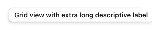
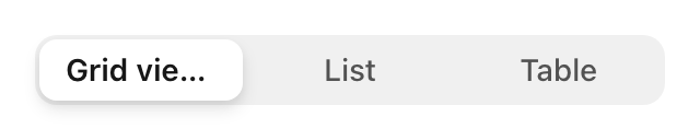
Layout matrix for this change — 11 cases, real Chromium, before / after / probe. Nothing ellipses anywhere on the current head:
text-overflow: ellipsisnever fires once.Containment
Assumption Relies on Holds Which box shrinks the <button>flex childno — only the inner <span>is constrainedMin-size defaults flex children default min-width: autostyles.fillhas nominWidth, so the button never shrinksWidth source fixed vs auto-sizing agree no — an auto-width parent hides the bug entirely Ancestors none above matter no — a flex: 1ancestor re-breaks it even with the fixCases
# Case Before After Probe 1 short labels, 600px identical identical — 2 long label, hug, wideidentical identical — 3 long label, hug, 320wraps, fits 394px, "Table" off-edge no help 4 long label, fill, 3204 clipped lines 392px, "Table" gone Grid view …, fits5 one long + two short wraps long one takes 273px, siblings pushed out 3×104px, ellipsed 6 fixed / auto / flex / grid parent — auto hides it; grid track blown 200→392 flex :1still 3947 ancestor overflow: hidden— segment silently disappears contained 8 RTL mirrors mirrors, off left edge ellipsis on logical end 9 200% text zoom clipped 663px in 320 contained 10 forced colors same as 4 same as 4 correct 11 icon-only / icon+label identical icon-only untouched icon holds, text ellipses Case 5, the one that answers "does the long item starve the others":
After Probe Probe — one line,
SegmentedControlItem.tsx:fill: { flex: 1, justifyContent: 'center', + minWidth: 0, },Not fixed by it:
hug(case 3, no shrink axis — now worse than main, which wrapped and fitted) and flex ancestors (case 6c, needsmin-width: 0on the consumer's wrapper).The added test substring-matches
getAllInjectedCss(), so it does not assert the rules apply to this element, and jsdom has no layout. It passes while nothing truncates in any browser.One-line check without any harness:
const s = document.querySelector('[role=radiogroup] button span:last-of-type');
s.scrollWidth > s.clientWidth   // false on head, true with minWidth:0
All 33 frames, metrics, the Storybook harness and the shoot script: full evidence. Only neutral theme, light,
size="md"; nosm/lg, no real-device HCM.Layout evidence generated for review — not a review.
[Reviewed by Robohands]

