Review 5516
#5516 — fix(core): ensure pressed overlays override hover
#5516 fix(core): ensure pressed overlays override hover by jiunshinn (bucket: collaborator)
Verdict: approve (critic-confirmed; drafted, no PR action)
a6d4430876df4211342da8695a7ecd858b216ce3 — exact base 41494fcd41310c819f0501df2e798235c4b41135.
LOOP VERSION: 1.4.1
AUDIT RUBRIC: 1.12
The task named loop 1.4.0; the authoritative current file had advanced to 1.4.1 before gate 1. The patch only makes one-agent execution explicit and does not change judgement or evidence standards.
LANE: full WHY: cross-cutting visible-state fix in published core; 27 files, 17 reported components, and a new shared internal style owner. The exact-head visual job skipped its 1,160 shots, so manual frames were required.
STEP-0 SAFETY passed before any PR code ran. The exact package/script diff added one local Chromium guard and generated-CSS assertions; it changed no dependency, lockfile, workflow, credential read, external call, or install hook.
On a hover-capable pointer, pressing is simultaneously :hover and :active. StyleX emitted the media-nested hover selector at higher specificity than the bare active selector, so users saw the lighter hover tint while holding affected controls instead of the stronger pressed feedback specified in Design Conventions. #5451 records the class.
VERDICT: clear
Hover-capable devices now emit hover and active in the same media branch, giving them equal selector weight so active wins by state order. A second active rule outside that branch preserves touch feedback. The enabled guard and all three paint forms live in one internal utility; components retain ownership of disabled, selected/current, and focus semantics.
SOLUTION (1 decision · 313 runtime changed lines of 742 total)
- Centralize the three affected self-background paint forms, migrate every direct consumer, and guard the generated selector contract in Vitest and Chromium.
VERDICT: clear
OWNER: the shared interaction-overlay StyleX utility owns hover/pressed selector ordering; each component owns its state semantics and base paint TIER 1: StyleX pseudo/media compilation plus the existing hover, pressed, and neutral tokens TIER 2: none SEAMS: direct background color; direct background image; neutral-composited image; shared navigation base; existing pseudo-element overlays as a non-regression control BEHAVIOR UNIT: pure style utility — deterministic generated CSS, independently exercised from React
| seam | decisive result |
|---|---|
| direct image | Button simultaneous hover+active changes from hover .05 at base to pressed .1 at head |
| direct color | Chromium guard passes hover, active, native-disabled, and touch fallback |
| neutral image | Chromium guard keeps the neutral layer and paints pressed above it |
| shared navigation base | every navItemStyles.item render consumer also applies the utility |
| sampled pseudo-element control | ClickableCard simultaneous hover+active stays pressed at .1; base/head rasters are byte-identical. This proves pressed-state non-regression only—hover alone is transparent in both arms |
The shared mechanism is the right owner for the affected self-background class. ClickableCard is a distinct pseudo-element path, and the pair proves only that its already-working pressed state did not regress. SelectableCard and Thumbnail share the untouched source pattern but were not browser-proved here.
VERDICT: clear
Users across 20 consumer files / 32 render sites now see the stronger pressed tint while holding Button, Calendar, selector, item, navigation, stepper, token, and tree surfaces. The exact Button pair preserves rest, hover, and geometry; the shared guard preserves touch and disabled; selected/current and focus were source-audited and suite-tested; the sampled ClickableCard pressed pseudo-element remains unchanged.
VERDICT: clear
No public API change. The new module is internal and unexported; it adds no prop, type, default, package subpath, DOM contract, theme target, or consumer call site.
OSSIFICATION: only an internal style owner is added. It consolidates a class used by 20 consumer files and can be repaired without a consumer migration.
VERDICT: clear
No target, CSS variable, token, or visual vocabulary changes. The utility consumes the same semantic overlay tokens and preserves neutral composition. The intended change matches the existing Pressed representation; rubyycheung approved the exact head for design on Aug 26.
VERDICT: clear
BEHAVIOR: yes, intentional bug fix — simultaneous hover+active resolves to pressed on affected self-painted surfaces; touch keeps a bare active rule API: no — no exported or call-site surface changes VISUAL: yes, intentional — sampled Button pixels darken from RGB 36 to 34 inside the control; geometry is unchanged THEME: no — existing targets and token overrides resolve through the same tokens
Disabled remains native/ARIA-guarded. Selected/current styles still follow the overlay utility at their call sites. Focus outlines remain independently composed and the overlay writes only background properties. No selected/current/ARIA contract line changed.
VERDICT: note — intentional pressed-state correction, with no API, theme, or geometry break
EFFECTS: zero RENDER: static StyleX handles replace duplicated declarations; no state, loop, subscription, or dynamic computation LISTENERS/OBSERVERS: zero LAYOUT: no DOM, geometry, or layout-property change BUNDLE: generated CSS is 157,090 → 157,935 raw bytes and 25,923 → 25,982 gzip bytes (+59), while emitted StyleX rules fall 6,771 → 6,743
The 59 gzip bytes are the selector capability itself; no user pays per-interaction runtime work.
VERDICT: note — +59 gzip bytes, no runtime resource path
VISUAL CHECK: manual frames required WHY: pressed pixels intentionally change and the exact-head visual job skipped because 1,160 shots exceeded its 240-shot budget.
| what it proves | before | after | receipts |
|---|---|---|---|
| Button pressed wins | 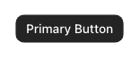 |
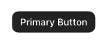 |
base · head |
| sampled pseudo-element pressed state does not regress |  |
 |
base · head |


All non-build receipt fields match: neutral/light/LTR, 640×300@1, hover-capable, one semantic target, fonts loaded, zero active animations, and no page/Storybook errors. The Button changes 3,573/10,452 pixels, all inside the control. ClickableCard is byte-identical; hover alone is transparent and simultaneous hover+active remains pressed in both arms, so the control proves pressed-state non-regression only. Metrics · reproduction.
VERDICT: clear
No DOM, role, ARIA, focus ownership, keyboard, string, locale, or direction line changes. The shared enabled guard covers native disabled and aria-disabled="true"; touch active was driven in Chromium. Exact-head pr-a11y and pr-rtl passed. The 25 focused suites passed 1,416 tests covering the affected components' disabled, selected/current, focus, keyboard, and ARIA paths.
The suites do not force pseudo-state paint at every render site. Approval rests on the shared three-form generated-CSS/Chromium guard, the full source audit, exact Button/control receipts, and the critic's focused TopNav/TreeList Chromium confirmation.
VERDICT: clear
| slot | verdict |
|---|---|
| PROBLEM | clear |
| SOLUTION | clear |
| ARCHITECTURE | clear |
| IMPACT | clear |
| API | clear |
| THEMING | clear |
| BREAKING | note — intentional pressed-state correction |
| PERFORMANCE | note — +59 gzip bytes, no runtime path |
| VISUAL | clear |
| A11Y & I18N | clear |
GOAL: met — exact-base Button simultaneous hover+active painted hover; exact-head painted pressed, with matching receipts. DISPOSITION: no negative findings. ADVICE: omitted — no defect or unsupported remedy. AUTHOR CAN PROCEED: yes — no author change is required; an entitled code-owner approval is the remaining repository gate. WORST OUTCOME: none found → approve.
JUDGEMENT NEEDED: none — the existing Pressed convention and exact-head design approval settle the visual decision; no API decision exists.
approve
Thanks for fixing this in the shared layer. Chromium confirms pressed now wins while disabled, touch, and pseudo-element states stay intact; source/tests cover selected and focus.
[Reviewed by Robohands]
None.
- Exact-head build, test, lint, Storybook, sandbox, theme layers,
pr-a11y, andpr-rtlpassed; the external Vercel deployment alone failed. - Current main changed seven touched files after the PR base, but merge-tree analysis found no conflict markers or mechanism invalidation.
- No competing open PR covers #5451.
TIME total 47m setup 4m safety read, exact-head worktree, install, Storybook; warm main reused: no reading 13m brief, critic, rubric, rulings, guidance, body, test plan, complete diff, state audit measuring 16m CSS/type/Chromium guards, 1,416 focused tests, exact base/head frames and raster comparison writing 14m two presentations, critic correction, public-safe record waste 2m one surface-luminance sensor mismatch and one shell mismatch, both corrected without weakening evidence
- The provider-side cause of the separate Vercel deployment failure; GitHub workflow previews and the local exact-head Storybook are green.
- Non-Chromium engines on the managed Mac; the required Chromium cascade was driven directly.
The critic kept the approve verdict and AUTHOR CAN PROCEED: yes. Before wiki publication, the ClickableCard claim was narrowed to pressed-state non-regression only, and the public review was corrected to separate Chromium evidence from source/test evidence. Nothing was posted to the PR; the REVIEW block above is the exact proposed text for a later authorized action.
One critic pass: confirmed approve. No code finding was added. The only required changes were evidence wording: do not call ClickableCard's transparent hover a proven hover treatment, and do not attribute selected/focus preservation to the Button Chromium pair.