Game widgets
The in-play widgets: health bars with a damage trail, a crosshair, hit markers and damage direction arcs, a low-health vignette, damage numbers anchored in the world, nameplates and waypoints pinned to points in the world, cooldowns, a hotbar, a weapon wheel, an inventory grid, a minimap frame, a compass bar, a dialogue box with answers and a log, an in-game chat box, a skill tree, an objective tracker, notifications, timed subtitles, item cards that compare a drop against what is equipped, and particles. These are the ones that made this toolkit worth building.
They live in composegl-game, a separate module on top of composegl-ui, so a
tool or a menu-only project carries none of them.
implementation("dev.wildware.composegl:composegl-game:0.6.0")import dev.wildware.composegl.game.Bar
import dev.wildware.composegl.game.Reticle
import dev.wildware.composegl.game.rememberReticleStateIt targets everything composegl-ui does: the JVM, Linux, iOS and the browser.
Coming from 0.5.0? These widgets used to be inside composegl-ui, in
dev.wildware.composegl.ui.game. Add the dependency above and change those
imports to dev.wildware.composegl.game. Nothing else about them changed.
No special access. The module is built only from the public API of
composegl-ui, the same one your own widgets use; the build checks it has no
other dependency. So anything a bar or a crosshair can do, a widget of yours can
too. The pieces it needed became public for that reason: UiCanvas.textRun, for
text that takes a ring only when there is one,
SkinDrawable.flatColour, for a widget that draws shapes rather than boxes, and
RectCache, for drawing the same rectangles every frame without allocating.
Their look is in the skin. The default and high-contrast skins
already have every style these use (bar.*, reticle.*, hitmarker.*,
damage.*, vignette, marker.*, cooldown.*, hotbar.*, wheel.*,
inventory.*, minimap.*, compass.*, dialogue.*, chat.*, skilltree.*,
objective.*, notification.*, subtitle.*, itemtip.*), so they look right
with no setup. Your own skin file styles them by the same names.
Typewriter, PromptGlyph and ProvidePrompts stay in composegl-ui: they
are not only for games, and the dialogue box here is built on the
first of them. See Widgets.
Bar(hull, Modifier.fillMaxWidth())
Bar(
    health,
    segments = 5,                   // pips, not a smooth bar
    thresholds = listOf(BarThreshold(below = 0.25f, style = "bar.critical")),
    trail = true,                   // the white "you just lost this much" tail
    holdMillis = 300,
    drainMillis = 450,
)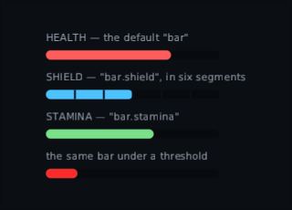
The trail is the thing: a hit drops the bar instantly and leaves a pale tail that catches up a moment later, which is how a player sees how much they just lost.
In a right-to-left language a horizontal bar turns round with everything else: it
fills from the right and drains towards the left. A bar that must not turn round
— a timeline, a media scrubber — goes inside a ProvideLayoutDirection of its
own.
A bar shows a known amount. For "working on it" with no amount to show, use
IndeterminateBar or Spinner from the core toolkit: see
Widgets.
val reticle = rememberReticleState()
Reticle(reticle, Modifier.align(Alignment.Centre))

// …from the game
reticle.spread = movement * 1.4f
reticle.hit(kill = true)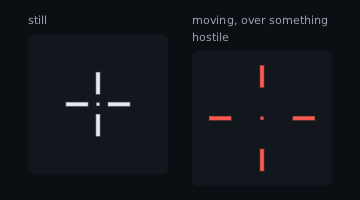
Spread, bloom, hit markers. It is driven from your game code, not from state the interface owns.
The ticks that flash over the middle of the screen when a shot lands. Reticle
has a small one built in; this is the standalone widget, with a shape as well as
a colour per kind — four ticks for an ordinary hit, eight for a critical, and the
four with a diamond inside for a kill — and a hook for your own sound.
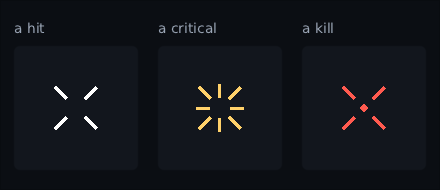
Each was taken a moment after a real hit, so all three are already on their way out — which is why the kill, the one worth looking at, is still the brightest.
val marker = rememberHitMarkerState()
HitMarker(marker, onHit = { kind -> audio.play(if (kind == HitKind.Kill) killSound else tick) })

// …when a shot lands
marker.hit(if (shot.killed) HitKind.Kill else if (shot.critical) HitKind.Critical else HitKind.Normal)
onHit is called on the frame the marker starts, which is where a game plays its
own sound: the toolkit has no idea how yours does that, so it hands over the
moment instead. Hitting again while a marker is still fading takes the marker over
rather than stacking a second one on it. Keeping the state above the HUD is fine:
a widget that comes back after the HUD was hidden does not flash, or sound, the
hit it left behind.
Arcs round the middle of the screen saying where the hits are coming from. Several stack, each fading on its own, so being shot at from two sides looks like being shot at from two sides.
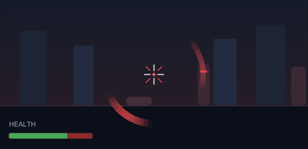
One shooter off to the right and another behind your left shoulder, who is not on the screen at all. That is the whole job: the arc is how you know to turn.
val incoming = rememberDamageDirections()
DamageDirectionLayer(incoming)

// …when the player is hit
val bearing = atan2(shooter.x - player.x, shooter.z - player.z) * 180f / PI.toFloat()
incoming.hit(fromAngle = bearing - camera.yawDegrees, strength = 0.7f)
fromAngle is degrees clockwise from straight ahead: 0 in front, 90 on the
player's right, 180 behind. strength goes from a thin faint arc to a thick bright
one. It is a pool like the damage numbers, so a firefight allocates nothing, and
the arcs go round the middle of the layer's own box — which is each player's own
half in split-screen. They do not swap sides in a right-to-left
interface: an arc is about the world, not about reading order. An arc is timed from
the hit rather than from the frame it is first drawn on, so a pool held above a HUD
the player can hide does not save the hidden minutes up and show them all at once.
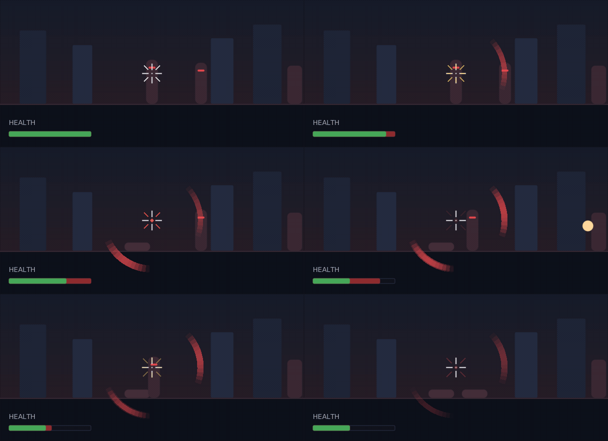
Both widgets are about timing, so here is the fight itself. Nothing in it is posed: shots land and hits arrive on the frames the game says, and how faded each arc is, how bright each marker is and where the health bar's trail has got to is whatever the widgets themselves had reached.
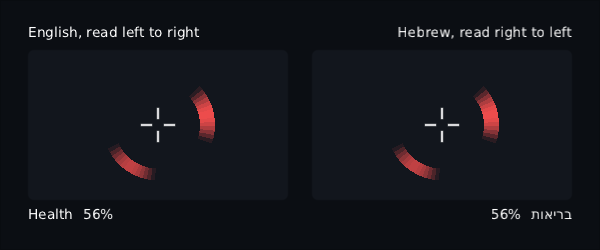
The high-contrast skin, in English and in Hebrew. The arcs are in the same places in both. The row of text under them is an ordinary row, and that one does mirror.
LowHealthVignette(health = player.health / player.maxHealth, threshold = 0.3f)Nothing at all above the threshold — no node, no drawing, no frames. Below it the ring closes in as health drops, and it beats like a heart that quickens the closer to dead the player is. It is one shader over the whole box through the same effect pipeline a blur goes through, so the falloff is a real gradient; a backend that cannot take a picture of a layer gets a flat wash of the same colour instead.
The beat is worked out from the clock as the frame is drawn, so it costs the
composition nothing while it is up: the ring recomposes when health moves and not
otherwise. The price is that the beat moves on the frames your game draws rather
than on the frames the toolkit reports as changed — a host that skips drawing an
unchanged frame shows a still ring. Every backend here draws every frame; one that
does not should pass pulse = false and say it some other way.
All three run on the world clock, so a pause menu freezes the arcs, the marker and the beat rather than letting them run out behind it.
val numbers = rememberDamageNumbers()
DamageNumberLayer(numbers, projection = projection)

// …when something is hit
numbers.show("148", WorldAnchor.at(enemy.x, enemy.y + 2f, enemy.z), critical = true)
They float, fade, and are placed in the world through the same WorldProjection
your camera already provides.
Nameplates, health bars over enemies, quest waypoints, interaction prompts, ping markers — interface that belongs to a point in the world rather than to a corner of the screen.
WorldMarkerLayer(projection = camera, maxVisible = 12) {
    enemies.forEach { enemy ->
        marker(
            key = enemy.id,
            position = { it.set(enemy.x, enemy.y + 2f, enemy.z) },
            fadeDistance = 30f..40f,
            anchor = Alignment.BottomCentre,
        ) {
            Column {
                Text(enemy.name)
                Bar(enemy.health, Modifier.width(60f), thickness = 4f)
            }
        }
    }

    marker(
        key = "objective",
        x = objective.x, y = objective.y, z = objective.z,
        offScreen = OffScreen.ClampToEdge(arrow = true, inset = 24f),
        priority = 1f,
    ) {
        WaypointIcon(player.distanceTo(objective))
    }
}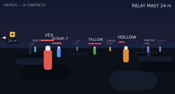
That is one WorldMarkerLayer over a scene drawn by the same camera:
the nameplates sit over the figures because the projection agrees with itself, not
because anything was nudged into place. The far ones are smaller and fainter
because they are further away, and the waypoint is at the edge because the thing it
belongs to is off to the left.
A marker is a real node, so what goes in one is any interface at all — a bar, a portrait, a button — and it is clicked, hovered and reached by a pad the same way anything else is.
Moving a marker does not recompose it. Your position is asked where it is
once a frame and the answer places the node, which is the cheap half of layout:
a hundred nameplates following a hundred running enemies recompose nothing.
Move your camera before the layer reads it. The layer asks your projection where everything is from inside a frame callback of its own. If your game writes its camera from a frame callback registered after that one, the markers on that frame were placed from where the camera was last frame — which looks like the markers sliding a frame behind the world during a fast pan. Write the camera in your own update, before the interface is composed, and it never comes up. A camera held in ordinary state and written from anywhere outside a frame callback is already right, which is nearly always the case.
Off the edge is OffScreen.Hide (the default), OffScreen.Show, or
OffScreen.ClampToEdge, which holds the whole marker just inside the layer and
draws a triangle beside it turned towards the thing. It is the marker's whole box
that is measured against the edge, so a wide nameplate starts sliding in while its
point is still on screen instead of jumping half its own width when the point
crosses over. The triangle is held inside too — an arrow off the edge tells nobody
anything — so asking for one costs about another arrowSize of room on top of
your inset. Something behind the
camera is held at the edge the player has to turn towards, with OffScreen.Show
as well: a projection mirrors a point behind the lens, so there is no "where it
landed" to leave it at. Say which points are behind by writing a negative depth:
val camera = WorldProjection { point, view, onto ->
    val p = scene.camera.project(point)
    onto.set(p.x, view.height - p.y, distanceTo(point))   // negative when behind
    true
}
That third number is the depth, in whatever units your game measures distance in.
It is what fadeDistance and scaleDistance compare against, and what decides
which markers draw on top: nearer over further, always. The minus sign only says
behind; how far away counts the same either way, so a waypoint fifty metres
behind the player fades like one fifty metres in front, and never covers — or
takes the place of — something they can actually see.
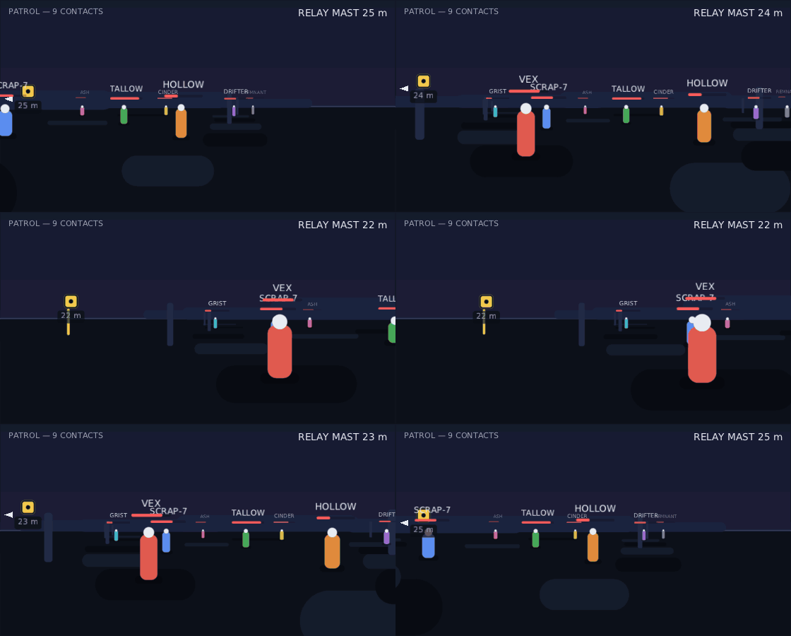
That is one camera really turning, a frame at a time. Nothing inside a marker is built again as it moves: the layer asks the camera where each point is and places the node there. The waypoint is held at the edge the whole time the mast is off screen — including while it is behind the player at the start — and lets go of the edge by itself when the mast comes into view.
When there are too many, maxVisible keeps the best of them and declutter = true drops any that would sit on top of one already kept. Best means the highest
priority, and among equal priorities the nearest — so the objective survives and
the sixteenth nameplate does not. A marker that is not shown is drawn at nothing,
which means it is not clickable and focus cannot land on it either.
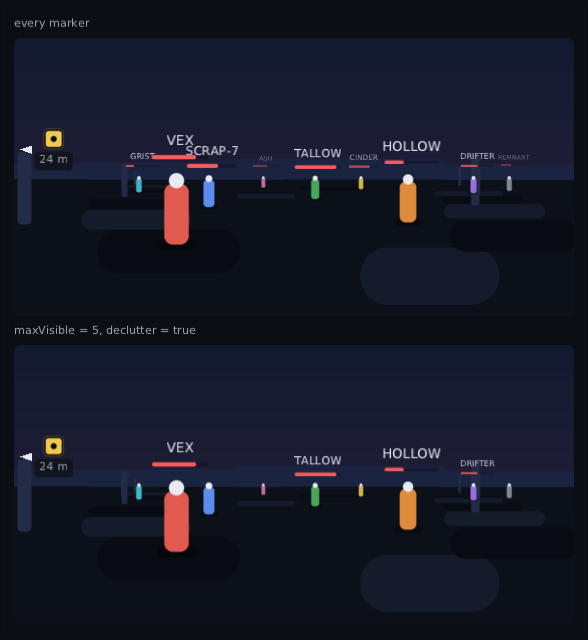
The same frame twice. Underneath, the layer was told maxVisible = 5 and
declutter = true: the objective survives because it asked for the highest
priority, and what goes is the crowd along the horizon and anything that landed on
top of a plate already kept — which is why the one tucked behind the nearest
figure is gone even though it is close.
The skin supplies marker.arrow, the colour of those off-screen triangles.
Everything else about a marker is whatever you put inside it.
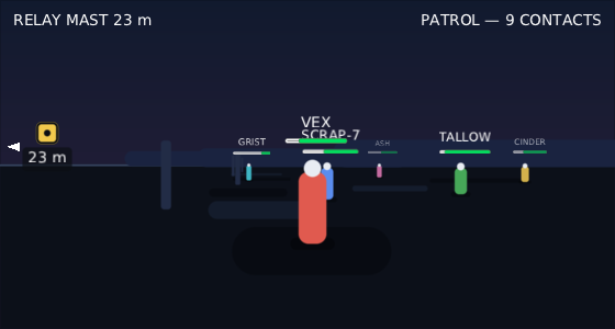
The high-contrast skin, reading from the right. The writing turns round and the
world does not: a marker lands where its point is whichever way the screen reads,
because a world is a picture rather than a line of text. Three of the patrol have
no plate here — their points went off the right-hand side, and OffScreen.Hide is
the default.
scaleDistance is the one thing to be careful with: scaling draws through an
offscreen picture, so it is crisp shrinking and soft growing — see
Modifiers.
val dash = rememberCooldown(durationMillis = 4_000)
RadialCooldown(dash)                   // the sweeping wedge over an ability icon

Hotbar(slots, selected = selected, onSelect = { selected = it }, onUse = { use(it) })

MinimapFrame(Modifier.size(160f), markers = contacts, range = 120f) { bounds ->
    drawWorld(bounds)               // `this` is the UiCanvas
}

val alerts = rememberNotifications()
Notifications(alerts)
alerts.show("SHIELD DOWN")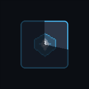 |
the wedge sweeps away as the ability comes back |
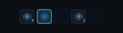 |
slots, charges, and which one is selected |
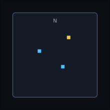 |
your own map in the middle, the chrome and the markers from the skin |
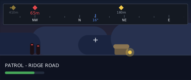
The heading strip along the top of the screen, as Skyrim, Far Cry and Fortnite have it: a window onto a circle, with the names of the compass points sliding past as the player turns.
CompassBar(
    heading = player.yaw,                    // degrees clockwise from north
    fieldOfView = 180f,                      // how much of the circle is on show
    Modifier.width(600f).height(48f),
    readout = { "${it.roundToInt()}°" },     // optional; null for no number
    distanceText = { "${it.roundToInt()}m" },
) {
    pin(bearing = bearingTo(quest), icon = "icons/quest", distance = rangeTo(quest))
    pin(bearing = bearingTo(enemy), icon = "icons/enemy", fadeWithDistance = true)
}
On a screen, over a game. Nothing here was placed by hand: the hut, the two raiders and the ridge behind them are put on screen from their own bearings, through the same arithmetic the strip uses, so each pin sits over the thing it is a pin for. The third pin is the pickup, behind the player, stuck to the left-hand end with an arrow on it.
Four things it gets right, which are the four a hand-rolled one gets wrong:
- It wraps at 360 with no seam. Every mark on it is drawn from its bearing, so facing 350 puts north ten degrees to the right rather than 350 degrees to the left. There is no wound-up position to unwind.
-
A pin outside the field of view sticks to the end it left by, with an
arrow saying which way to turn.
clamp = falseon a pin that should simply not be there instead. - The ends fade out, so a name sliding off is not chopped in half — and a pin never sits in the faint part, it stops just inside it.
- Only the strip redraws. It is one leaf node, so a heading that changes every frame lays nothing out again. Read the heading inside a composable of its own and the recomposition stops there too:
@Composable
private fun Heading(player: Player) = CompassBar(player.yaw, 180f, Modifier.width(600f))
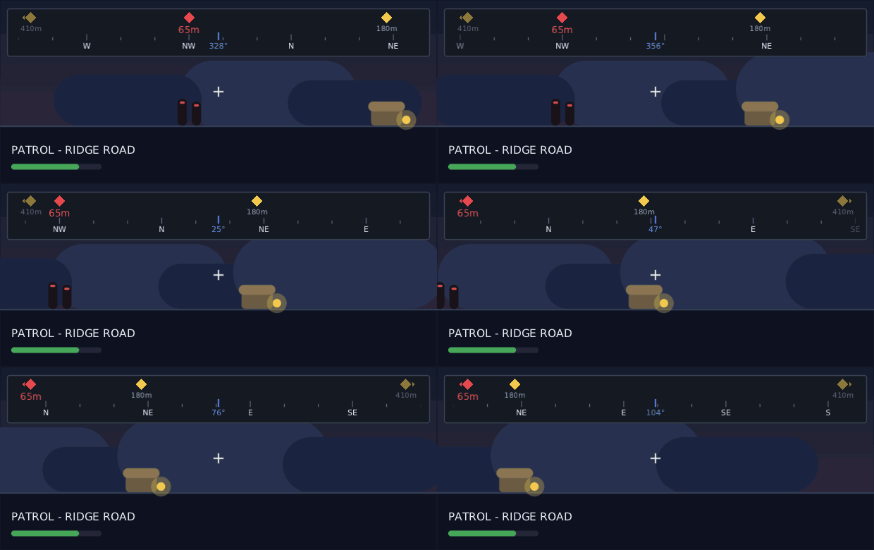
Here is the same player turning on the spot, a frame at a time. West goes by, north comes round with no seam, the raiders slide off the left-hand end and the pickup's pin swaps ends as it passes behind:
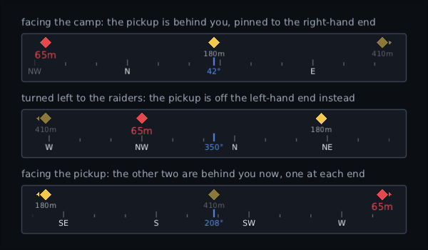
The same three things out there, from three headings — so you can see what a pin does when it runs out of strip. It stops at the end it left by with an arrow on it, rather than disappearing and leaving the player to guess which way to turn:
The pins are named in the trailing lambda, which runs while the strip is
drawn rather than while it is composed. So a pin is a little arithmetic and
nothing else: no list to build, no object per quest marker per frame, and the
bearings are the ones the game has this frame. Leave live = false on a paused
screen and the strip is not redrawn at all.
N is not north everywhere. The names come from your
string table by default, as compass.n, compass.ne and so
on, and a point nobody has translated keeps its English letter:
compass.n = И
compass.ne = СВ
CompassBar(heading, labels = rememberCompassLabels(points = 16))  // or 4, or 8
CompassBar(heading, labels = CompassLabels(listOf("N", "E", "S", "W")))
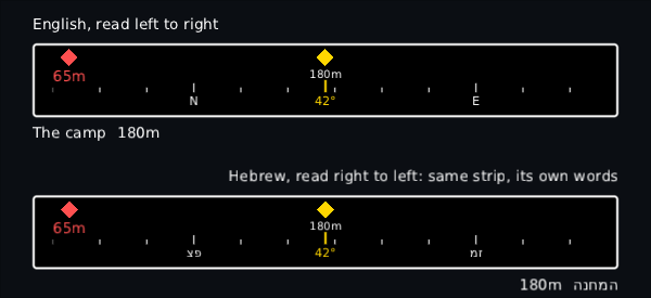
The strip itself does not mirror in a right-to-left language, unlike everything else on the screen. East is to the right of north for an Arabic player standing in the same field as an English one, and a strip that mirrored would slide the wrong way as they turned.
The same strip twice, through the high-contrast skin: once in English and once in Hebrew, at the same heading. The names change and the ordinary row under the strip swaps to the other side, but the strip does not — north is in the same place in both:
var wheelOpen by remember { mutableStateOf(false) }

RadialMenu(
    open = wheelOpen,
    items = weapons,
    selected = equipped,
    onSelect = { equipped = it },
    centre = { Text(it?.name ?: "", style = "wheel.label") },
) { weapon, highlighted ->
    Image(weapon.icon, Modifier.size(if (highlighted) 44f else 36f))
}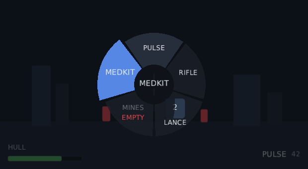
The point of a wheel, and the reason it is not a ring of buttons: nothing has to be reached. The stick's angle picks a slice however far past the dead zone it is pushed, and the mouse picks the slice its direction from the middle points at, however far away the pointer is. Slamming the stick south-west and letting go is the fastest menu input there is, and the only one that works while the player is also driving.
The picture above is a real push: the stick is a little over half way out and the medkit is chosen, because the medkit is the direction it is pointing in. Push it all the way and the same slice is chosen. A thumb only resting on the stick is inside the dead zone, and a wheel in that state has chosen nothing at all — which is what stops a resting thumb from equipping the wrong gun:
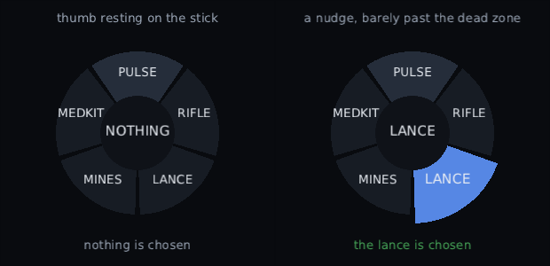
Both halves are two real pads in one window, pushed different amounts.
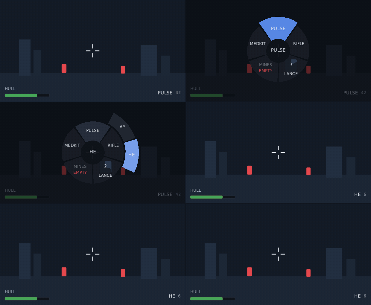
The whole thing, as it happens: the bumper goes down, the thumb swings from the pulse round to the rifle, pushes all the way out into the rifle's ring of rounds, and lets go — and letting go is what equips the shell in the corner.
open is yours, never the wheel's. It never closes itself — it says what
happened and your game decides. That is what makes hold-to-open work: the button
being down is the state.
// Hold Q, flick, let go. The wheel is up exactly while the key is down, and the key is
// heard wherever focus happens to be, because nobody clicks a wheel open first.
val held = remember {
    KeyHandler { event ->
        if (event.key != Key.Q) false
        else {
            wheelOpen = event.type == KeyEventType.Down
            true
        }
    }
}
Box(Modifier.fillMaxSize().onShortcutKey(held)) {
    RadialMenu(open = wheelOpen, items = weapons, onSelect = { equipped = it }) { weapon, _ ->
        Text(weapon.name)
    }
}
confirm = RadialConfirm.Release |
the weapon wheel: the slice being pointed at is taken when the wheel closes. The default |
confirm = RadialConfirm.Press |
the emote wheel: the wheel stays up, and South, Enter, Space or a click takes the slice. East or Escape backs out |
onCancel |
confirmed with the stick inside its dead zone or the pointer still on the hub, backed out of, or taken off the screen while still open |
onOpenChange |
told when it comes up and goes away. Where you slow or stop the world |
startAngleTurns |
where the first slice's middle sits, clockwise from straight up. Mirrored in a right-to-left language, so the first slice stays where the eye starts |
children |
a category's contents: pointing at it opens a second ring, and pushing the stick to the edge chooses out of that one |
deadZone, stick
|
how far the stick must travel to count, and which stick aims it. The mouse's dead zone is the hub |
Moving from one slice to the next ticks: UiSounds.focusMove() and a
Haptic.Tick, the same pair a pad's focus move makes, and the new slice swells
into place. Taking one is a UiSounds.change() and a Haptic.LightTap.
A slice is whatever you draw in it. The wheel knows nothing about ammunition
or cooldowns: the dim EMPTY slice and the one counting down in the first
picture are content drawing them, a RadialCooldown and all. The wheel will
still hand you an empty gun if the player picks it, so refuse it in onSelect.
Right to left. The same push of the stick, in two languages. The slices run the other way round in Hebrew, so the first item stays where that reader's eye starts and the same flick lands on a different one:
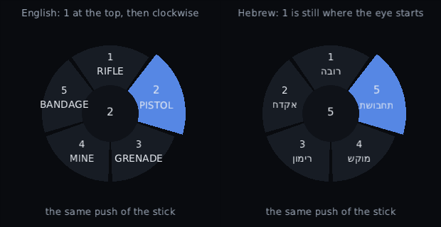
Slowing the world. The wheel runs on the interface clock, so it keeps animating while the game does not:
val clocks = LocalClocks.current
RadialMenu(open = wheelOpen, onOpenChange = { clocks.setRunning(Clock.World, !it) }, …)
See Animation for what a clock is and why there are two.
onOpenChange(false) also arrives when the wheel is taken off the screen while
it is still open — a screen swapped, the whole widget switched off — so a world
clock you stopped for it is always started again. Nothing can leave your game
paused with no wheel on screen to close.
Going away like that cancels: onCancel is called and nothing is equipped,
even on a release wheel. A screen changing underneath a player is not the player
letting go of the button, and a gun equipped that way is one they never chose and
cannot undo. Only open actually going false takes the slice.
The wheel is modal over the pointer, the stick and the pad's South and East while it is up, so a click or a pad press cannot reach a button behind it. On a release wheel South and East are swallowed and do nothing at all — the choice belongs to the button holding the wheel open.
Nested rings. A category with two or three children gets a wider ring than its own slice, because three children inside a quarter turn are thirty degrees each and no stick can hit that. So the ring spills over its neighbours, and while the stick is out at it the ring belongs to the category that opened it: aiming at a child drawn past the parent's edge takes that child, not the slice underneath it. Sweeping right round, out of the ring altogether, moves to the next category.
A ring never goes the whole way round, however many children a category has: it stops at seven eighths of a turn so that there is always an angle outside it to sweep back out through. Past eight children, put them on a second wheel rather than a ring.
The card a looter lives in: what this drop is, and how it compares with what is already equipped. Players do not read the numbers — they read the green and red arrows and decide in about a third of a second.
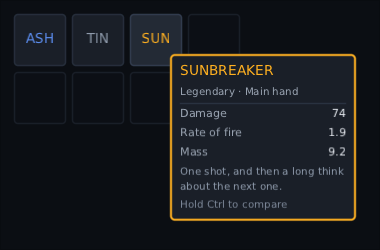
A real mouse on a real bag. The square under the pointer is still lit, which is the thing to notice: the card is a layer over the whole picture, and it only watches the pointer, so the bag is hovered exactly as it would be with no card there.
ItemTooltip(
    item = hovered,                      // what the pointer or focus is on; null draws nothing
    compareWith = equipped[slot],        // what the player has on now
    rarity = { it.rarity.colour },       // the card's edge and its title
    compareHint = "Hold Ctrl to compare",
) {
    title(it.name)
    subtitle("Rare · Main hand")
    separator()
    stat("Damage", it.damage)
    stat("Rate of fire", it.rateOfFire)
    stat("Mass", it.mass, higherIsBetter = false)
    flavour(it.description)
}
The block is run twice — once for the item and once for the thing it would
replace — and the two runs are paired up by the label each stat was given. So a
game writes stat("Damage", it.damage) once and gets the difference for free.
A stat the other item has not got simply has nothing beside it.
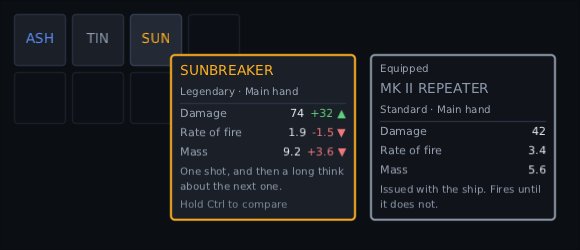
The same bag with Ctrl really held down, on the gun that is the actual decision:
it hits half as hard again and is worse at everything else. Mass reads +3.6 ▼ —
the number went up, and that is bad — which is what higherIsBetter = false is
for.
Red and green are the first thing a looter player learns and the one thing about eight per cent of the men playing cannot see. So every difference is written three ways at once:
- the sign says which way the number moved:
+6,-1 - the mark says whether that is an improvement:
▲,▼,= - the colour says the same thing again, out of the skin
higherIsBetter = false is what makes those two disagree on purpose. A lighter
gun reads -0.7 ▲: the number fell, and that is good. A card that only turned
the number green says nothing at all to a player with deuteranopia. Swap the
glyphs for a font atlas with no triangles in it:
ItemTooltip(item = hovered, marks = ItemMarks(better = "up", worse = "down", same = "--")) { … }ItemTooltip(
item = hovered,
compareWith = equipped,
compare = ItemCompare.Held, // the default: while the key or the pad button is down
compareKey = Key.Control,
compareButton = GamepadButton.LeftBumper,
) { … }Ctrl and not Shift, which is the one place these two widgets could have got in each other's way. Shift held as a pile is picked up is what splits a stack in half, here and in every game that has a bag, so a card over a bag that also wanted Shift would mean a player who held it to read the arrows walked off with three of their five rings. Ctrl is what Diablo compares with, and it is free.
ItemCompare.Held is Diablo's Ctrl and Destiny's trigger. Always is for an
inventory screen with nothing going on behind it, Toggled is a press on and a
press off for a player who would rather not hold anything, and Never leaves the
card plain. Pass sideBySide = false to keep the arrows and drop the second
card — which is what a screen narrower than two cards plus the gap is. That is
the game's call, not the widget's: two cards need 2 × width + gap of room and
nothing sheds the second one on its own, so a layout that goes narrow has to say
so. The key
and the pad button are heard wherever focus is, because a player holding one
is not first clicking on anything. They are only heard there, never taken: the
key is swallowed while a card with something to compare against is actually up,
and left to the rest of the game the other ninety-nine per cent of the time.
It is a layer, not a wrapper round the icon — the card has to be drawn over the bag it came out of and be allowed to move so that none of it is off the screen. Give it the room it may use and say what is being looked at:
Box(Modifier.fillMaxSize()) {
    Bag(onHover = { hovered = it })
    ItemTooltip(item = hovered, compareWith = equipped) { … }   // fills the screen by default
}
The layer covers the screen and is still not in front of the bag: it watches the
pointer rather than handling it (watchPointer), so every slot underneath is
hovered exactly as it was before the card was there. A layer that handled the
pointer would take the hover the game works item out from, and the mouse would
stop putting cards up at all.
It hangs beside the pointer, flipping to the other side and above rather than being cut off at an edge. On a pad nothing is ever hovered, so pass the focused slot instead and the card follows focus:
val interaction = remember { InteractionState() }
var slot by remember { mutableStateOf<Rect?>(null) }

// The state has to go to `focusable` as well: `interaction` on its own is told
// about the pointer, and focus is only reported to the state focus was given.
Slot(
    Modifier
        .interaction(interaction)
        .focusable(interaction)
        .onPlaced { node -> slot = node.boundsInRoot },
)
ItemTooltip(item = if (interaction.isFocused) item else null, anchor = slot) { … }
Out of an inventory grid it is two lines, because the grid already knows which square the ring is on and where that square is:
val focus = rememberInventoryFocus()

InventoryGrid(state = bag, focus = focus) { item -> Image(art(item.kind)) }
ItemTooltip(item = focus.item, anchor = focus.bounds, compareWith = equipped) { … }
focus.cell and focus.item are state, so the card follows the ring on its own.
focus.bounds is not — where a square is changes on every layout, and a
rectangle that recomposed the screen each time one moved would be a scroll that
never settles — so it is read at the moment the card is laid out, which is the
moment it is wanted.
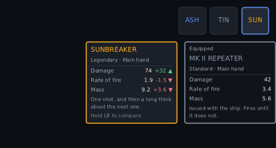
No pointer anywhere in that one. A pad walked focus along the three squares and held the left bumper, and the card hangs off the square that has focus. The squares are against the right-hand edge on purpose: two cards centred under that last one would hang off the picture, so they are slid back rather than one of them being cut off.
anchor is in the root's coordinates — boundsInRoot, the same rectangle
every other widget here takes — and the layer turns it into its own. So it is
still the right rectangle when the layer is inside something padded, offset or
scaled, rather than only when it happens to start at the top left of the screen.
Right to left, all of it mirrors: the card goes to the left of the pointer and the equipped card sits to the left of the new one, where an Arabic reader's eye is already looking.
Nothing is composed while item is null, which is nearly all of the time. The
layer's own node stays, so that a player already holding the compare key when
they hover the next sword sees the arrows on it straight away.
Skin: itemtip is the card, itemtip.rarity the edge when the game names no
colour of its own, itemtip.compare the equipped card beside it, and
itemtip.title, .subtitle, .label, .value, .better, .worse, .same,
.flavour and .hint are its lines.
Timed lines with a speaker over them, captions for the sounds between them, and the three settings a player is allowed to change.
val subs = rememberSubtitleQueue(clock = Clock.World)

Subtitles(
    subs,
    Modifier.align(Alignment.BottomCentre).padding(bottom = 64f),
    settings = settings.subtitles,                 // the player's own, saved with the rest
    speakerColours = mapOf("Mira" to Colour.rgb(0x5B8DEF)),
)

// as the scene plays:
subs.show("We are through the gate.", speaker = "Mira", durationMillis = 3_200)
subs.caption("[a door slams somewhere below]")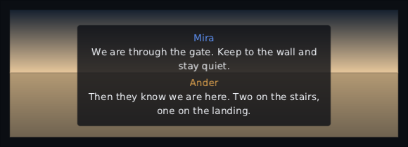
A queue, not a list. A cutscene hands over its whole script at once and only
capacity lines are up at a time — two by default, so a caption for a sound can
sit under the sentence somebody is speaking, which is the case captions exist
for. The rest wait their turn, waiting says how many, and dismiss skips one
and lets the next in straight away.
Five lines handed over in one go, playing out on the clock: each one leaves when its time is up, the one behind it takes the place, and when there is nothing left to say there is no band at all.
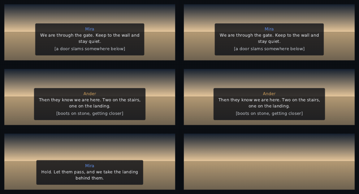
You do not have to time a line. durationMillis = 0 works it out from how
long the line is, at charactersPerSecond and never under minimumMillis —
which is what a game with no recorded timings gets for free.
var subtitles by remember { mutableStateOf(SubtitleSettings()) }

Stepper(SubtitleSize.entries, subtitles.size, { subtitles = subtitles.copy(size = it) })
Slider(subtitles.backgroundOpacity, { subtitles = subtitles.copy(backgroundOpacity = it) })
Toggle(subtitles.speakerNames, { subtitles = subtitles.copy(speakerNames = it) }, label = "Speaker names")
size |
Small, Medium, Large, Huge. Its own setting, not the interface's text scale: a player who set the interface to 150% and their subtitles to Medium asked for Medium subtitles. |
backgroundOpacity |
how solid the band is, 0 to 1. The words stay at full strength whatever it is — text faded to match its own background is text nobody can read. |
speakerNames |
whether who is speaking is written above the line. |
maxLines, widthFraction
|
where the words wrap and where they stop. The width is a fraction of the room the band was given, so the setting means the same on a handheld and on a television. |
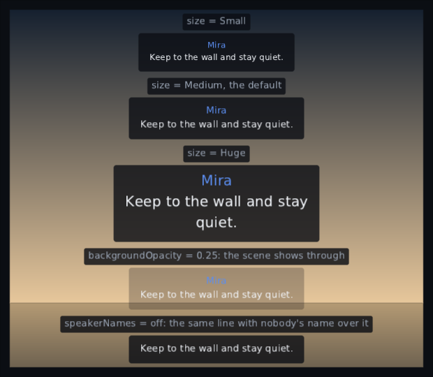
The same line with one setting changed each time. The sizes are drawn at fonts
baked at that size rather than stretched to it, and at 0.25 the band lets the
sunset through:
Register the font sizes the presets can reach, or the first player to pick Large gets a crash rather than bigger words:
fonts.registerTrueType("body", file, scaledTextSizes(listOf(16), SubtitleSize.scales))By default the queue counts down on its clock, so a queue on Clock.World
holds behind a pause menu and one on Clock.Ui runs out over it.
A voiced game wants neither: the words have to leave when the actor stops
speaking, however long the frame took. Pass clock = null and hand over the
sound system's playback position every frame:
val subs = rememberSubtitleQueue(clock = null)
Subtitles(subs)

// …and from the game's own loop, once a frame:
subs.playTo(audio.positionMillis)
The first call only takes the mark; after that each one moves the queue by exactly the distance the audio travelled. A position that goes backwards clears the queue, because the only way audio goes backwards is a seek, a restart or a skip — and the words on screen belong to a moment that is no longer happening.
-
The words wrap and stop. A long line breaks inside
widthFractionof the width and is cut off with an ellipsis atmaxLines. - Each line is centred, not just the block. Subtitles go through the toolkit's own line breaking, so a three-line subtitle is three centred lines rather than a centred block of ragged ones.
- Right-to-left works with nothing set. Arabic and Hebrew are laid out by the same bidi stack as any other text, and the band stays in the middle either way.
- It is not a control. It takes no focus, swallows no click and has no state a player can get stuck in — a subtitle over a fight must never be the thing that eats the button press. Its words are not selectable either, so a screen wrapped in a SelectionContainer still gets the shot fired through the band.
- An idle queue costs nothing: nothing composed, nothing drawn, and no frame asked for.
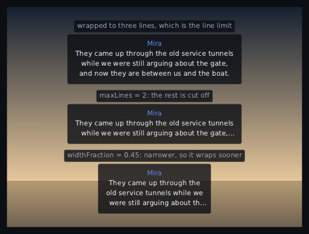
One long sentence, three settings: wrapped to the three-line limit, cut off with an ellipsis at two, and wrapped sooner in a narrower band.
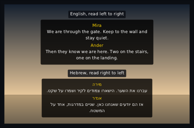
The same moment of the same scene in English and in Hebrew, through the high-contrast skin. Nothing is set on the widget for the second one: the words run right to left because the text stack lays them out that way, and the band stays in the middle, which is the same place in both.
Skin: subtitle is the band and the words on it, subtitle.speaker is the name
above a line, subtitle.caption is a sound written down. A line may name a style
of its own for a shout or a radio voice, and the name over it follows: give the
skin a radio.speaker beside radio and a radio line gets a radio-voice name
too. A line style with no .speaker of its own leaves the name as the band
draws it.
// A beat of your own script. The widget never sees this type: it is handed the line and the
// answers separately, because a line is a line whoever wrote the script around it.
class Beat(val line: DialogueLine, val answers: List<DialogueChoice> = emptyList())

val log = rememberDialogueLog()
val beat = script.getOrNull(at)            // null when the conversation is over

DialogueBox(
    line = beat?.line,
    choices = beat?.answers.orEmpty(),
    onChoose = { branch(it.tag) },
    onAdvance = { at++ },
    log = log,
    auto = settings.auto,
    onAutoChange = { settings.auto = it },
    onHistory = { logOpen = true },
    portrait = { Image(it.portrait as String, Modifier.size(96f)) },
)

if (logOpen) Panel { DialogueHistory(log) }
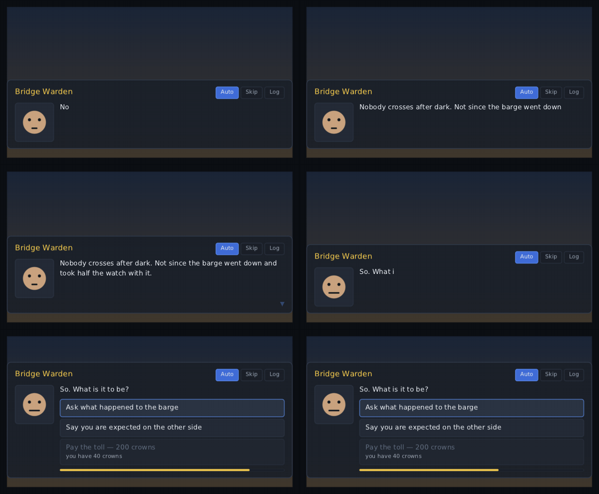
A speaker, a face, a line that types itself out with Typewriter, and the answers to it. The conversation stays yours: there is no script, no state machine and no "next" inside the widget, because every game already has its own and none of them agree.
A line is DialogueLine(text, speaker, portrait, runs, speakerStyle), and its
identity is the object, not the words — a second … in an awkward silence is a
second line, and it types itself out again rather than sitting there already
finished.
One press does two things, which is the rule every player already knows: while the line is still arriving it shows the rest of it at once, and once it has arrived it moves on. A click on the box, Space, Enter or the pad's South all do it.
Answers appear when the line has finished, never over the top of it:
DialogueChoice("pay the toll", tag = "pay")
DialogueChoice("pay the toll", enabled = false, reason = "you have 40 credits", tag = "pay")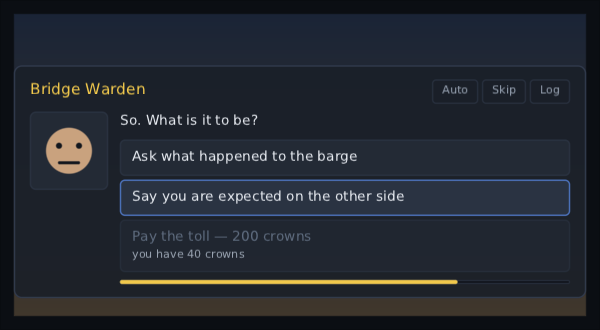
The highlight above is where a real push on a real pad put it: the box focused the first answer as it appeared, and one press of down walked it to the second.
Focus moves to the first answer that can be taken the moment the answers appear,
so a pad or a keyboard can answer without touching anything else — even if the
player was last on the box's own Auto button; 1 to 9 take one straight off
the number row; focus stays inside the box while a question is up, so it cannot
be tabbed away from. A disabled answer is shown rather than hidden, with its
reason under it — that is the whole point of having one, because a choice quietly
left off the list tells the player nothing.
A question with every answer disabled is a wall rather than a question. It is still drawn, reasons and all, but focus is not trapped on it and a press moves the conversation on as it would on a line with no answers at all — otherwise the player would be stuck in front of it with nothing to press.
timerMillis, onTimeout
|
a bar under the answers that drains while the player thinks. Silence is an answer and your game decides what it means |
auto, onAutoChange
|
waits autoMillis on a finished line and then moves on. The button appears when you pass the callback |
skipping, onSkippingChange
|
lines arrive whole and move on after skipMillis. Stops at a question — reading past a line the player has seen is one thing, answering for them is another. Holding Ctrl skips while it is held |
onHistory |
the Log button, and the pad's North. Your game opens DialogueHistory where it wants it |
log |
the box writes each line down as it starts and each answer as the player gives it, for that history |
indicator |
what says the line is done: a small blinking arrow by default, and the place to put a [[PromptGlyph |
effect |
a per-character TypewriterEffect — a letter that shakes as it lands, a word that fades up |
The portrait swaps when the expression does. The face fades out and the new
one fades in, so a change from calm to furious is something the player sees
happen; two lines from the same speaker with the same portrait do not blink
between them. The slot is yours — a picture, a panel, an animation — and it is
called with the line whose face is showing, which during a swap is still the old
one.
Names in colour come from the same styled runs an ordinary label takes:
DialogueLine(
    "whatever is out there is using VEGA codes",
    speaker = "VEGA",
    runs = listOf(TextRun(TextRange(30, 34), colour = gold)),
)
A run's colour is applied as the characters arrive. A run's underline is not:
a typewriter draws letter by letter and does not know where a line breaks, so
decorations appear in the log, where the line is an ordinary Text. See
styled runs.
The log is a lazy list, so a conversation a thousand lines long costs a
screenful. DialogueLog is the game's — the box goes away while the player reads
the log, and comes back with the same log behind it:
val log = rememberDialogueLog(limit = 200)
DialogueHistory(log, Modifier.fillMaxSize())     // opens at the newest line

log.say(line)                                    // only for lines the box never saw
log.answer("say nothing")                        // and answers it never heard
log.clear()                                      // a new conversation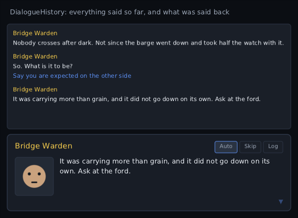
Nothing in that log was put there by hand. A keyboard played the conversation — Enter to finish the line and Enter again to move on, Down to walk to the second answer and Enter to take it — and the box wrote down what happened as it happened.
Pass log to the box and it writes both halves down by itself — the line as it
starts, the answer as it is given — so say and answer are only for a game
putting something into the log the box was not showing.
Its own words are localised. Auto, Skip and Log are looked up as
dialogue.auto, dialogue.skip and dialogue.log, falling back to the English
words rather than showing the key — the same bargain the compass
points make. Everything else on the box is
your text, already in the player's language before it arrives. In Arabic the
whole box is mirrored: the portrait is on the right, so is where the words and
the answers start, and the timer bar drains the other way.
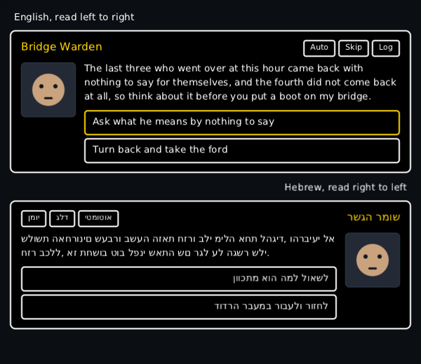
A paragraph wraps where the text stack breaks it, and the Hebrew box has nothing set on it that the English one does not: the layout direction is the only difference between the two.
The skin names every part: dialogue, dialogue.speaker, dialogue.text,
dialogue.choice and dialogue.choice.reason, dialogue.timer.track and
dialogue.timer.fill, dialogue.control and dialogue.control.on,
dialogue.advance, and dialogue.history.speaker, .line and .answer.
It costs nothing when it is not talking. A null line draws nothing, composes
nothing and asks for no frames. A finished line asks for one thing only: the
small arrow breathing to say it is waiting for the player. Pass an indicator of
your own — a static glyph, a prompt — and even that goes.
What the player is meant to be doing, pinned in a corner of the HUD. A step that gets finished is ticked, has a line struck through it and slides away; a quest that arrives slides in and can raise a toast.
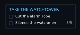
That is the real widget a second into a real fight — the counter says 3/5 because a third watchman really fell a moment before the picture was taken.
val notices = rememberNotifications()

ObjectiveTracker(
    quests = tracked,
    modifier = Modifier.align(Alignment.TopEnd).padding(20f),
    keyOf = { it.id },
    visible = !inCutscene,
    notify = notices,
) { quest ->
    title(quest.name)
    quest.steps.forEach { step(it.text, done = it.done, progress = it.progress) }
}
The block is the same shape as a world marker layer's above: it is declared, not composed, so it runs only when something it reads changes, and a step that has not moved keeps its node — and its half-played animation — from one frame to the next.
step(...) takes a progress for the counter beside the words:
step("Kill the wolves", progress = ObjectiveProgress(have = 3, need = 5)) // draws "3/5"ObjectiveProgress is two counts rather than a fraction, because two counts is
what the player reads. fraction is there for anything that wants a bar, and
counting past the end is finished rather than more than finished. The counter
gives a small jump the moment its number changes, which is the news.
Turning a step's done from false to true plays the whole thing: the tick is
drawn stroke by stroke, a line is struck through the words, it stays up long
enough to read, and then it slides away with the list closing up over it.
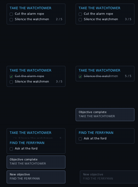
One little raid, photographed a frame at a time as it really ran. Nothing in it is posed: the numbers change on the interface clock, and the tick, the line, the slide, the two toasts and the quest that arrives are all the tracker's answer to them.
A step that is already done the first time it is declared is history, and
is not drawn at all — so loading a save does not replay its own quest log.
keepCompleted = true keeps finished steps on the list instead, struck through,
which is what a quest log rather than a HUD wants.
A step finished where nobody could see it plays when they can. A quest folded behind the "+2 more" row, or a whole tracker hidden for a cutscene, is not drawn at all, so its step waits: it comes up un-ticked and plays the tick, the line and the slide the moment the player opens the fold or the cutscene ends.
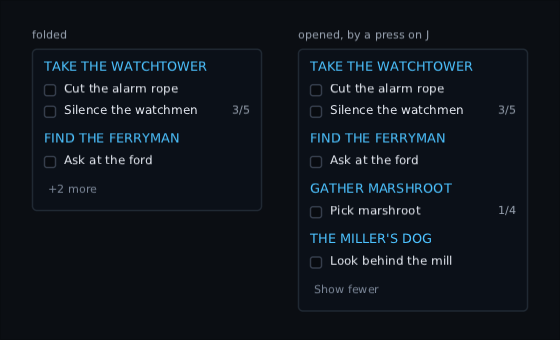
Two real trackers with the same four quests and maxVisible = 2. Only the right
one was given expandKey = Key.J, and a real press on a real keyboard is what
opened it.
step(style = ...) gives one line a look of its own, and it keeps it when it is
finished: a step styled "main" takes "main.done" where the skin has one, and
the tracker's own objective.step.done where it has not.
Taking something back is allowed, mid-animation and all. Set done back to
false, or hand a dropped quest back to quests, and the row comes back to full
height from wherever the way out had got to rather than sticking there. That is
what a game does when a step is failed again, or when a save is loaded over one
that had just been finished.
Given a notify queue, the tracker raises the ordinary Notifications toasts:
| a quest arrives | "New objective", with its name under it |
| its last step is done | "Objective complete" |
The quests that are there when the tracker first appears say nothing, so opening a save is not five toasts at once.
keyOf |
what a quest is, so a row keeps its node and its animations while the list changes. The quest itself by default. One key per quest: two quests answering it the same are one quest here, and only the first is drawn |
maxVisible |
how many quests are on the list at once; the rest fold behind a "+2 more" row |
visible |
false fades the whole thing away for a cutscene, and once gone it composes nothing, draws nothing and asks for no frames |
focusable |
lets the fold row take a turn in the focus order. Off by default: a HUD that focus stops on during a fight is worse than one you have to click |
expandKey, expandButton
|
fold the extra quests in and out from anywhere, without taking focus. Claimed only while there is a fold row to open; with nothing folded away the press is the game's |
width |
how wide the list is. Zero is as wide as its longest line; a width puts every counter in a column down the end |
slide |
how far a row travels as it arrives. It comes in from the side the language ends on — the right in English, the left in Arabic |
clock |
which clock the animations and the pause before a step leaves run on |
The skin names every part: objective for the panel, objective.title,
objective.step and objective.step.done, objective.bullet with
objective.tick drawn in it, objective.count and objective.more.
Its own words read objective.progress ({0} / {1}), objective.more,
objective.fewer, objective.added and objective.completed from your
strings, and keep their English where a key has not been
translated.
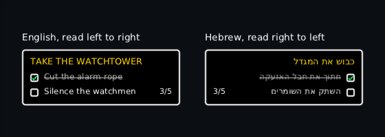
Nothing is set on the tracker to mirror it. The Hebrew one is the same call under
a right-to-left layout: the little box moves to the side the words start on, the
line is struck through from there, and the counter stands at the other end. Both
are the high-contrast skin, whose objective.* styles it picks up on its own.
Only keepCompleted = true is different here — on a HUD the cut rope would have
slid away long before the shutter.
Nothing on it is a control except the fold row. The list takes no turn in the
focus order and swallows no click, so a tracker over a fight can never be the
thing that ate the button press. Even expandKey and expandButton only take
the press while there is really something folded away.
A message history over the HUD and an input line when it is open.
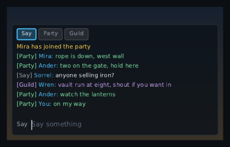
That is the real box with a real hand on the keyboard. The raid's lines arrive on
the clock one at a time; Enter opens the box, /p on my way is typed into it
and Enter sends it. The prefix put that one line in the party without moving the
player, which is why the label by the input still reads Say — and the line is in
the log at all because onSend put it there, the way your game will.
val All = ChatChannel("all", "All", prefix = "/a")
val Team = ChatChannel("team", "Team", prefix = "/t", style = "chat.team")

val chat = rememberChatState(maxMessages = 200)

ChatBox(
    state = chat,
    modifier = Modifier.align(Alignment.BottomStart).padding(16f),
    channels = listOf(All, Team),
    onSend = { channel, text -> net.send(channel, text) },
    openKey = Key.Enter,
    width = 420f,
)

// when the server says something arrived:
chat.receive(ChatMessage("on my way", from = "Mira", channel = Team))
chat.system("Mira has joined")Closed, it is the newest few lines drawn straight on the game. Each holds for
idleMillis, fades, and goes. With nothing up it draws nothing and asks for no
frames, so leaving it on screen for a whole match costs a game nothing.
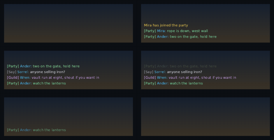
The closed box, a frame at a time, on the real clock: five lines arrive, only the
newest idleLines stay up, and then each one holds its own few seconds and fades
on its own timer. By the last frame there is nothing on screen and nothing being
composed.
Open, it is a panel: the channel tabs, the whole history scrolled to the newest line, and an input with the caret already in it. The history follows the newest line unless the player has scrolled back to read something — then it holds still and lets the new lines pile up below, and follows again once they scroll back to the end.
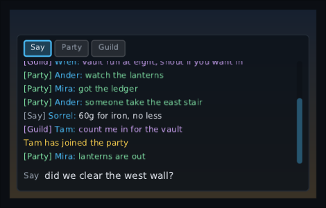
Two PageUps, and then the raid carried on talking for another two seconds. The window stayed where the player left it — the scrollbar is short of the bottom and three newer lines are waiting below it — and the half-typed question is still there, because scrolling is not typing.
openKey opens it from wherever focus happens to be. It is a shortcut rather
than an ordinary key, so a field of your own still gets its keys and a dialogue
that traps focus still keeps them.
| Key | What it does |
|---|---|
openKey (Enter) |
opens it, with the input focused |
| Enter | sends the line and closes it (closeOnSend = false to leave it open). Enter on an empty box just closes it; Enter on a line that is only a channel's prefix moves to that channel and leaves the box open |
| Up / Down | walk back through what you have sent |
| PageUp / PageDown | scroll the history |
| Escape, Back | close it |
| Tab | moves focus between the tabs and the input; from the tabs the arrows do too |
| anything else |
eaten while it is open, so typing wait does not also walk the player forward |
On a pad, openButton opens it and the bumpers walk the channels; East closes it
through your BackStack. A pad player types with the button keyboard from
ProvideGamepadKeyboard if you provide one, and on a phone the on-screen
keyboard and the input method come up with it — what is typed into is an ordinary
TextField, so none of that is the chat box's own code.
Pick one by clicking its tab, or by typing its prefix: /t on its own moves
to the team channel — the box stays open, with an empty input in the channel you
just picked — and /t on my way sends one line there without leaving the
channel you were in. The longest prefix wins, so /te and /t can both
exist. Each channel's messages are drawn in its own style, which is where a
channel's colour comes from, and a message with no from is a system line drawn
in chat.system.
Your line is not put in the log by the box. Write it down when your server says it went out — that is what stops a message appearing twice, and what makes one that was refused not appear at all.
show says which messages the box draws, for a game whose tabs pick a channel to
read rather than only a channel to talk in:
ChatBox(
    state = chat,
    channels = listOf(All, Team),
    onSend = ::send,
    show = { it.channel == null || it.channel == chat.channel },
)
It filters the whole box — the open log and the lines fading over the HUD — so a box narrowed to Team is narrowed to Team whether it is open or shut. Leave it null for one log with a colour per channel, which is what most games want.
Hand in nameMenu and every name in the open box becomes a
context menu: right-click, long press, Shift+F10 or the
pad all open it, and it is written in the same scope a menu bar's menus are. A
line fading over the HUD is not clickable and is not somewhere focus can go — it
is half gone, and aiming at it is not a thing a player can do.
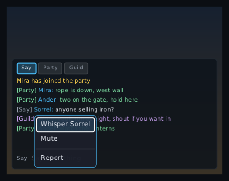
No mouse in that one. Enter opened the box, three Shift+Tabs walked focus back off the input on to Sorrel's name — you can see the ring on it — and Shift+F10, the keyboard's right-click, opened the game's own menu under it.
ChatBox(
    state = chat,
    // Whisper is on the list, because `chat.open(...)` only holds for a channel the box was given:
    // the box puts the channel back to one of these on the next frame.
    channels = listOf(All, Team, Whisper),
    onSend = ::send,
    nameMenu = { message ->
        Item("Whisper") { chat.open(Whisper) }
        Item("Mute") { mute(message.tag) }
        Separator()
        Item("Report") { report(message.tag) }
    },
)
ChatMessage.tag is whatever your game wants back — an account id, a handle, the
player object — because the name on screen is rarely what you send a whisper to.
In Arabic the whole box is mirrored: the tabs start on the right, and so does the
name in front of a line. A line that mixes Hebrew and English reads by its own
first letter rather than by the screen's, so the same line reads the same way on
either — every label in the box is an ordinary Text, and that is the Text's
doing rather than the chat box's.
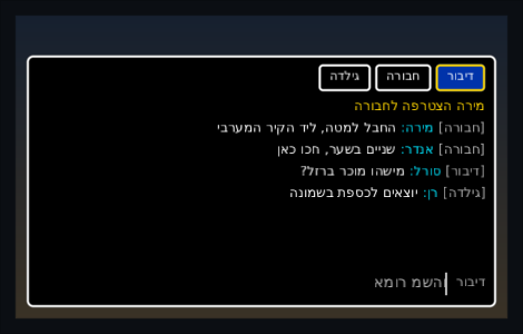
The same widget, the shipped high-contrast skin,
and a player reading Hebrew. Nothing is set on the box to get any of that: the tabs
start on the right because the layout does, the caret sits at the right-hand end of
the input, the hint in it is chat.say looked up in the player's own
strings, and the last line — Hebrew with one English word in it —
reads correctly both ways round.
The skin names every part: chat for the open panel, chat.message,
chat.system, chat.name, chat.channel, chat.tab and chat.tab.selected,
and chat.field with .placeholder, .caret, .selection and .composition
under it. The hint in the empty box is chat.say in your
strings, falling back to English.
The bag: squares, the things in them, stacks that merge and split, and items bigger than one square.
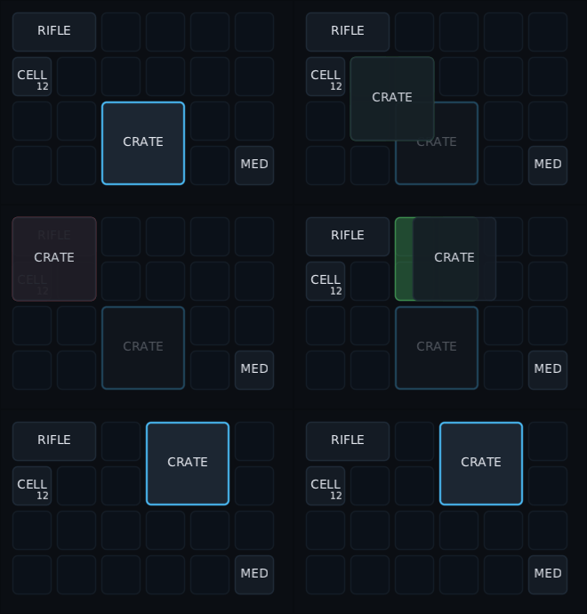
That is a real mouse on the real widget, a frame at a time: the crate is picked up by the square it was grabbed by, carried over two squares that are already taken so the answer goes red, carried on to four free ones so it goes green, and put down there.
val bag = remember { InventoryState(columns = 8, rows = 6, items = save.items) }

DragAndDropHost {                        // once, round the screen
    InventoryGrid(
        state = bag,
        onMove = { item, to -> bag.move(item, to) },
        canPlace = { item, at -> bag.canPlace(item, at) },
    ) { item -> Image(art(item.kind)) }
}
The trailing lambda is what you draw in a square — the picture, the name, whatever your game has. The frame, the count badge, the footprint under a drag and every way of picking something up are the grid's.
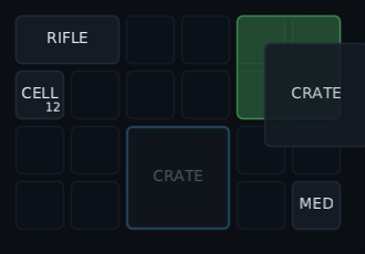 |
the crate is held by the square it was grabbed by, and the squares it would land on are lit before the player lets go |
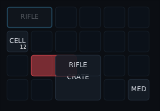 |
one square of the rifle would land on the crate, which is one too many, so the answer is no while it is still in the air |
InventoryState is the rulebook, and it has no screen in it, so the fiddly half
of an inventory is testable without composing anything.
InventoryItem(id = "bow1", kind = Bow, at = InventoryCell(2, 0), width = 1, height = 3)
InventoryItem(id = "arrows1", kind = Arrow, count = 12, stackLimit = 20)
id is this pile and kind is what it holds: two piles of arrows have two
ids and one kind, which is what says they would merge. kind is usually your own
item type, and it is what the picture is looked up from.
bag.move(item, to) |
a move inside one bag: onto free squares, merged into a pile of the same kind, or swapped with the one item in the way. A pile of the same kind that is already full has no room to merge into, so that is a swap as well |
bag.accept(item, to) |
a pile arriving from another bag. Hands back what would not fit |
bag.take(item, count) |
that many out of a pile, as a hand takes them |
bag.split(item, n), bag.splitHalf(item)
|
a pile of n in the first square it fits |
bag.addAnywhere(item) |
loot: fills the stacks it can, then takes a square. Hands back what will not go in |
bag.rotate(item) |
turns a long item where it stands |
bag.sort() |
merges the stacks and packs everything back in from the corner. False and nothing moves when it cannot |
bag.matching { … }, bag.countOf(kind)
|
the filter half, for a search box or "do I have ten arrows?" |
bag.fits, bag.canPlace, bag.firstFree
|
the questions, without changing anything |
- A mouse picks a pile up and drops it. A long item hangs from the square it was grabbed by, and the squares it would land on are drawn ahead of it — green when it fits, red when it does not.
- A pad or a keyboard moves focus square by square, empty ones included, because an empty square is where a player wants to put something. South or Enter picks up and puts down; East or Escape puts it back.
- Stacks show a count, merge on a drop onto the same kind, and split in half when the split key (Shift) or pad button (West) is held as the pile is picked up. What is in hand is settled at that moment, so letting go of Shift halfway across the bag does not change it. The grid also lets go of the key on its own when the pile's menu or the split prompt opens, because a menu keeps the keyboard to itself and the release would never arrive — so a right-click with Shift held never leaves the bag splitting everything afterwards.
- Long items turn with R, or the right bumper, while they are in the air — and the square they are held by turns with them, so the part under the hand does not jump.
-
A right-click, a long press or the pad's North opens the pile's menu. Yours
goes in
menu = { item -> … }, written in the same MenuScope a menu bar uses, and the grid adds what it can do itself under a line: split half, split a number with a stepper, turn. Those three go out through yourcanPlace,onTake,onAcceptandonMovejust as a drag does, so a rule of yours about where things may sit holds for the menu too — and a pile with nowhere allowed to go is simply not split. A grid that is notenabledoffers none of the three, because all three rearrange the bag; yours still show, since a read-only bag may still be worth examining. - Right to left, the first column is the right-hand one. Nothing else changes.
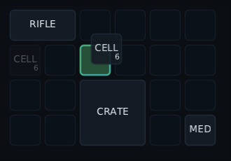 |
a pad held West, pressed South on the pile of twelve, let West go and walked right twice. Six are in the hand, six are left behind, and the ring is on the square the pad really walked to |
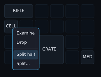 |
a real right-click on the same pile. Examine and Drop are the game's own; the two under the line are the grid's, and they are only offered because this pile is more than one thing |
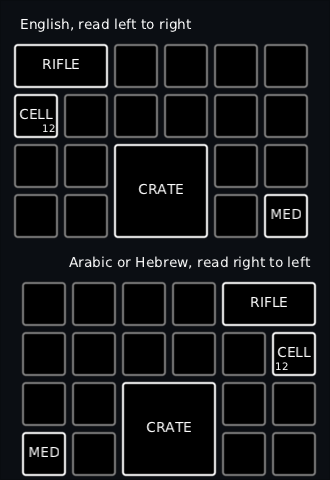
The same bag under the high-contrast skin, laid out each way. Nothing is set on the grid to mirror it: in the right-to-left one the first column is the right-hand one, so the rifle starts in the top-right corner and the counts move with their piles.
A bag and a chest are two InventoryStates and two grids under one
DragAndDropHost. Neither knows the other exists:
DragAndDropHost {
    Row(horizontalArrangement = Arrangement.spacedBy(32f)) {
        InventoryGrid(state = bag) { Image(art(it.kind)) }
        InventoryGrid(state = chest) { Image(art(it.kind)) }
    }
}
The grid a pile lands on asks its own canPlace and puts it in with its own
onAccept; the one it came from gives it up through its own onTake and takes
back anything that would not fit through onPutBack. A pad carries it across the
same way a mouse drags it.
cellSize, spacing
|
how big a square is and the gap between them |
matches |
the filter: a pile it says no to is faded, not hidden — a filter is for finding something |
lazy, scroll, overscan
|
a stash of a thousand squares builds only the rows in view and scrolls |
enabled |
a bag that can be read but not rearranged: nothing can be picked up or dropped, and the grid drops its own three menu entries, since all three rearrange it |
splitKey, splitButton, rotateKey, rotateButton
|
the bindings, any of them null for none |
rotating |
false for a bag where nothing turns: no R, no bumper, and no "Rotate" in the menu |
focus |
which square the ring is on, what is on it, and where it is. For a pad, where nothing is ever hovered |
style |
the skin names: inventory.cell, inventory.item, inventory.count, inventory.footprint, inventory.footprint.invalid, inventory.split
|
Item tooltips are the ordinary tooltip modifier on what you draw in a square — the grid does not own the inside of a square, so nothing special is needed.
An item card on a pad wants focus instead. A console hovers
nothing, so the card has to hang off the square the ring is on, and that is the
one thing a grid knows and a game cannot work out:
val focus = rememberInventoryFocus()

InventoryGrid(state = bag, focus = focus) { item -> Image(art(item.kind)) }
ItemTooltip(item = focus.item, anchor = focus.bounds, compareWith = equipped[slot]) { … }
focus.cell is the square, focus.item the pile on it — null for an empty
square, which a pad stops on too — and focus.bounds its rectangle in the root's
coordinates, which is exactly what anchor takes.
Its own menu entries read inventory.split.half, inventory.split.some,
inventory.rotate, inventory.split.title, inventory.split.confirm and
inventory.cancel from your strings, and keep their English
when a key has not been translated.
val skills = listOf(
    SkillNode("power", x = 0f, y = 0f, rank = 1, label = "R", tooltip = "Reactor"),
    SkillNode("guns", x = 130f, y = -80f, ranks = 3, label = "G", tooltip = "Autocannon"),
    SkillNode("shield", x = 130f, y = 80f, ranks = 2, label = "S", tooltip = "Shield"),
)
val links = listOf(SkillEdge("power", "guns"), SkillEdge("power", "shield"))

val camera = rememberPanZoomState(bounds = remember { skillTreeBounds(skills) })

SkillTree(
    nodes = skills,
    edges = links,
    state = camera,
    onActivate = { buy(it.id) },
)
A graph of unlockable nodes joined by lines: a skill tree, a tech tree, a talent grid, a constellation board. It is a pan-and-zoom canvas with the graph on it, so it drags, wheels, pinches and double-clicks like one, and every node is an ordinary widget laid out in world units — as sharp at three times its size as at its own.
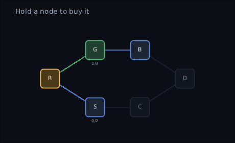
You say how many ranks a node has and how many are bought. It says what that means:
| State | When |
|---|---|
Available |
nothing bought, and everything leading into it is bought |
Owned |
some ranks bought, some left |
Maxed |
every rank bought |
Locked |
anything else |
A node with no line into it is a root and starts Available. unlock = SkillUnlock.All (the default) makes a node with two lines into it wait for both,
which is what a tech tree wants; SkillUnlock.Any opens it on either, which is
what a talent grid wants.
The one decision left to the game is SkillNode.enabled: "will I let you, right
now" — enough points, high enough level, the right class. A node switched off
never becomes Available, and ranks already bought stay bought.
SkillNode(id = "guns", x = 130f, y = -80f, ranks = 3, rank = spent["guns"] ?: 0, enabled = points > 0)onActivate is called only for a node that can really be taken, so the game can
spend the point without asking again. It takes a hold, not a click —
holdMillis, the toolkit's own long press — so a mis-click never spends a point,
and the node fills clockwise while it is held to say how long "held" is. The same
hold comes from the mouse, from Enter and from the pad's South button. Pass
holdMillis = 0 for a tree where a point is cheap and a click should buy.
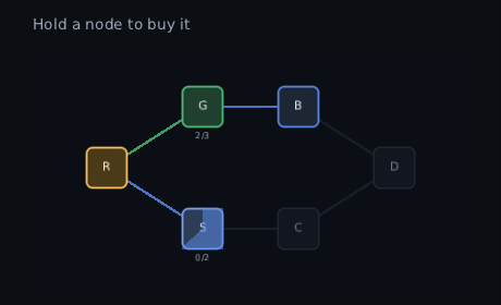
The whole thing, run rather than posed — one real hold on the shield, from the first frame to the last:
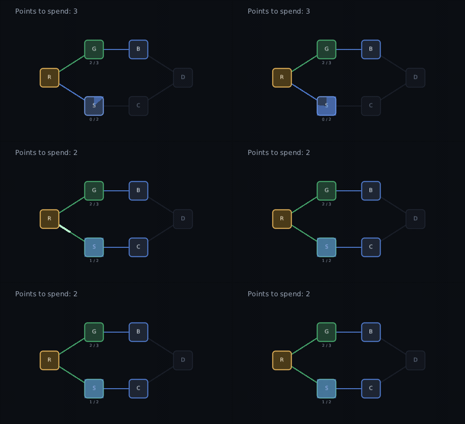
Nothing in that is staged: the picture is one press held down, onActivate
spending the point, and the tree working the rest out from the ranks it is handed
next frame.
A direction from a node goes along whichever line leaves it nearest that way. Only where no line goes that way does the toolkit's ordinary nearest-in-direction search take over, so a tree with a gap in it still walks. The camera eases to keep the focused node in view, and a game can fly it anywhere itself:
camera.animateTo(centre = Offset(skill.x, skill.y), zoom = 1.5f)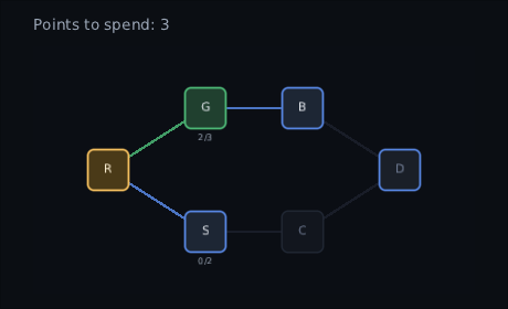
They are drawn by the canvas's background in world units, tinted by what they
join, and lines with no part in view are skipped — so a tree of a thousand links
costs the few dozen on screen. When a node is taken, the lines that opened it fill
from the old node to the new one over unlockMillis.
skilltree.node.locked, .available, .owned and .maxed are the four frames,
skilltree.hold the sweep of a hold, skilltree.rank the "2/3" under a node
with more than one, skilltree.plane the backdrop, and skilltree.edge.locked,
.available, .owned and .fill the lines.
Tooltips need a host. A SkillNode.tooltip is an ordinary
Tooltip, so the screen needs a TooltipHost round it — which
is also what makes it work from a pad, where nothing is ever hovered. Nodes with
no tooltip need no host.
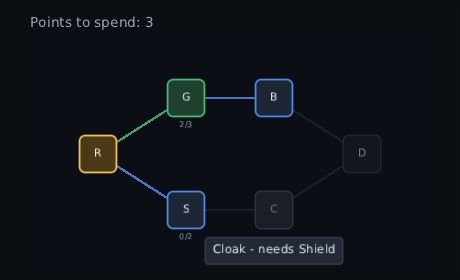
Drawing a node yourself. The default draws the node's icon or its label inside
the skin's frame. Pass content for your own art, and use SkillNodeIcon for the
nodes you do not want to change:
SkillTree(nodes = skills, edges = links, state = camera, onActivate = ::buy) { node, state ->
    if (node.id == "ultimate") Ultimate(node, state) else SkillNodeIcon(node, state)
}val sparks = rememberParticles(capacity = 240, seed = 11L)
ParticleLayer(sparks, Modifier.fillMaxSize())
sparks.burst(count = 24, x = hit.x, y = hit.y, style = HitSparks)Bursts and streams, simulated with no allocation per particle. Seeded, so the same seed gives the same burst — which is what makes it testable against a golden image.