Widgets
Everything that ships in composegl-ui: the ordinary interface controls. The tier
of things only games need — bars, a reticle, a hotbar — is in composegl-game, on
Game widgets.
None of it is Material. There is no theme to fight, and every widget takes its look from a skin file rather than from code.
Text("HULL INTEGRITY")
Text("148", colour = Colour.rgb(0xE5484D))
Text(story, softWrap = true, maxLines = 3, ellipsis = "…")
Text(name, Modifier.weight(1f), align = HorizontalAlignment.End)
Text(trackName, Modifier.width(160f).marquee())   // too long? it scrolls round
A name too long for a fixed slot can scroll instead of wrapping or ellipsising: see Marquee in Animation.
What was measured is what is drawn — the layout object the font produced at measure time is the object handed to the canvas, so text never wraps differently from the space reserved for it.
style picks a named style from the skin ("label" by default):
Text("GAME OVER", style = "display")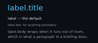
A text node is placed by its line box, whose top is the tallest glyph's
ascent. That is right for laying out — a box stopping at the capitals would clip
the accent off Á — but it is not what most coordinates mean. If you are
porting a layout from an immediate-mode or batch renderer, every y you carry
across is a cap top, and handed straight to Text every figure draws
ascent - capHeight low:
Text("148", Modifier.offset(y = capTop), anchor = TextAnchor.CapTop)
Text("HP", Modifier.offset(y = baseline), anchor = TextAnchor.Baseline)
Worth doing rather than subtracting yourself, because the mistake is silent — nothing clips and nothing overflows, the text is just low and looks deliberate — and it is proportional to the font size, so a screen with three text sizes is wrong by three different amounts and reads as three separate layout problems.
The anchor moves the node, not the glyphs inside it: same size, same wrapping,
and the background, border and clicks move with it. Your own offset still adds
on top. If you only want the number, FontMetrics.capInset is the line box top
to cap top, and ascent is the baseline.
TextAnchor.Baseline is also how you line a label up with an icon, or two
strings at different sizes against each other.
To see where those lines are, turn on TextMetricsOverlay: line box, ascent, cap
height, baseline and descent, in five colours, through every label, text field,
typewriter, tooltip and prompt glyph. See
Debugging.
A Text draws one string in one style. When part of a sentence has to look
different — a term the reader can tap for an explanation, a word struck through
because it no longer applies, a number in another colour — say which characters:
val term = TextRange(4, 12)
Text(
    "The tincture wears off at dawn.",
    runs = listOf(
        TextRun(term, colour = Colour.Orange, decoration = TextDecoration.Underline, tag = "tincture"),
    ),
    onRunHover = { highlight(it?.tag) },
    onRunClick = { explain(it.tag as String) },
)
A TextRun is a range, a colour, a decoration (Underline or Strike) and a
tag of your own that comes back when the pointer is over it. Runs may overlap;
the later one wins for whichever of colour and decoration it names. A run cannot
change the family or the size, on purpose: a run that changes the size changes
the line height, and a paragraph whose lines are different heights is a much
bigger problem than an underlined term.
That is the whole of what you write. The toolkit keeps ownership of measuring and line breaking, so the sentence stays one node — no splitting it into one node per word, no hit region per word, no line-breaking rules of your own to keep in step with everybody else's.
Two things change underneath, and both are worth knowing:
-
Lines are aligned as well as the block. Ordinary
Texthands the string to the backend and never sees where it wrapped, soaligncan only centre the block and leave the lines ragged inside it. A run-styledTextbreaks the lines itself, so it centres them too. - It costs more. Text is measured per line and per run boundary rather than once. Everything is cached on the text, the style and the width, so a paragraph standing still measures nothing — but a plain label should stay plain.
The Viewport scales the whole interface. A player who cannot read the words
does not want bigger panels, bigger icons and bigger gaps too — that spends the
screen on what was already big enough. So text has its own setting:
ProvideTextScale(settings.textScale) { Game() }Everything inside draws its text that many times the size its style says, and everything sized by its contents grows to fit: a button round its label, a tooltip, a row, a field's height. Anything you gave a fixed size keeps it, and text in it wraps sooner. Icons, bars and padding do not move.
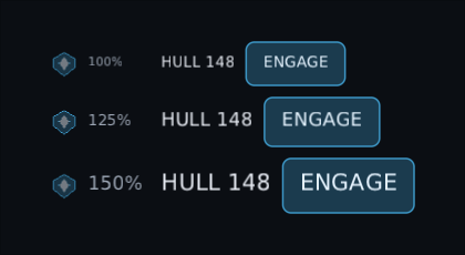
-
Every text widget follows it:
Text,Typewriter,TextField,Tooltip,PromptGlyph, and from Game widgetsDamageNumberLayerandMinimapFrame's compass, and so everything built from them, likeButtonandStepper. AtextStyleyou pass by hand is scaled too. -
The one exception is
Subtitles, which uses its own size preset instead. Subtitle size is its own row in its own menu, so a player who set the interface to 150% and subtitles to Medium gets Medium subtitles. See Subtitles and captions. -
Nested, they multiply. A dense panel that asks for
0.85finside a player's1.5fdraws at 1.275, so it still honours the setting. - Changing it re-measures. It is meant to move when a slider in a settings menu does, not every frame.
- Sizes are rounded to whole numbers, so 16 at 110% is 18, not 17.6. That is what keeps it sharp: the text is measured and baked at the bigger size rather than measured small and stretched.
The one thing to do in return is register the sizes. A backend bakes fonts at startup and refuses a size it has never seen, so give it every size at every scale your setting offers:
val sizes = scaledTextSizes(listOf(13, 16, 20), listOf(1f, 1.25f, 1.5f))
fonts.registerTrueType("body", Gdx.files.internal("fonts/body.ttf"), sizes)
Forget one and the error names the size it wanted and the sizes it has.
A display font rarely has Chinese, Japanese, Korean or emoji, and player names and chat have all of them. Name the fonts to borrow from, in order:
fonts.registerTrueType("body", Gdx.files.internal("fonts/body.ttf"), sizes)
fonts.registerTrueType("cjk", Gdx.files.internal("fonts/NotoSansCJK.ttf"), sizes, onDemand = true)
fonts.registerPictures("emoji", mapOf("😀" to smiley, "👍" to thumbsUp), sizes)

fonts.fallBackTo(listOf("cjk", "emoji"))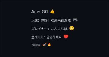
-
One character at a time.
"Ace 玩家 😀"takes its letters frombody, its Chinese fromcjkand the smiley fromemoji. Your font always wins for a character it has; only a character nothing has comes out as a box. - It sits on your font's line. Borrowed glyphs are moved onto your font's baseline, and the line height is still yours, so a label does not jump when a name with 한글 in it arrives.
-
onDemand = truemakes a character the first time text uses it, instead of baking the whole font at startup — a CJK font has tens of thousands. The atlas takes another page when one fills. - Emoji are pictures. Register one per character, from any emoji set. They are drawn in their own colours whatever colour the text is, and an outline rings the letters but not the pictures.
- Every size, again. A fallback must be registered at every size it is asked for, text scale included, or the error names the size it wanted.
-
fallBackTo("display", listOf(...))gives one family its own list.
On the raw OpenGL backend, StbFonts has the same fallBackTo and
registerPictures (from PNG bytes), but bakes everything up front: register a
fallback with codepoints = StbFonts.codepointsOf(textYouExpect) rather than
the whole font.
Not yet: emoji made of several characters joined together (families, flags, skin tones), right-to-left scripts, and scripts that need shaping, like Arabic or Devanagari.
If you are doing your own inline layout — an icon in the middle of a sentence, say — ask for the lines rather than approximating them:
val block = fonts.paragraph(story, style, maxWidth = 300f)

block.lines          // where each one breaks, and its baseline
block.words          // the stretches a line may break between
block.boxesOf(term)  // one box per line the term touches
block.indexAt(point) // which character is under the pointer
Greedy, like every interface text layout: a line takes as many words as fit. It
breaks after spaces, after hyphens, and between ideographic characters — so
Chinese and Japanese wrap without spaces, and a full stop or a closing bracket is
never pushed onto a line of its own. A word longer than the whole width overflows
rather than being chopped, and TextLine.width says that it did.
A ring round the letters, so a readout stays legible over a moving, colourful background:
Text("148", outline = TextOutline(Colour.Black, width = 2f))

// Or once, for a whole HUD.
ProvideTextOutline(Colour.Black, width = 2f) {
    Text("HULL")
    Text("$ammo")
}
ProvideTextOutline reaches Text, Typewriter, Tooltip,
and from Game widgets DamageNumberLayer, CompassBar's names, Subtitles and
MinimapFrame's compass letters. Not TextField or
PromptGlyph, which have backgrounds of their own; give those an explicit
outline if you ever want one.
Three things worth knowing before you use it:
- It is stamped, not stroked. The canvas draws the run eight times offset and once on top, out of the same bitmap glyphs. Honest up to about a sixth of the text size — two units on sixteen-unit text. Past that the eight copies start showing as eight copies.
- Use an opaque outline colour. The copies overlap, so a see-through ring reads darker where they stack. A fading label does fade whole — the ring is drawn at the face's alpha, so it goes out with the letters rather than leaving a silhouette — but not evenly: those stacked copies keep the ring reading a shade stronger than the letters all the way down.
-
It does not change layout. The ring is painted outside the text's box and
the box does not grow for it, so switching it on moves nothing and rewraps
nothing. The price is that a tight clip trims it and a background sized to the
text does not cover it — add
Modifier.paddingof the outline width where that matters.
It costs nine times the glyph quads and no extra nodes, draw calls or
measuring. For one hero label where the alpha has to be exactly right,
Modifier.outline from composegl-effects composites once instead of stacking;
it costs an offscreen picture and a draw call per node, which is why it is the
wrong tool for two hundred damage numbers.
A label is scenery: the pointer passes straight through it. For the things a player wants to copy out of a game — a seed, a server address, a lobby code, an error message for a bug report — wrap them:
SelectionContainer { Text("Seed: 8F3A-22C1") }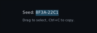
Inside, every Text takes the same gestures a TextField does, from the same
code: press and drag to select, double-click a word, triple-click a line,
shift-click to extend. Ctrl+C copies (Command+C on a Mac), Ctrl+A selects
the whole label, and shift with the arrows, Home and End moves the far end.
-
One selection per container. Pressing a second label moves it there, as on
a web page. Pass a
SelectionStateto readselectedTextorclear()it. -
Pad navigation is unchanged. A click brings the keyboard to the label, so
Ctrl+C talks to it rather than to the last button, but a label is never a Tab
stop or somewhere the d-pad lands.
Modifier.focusableByPointer()is that rule on its own, for widgets of your own. -
Controls stay controls. The labels on
Button,Checkbox,Toggle,RadioButton,Stepper, and from Game widgets aHotbarslot and a click-to-dismiss notification are not selectable, so pressing them still presses. Anything else you press — aclickablesave slot or list row — needs its text wrapped inDisableSelection { }, or the label takes the press first. - Focus leaving clears it, and so does the label's text changing.
- The highlight is the skin's
selectionstyle (its background), falling back tofield.selection.
One thing changes underneath: a label inside breaks its own lines, as a
run-styled Text does, because a selection has to know where each character is.
Very occasionally that moves a line break by one word.
Button("CONTINUE", onClick = { load(save) })
Button("QUIT", onClick = { exit() }, enabled = false)

// …or with whatever content you like
Button(onClick = { equip(sword) }) {
    Row(horizontalArrangement = Arrangement.spacedBy(6f)) {
        Image(icon)
        Text("EQUIP")
    }
}

IconButton(closeIcon, onClick = { dismiss() })
Every state comes from the skin — no Kotlin here names a colour:
 |
resting |
 |
under the pointer |
 |
held down |
 |
focused, which is where a pad and the arrow keys are |
 |
disabled |
A disabled button still swallows the click, so it cannot fall through to whatever is behind it.
A click also asks for a light tap on a phone or a pad, if the game provided one — see haptics.
Same widget, a different style name, and it is a chip:

Panel(Modifier.width(280f)) { … }          // a box with the skin's panel look
Panel(style = "panel.raised") { … }

Dialog(onDismiss = { open = false }) {      // a panel over a dimmed screen
    Text("Abandon the run?")
    Row { Button("YES", onClick = ::abandon); Button("NO", onClick = { open = false }) }
}

Tabs(selected, onSelect = { selected = it }, titles = listOf("GEAR", "SKILLS")) { page ->
    when (page) { 0 -> Gear(); else -> Skills() }
}
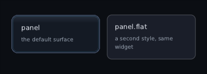
Panel is one widget and two style names here — the art-backed one and a flat one:
Dialog puts itself on the back stack, so Escape and the pad's B button close it
without you wiring anything up. OnBack { } is how anything else joins that stack.
Column {
    Text("AUDIO")
    Divider()                                   // across, 1 thick, skin style "divider"
    Text("VIDEO")
}

Row(Modifier.height(22f)) {
    Text("1920x1080")
    Divider(vertical = true, thickness = 2f)   // down, as tall as the row
    Text("144 Hz")
}

Divider(Modifier.width(80f))                    // a short rule instead of a full one
Divider(style = "divider.strong")               // falls back to "divider"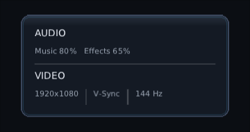
A divider is as long as the room it is given, and thickness across. The colour is
the skin's divider style, so one line in the skin file recolours every divider.
A vertical divider takes all the height its row may have. Give the row a height, or
it grows to fill whatever holds it. Row(Modifier.height(IntrinsicSize.Min)) makes
the row, and so the line, as tall as the tallest thing in it. Inside a ScrollArea there is no limit, so give
the divider a height there. The pad and the mouse pass straight over a divider.
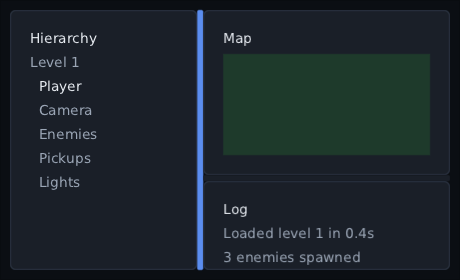
Two panes sharing one space, with a divider the player drags to give one of them more — a hierarchy on the left and its properties on the right, a map over a log:
var split by remember { mutableStateOf(0.3f) }

Splitter(
    fraction = split,
    onFractionChange = { split = it },
    modifier = Modifier.fillMaxSize(),
    orientation = Orientation.Horizontal,   // side by side; Vertical stacks them
    minFirst = 120f,
    minSecond = 200f,
    first = { Hierarchy() },
    second = { Properties() },
)
The splitter fills the room it is given. The divider is thickness of it (6 by
default), and fraction is how much of the rest the first pane gets. Each pane is
clipped to its share, so a squeezed pane cuts its contents off rather than drawing
over its neighbour. Like a slider, it reports and the screen holds the answer.
- Mouse or finger. Over the divider the cursor becomes a resize arrow. A press takes the pointer, so the drag carries on outside the splitter and even outside the window.
-
Keys or pad. The divider is focusable. Focused, the arrows or the d-pad across
it move it by
step(a twentieth of the space by default), the way they point. At a pane's minimum it lets the next press move focus on instead. -
Double click puts it back at
defaultFraction, which is wherefractionstarted unless you pass one. Enter or South twice quickly on the focused divider does the same.
minFirst and minSecond hold whatever fraction says. When there is not room for
both, the space is shared in proportion to them. On a right-to-left screen a
side-by-side splitter mirrors: the first pane is on the right.
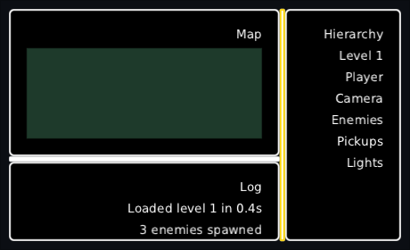
The divider's look is the skin's "splitter" style, in its hovered, pressed, focused
and disabled states. Pass style = "splitter.thin" to use another.
A title bar that folds away the section under it — a long settings page, a debug
window full of tweakables, a codex chapter. imgui calls it CollapsingHeader too:
Column(Modifier.width(320f)) {
    CollapsingHeader("Physics", initiallyExpanded = true) {
        Slider(gravity, onValueChange = { gravity = it }, range = 0f..20f)
        Toggle(ragdolls, onCheckedChange = { ragdolls = it }, label = "Ragdolls")
    }
    CollapsingHeader("Audio") {
        Slider(volume, onValueChange = { volume = it })
    }
}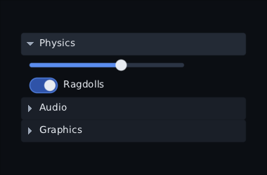
The contents are a column: each thing you put in goes under the one before, so
the slider and the toggle above need no Column of their own.
Changed since 0.6.0. In 0.6.0 the contents were a
Box, so several things passed straight into a header were all drawn on top of each other at its top-left corner. They now stack one under another. A section that already wraps its rows in aColumnlooks the same as before. A section that relied on the pile-up to layer things, such as a label over a picture, should wrap those in its ownBox.
A click, Enter, Space or the pad's South opens or closes it. The contents grow in
and shrink away with animateContentSize, so the sections under it slide instead of
jumping. Closed, the contents are not composed at all: the pad, Tab and the mouse
go straight past them to the next header.
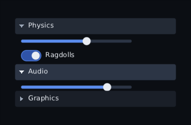
Whether a section is open is kept with rememberSaveable, so it is still open when
the player comes back to the screen (see Saving state). When the game wants to
hold the answer — an "expand all" button, or a choice kept in a save file — pass it
in:
CollapsingHeader("Graphics", expanded = graphicsOpen, onExpandedChange = { graphicsOpen = it }) {
    GraphicsSettings()
}
Closed like that while focus is inside, focus goes back to the header rather than
being lost. spec and clock pick how it moves, as for animateContentSize.
On a right-to-left screen the triangle is at the right, and a closed one points left.
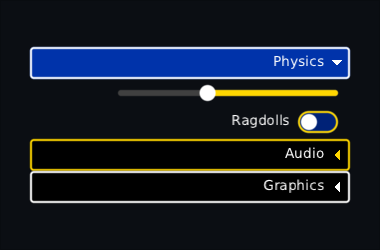
The look is the skin's: "collapsingheader" for the bar and
"collapsingheader.open" while it is open; "collapsingheader.glyph", whose text
colour is the triangle's; and "collapsingheader.body", whose padding is how far the
contents are indented. Pass style = "debugheader" and the same four names hang off
that instead.
var name by remember { mutableStateOf(TextFieldValue("")) }
TextField(name, onValueChange = { name = it }, placeholder = "CALLSIGN")

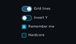
Checkbox(subtitles, onCheckedChange = { subtitles = it }, label = "Subtitles")
Toggle(vsync, onCheckedChange = { vsync = it }, label = "V-Sync")
RadioButton(quality == High, onSelect = { quality = High }, label = "High")
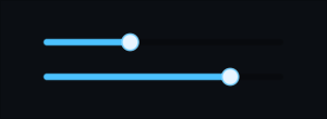
Slider(volume, onValueChange = { volume = it }, range = 0f..1f, step = 0.05f)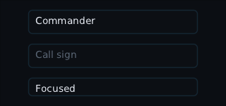
TextField handles selection, the clipboard, and the phone's keyboard, and
onSubmit fires on Enter.
A console or a Steam Deck has no keyboard at all. Wrap the screen and every field in it gets one made of buttons:
ProvideGamepadKeyboard {
    NameYourSave()
}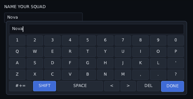
- It opens when a pad moves focus onto a field. A mouse click or Tab never opens it, so desktop players never see it.
- The d-pad walks the keys, South presses one. The keys type through the field's
own editor, so
maxLengthand the caret work the same as with a real keyboard. - Three pages — letters, symbols, a number pad — and the page key cycles them. Shift gives one capital, then lets go.
- Done, B or Escape close it, and focus goes back to the field. South on the field opens it again.
- Picking up the mouse, or typing on a real keyboard, closes it. The typed letters still reach the field.
GamepadKeyboard(openOnFocus = false) waits for South instead, for a long form a
player walks down. The pad's shortcut buttons — X deletes, Y is a space, the
bumpers move the caret, the left stick is Shift, Start is done — need one line in
your input sink, because the pad navigator does not use those buttons:
override fun onGamepad(event: GamepadEvent) = keyboard.onGamepad(event) || pad.onGamepad(event)The keys draw from "button.key" (a lit Shift is "button.key.on"), Done from
"button.primary" and the panel from "panel.keyboard". A skin without them
falls back to plain buttons and a panel.
The console settings control. It needs nothing but left and right, so nothing opens and a player on a stick never leaves the list.
Stepper(options = listOf("Low", "Medium", "High"), selected = quality, onSelect = { quality = it })
NumberStepper(value = volume, range = 0..10, onValueChange = { volume = it })
NumberStepper(fov, range = 60..110, step = 5, format = { "$it°" }, onValueChange = { fov = it })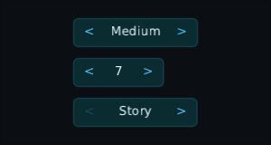
- Left and right change it while it has focus. Arrow keys and the pad both work. Up and down still move focus.
- Holding repeats. A held stick or d-pad steps once, pauses, then repeats at the pad's rate. A held key repeats at the keyboard's own rate. A mouse held on an arrow does the same on the frame clock, and waits while dragged off it.
-
At an end it lets go. One more press to the right past the last option
moves focus to the neighbour instead of doing nothing. That arrow is drawn
disabled. Pass
wrap = trueto go round instead. - Enter, South, or a click on the value moves to the next option, and goes round at the end.
- The arrows stay put. The value is as wide as the widest option. Give the stepper a width and the extra goes to the value.
-
Each step ticks. On a phone or a pad every change asks for a
haptic
Tick. A press at an end that only moves focus gives nothing.
Styles: stepper behind it, stepper.arrow for the two arrows (pressed while
held, disabled at an end), stepper.value for the words.
One choice out of a list that opens and closes — resolution, language, difficulty, a quality preset:
PopupHost {                           // once, around the screen
    Dropdown(
        options = resolutions,
        selected = current,
        onSelect = { current = it },
        modifier = Modifier.width(200f),
        label = { Text(it.toString()) },
    )
}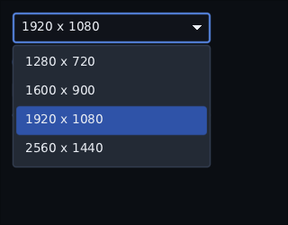
A click, Enter or the pad's South opens the list under the field, over everything else on the screen, with focus on the option that is chosen now. The arrows or the d-pad move, and the same press chooses. While it is open:
- Focus cannot leave the list. A pad pressing down past the last option stays on it, rather than wandering into the screen behind.
-
Escape, East and Back close it without choosing, before they reach any
OnBackbehind it. Focus goes back to the field either way. - A press outside closes it and does nothing else. It is not also a click on whatever was under the pointer.
The list is as wide as the field, so give the field a width that fits the
longest option. It opens upwards when there is no room below, and scrolls when
it is taller than maxListHeight or than the room it has.
PopupHost is what draws it on top. Draw order is tree order, so the only
place a list can be drawn over its neighbours — and escape a ScrollArea that
would clip it — is the end of the screen. The host composes the list there, but
as if it were where the dropdown is: it still gets the skin, the fonts and
anything else you provided around the dropdown. Forget the host and the screen
fails as it is built, saying so.
The field is the "dropdown" style, the list's panel "dropdown.list", and
the options are "item" and "item.selected".
A character's hair, a team colour, a crosshair, a tint you are tweaking in a debug window:
var tint by remember { mutableStateOf(Colour.rgb(0x4CC2FF)) }

ColourPicker(
    colour = tint,
    onColourChange = { tint = it },
    alpha = true,                        // adds the see-through strip
    presets = listOf(Colour.Red, Colour.Blue, Colour.Green),
)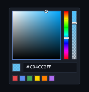
It has a square (strength across, brightness up), a hue strip beside it, an
alpha strip when alpha = true, a hex field with a swatch of the colour, and a
swatch for each preset. Like a slider, it reports and the screen holds the
answer. It keeps the hue itself, so dragging to grey or black and back does not
lose it.
- Mouse or finger. Press or drag on the square or a strip. The drag carries on past the edge and holds the marker there.
- Arrow keys or d-pad. Move the marker on whichever part has focus, a twentieth of the way per press. At an edge the next press moves focus on.
- Left stick. On the focused square it moves the marker smoothly, faster the further you push. No virtual cursor needed. A fresh push against the edge the marker is already on moves focus instead, so a stick alone can leave.
- Shoulder buttons. Turn the hue from anywhere in the picker, and keep turning while held. It wraps past red.
-
Hex field. An ordinary
TextField, so a pad player gets the on-screen keyboard — delete with DEL and type the code key by key. It takes#RRGGBB,#RGB, or#AARRGGBBwithalpha. The colour changes as soon as the text is one. Half a code is left as typed, and put back to the colour once you leave the field, which the on-screen keyboard being open does not count as. - Presets. A click, Enter or South picks one.
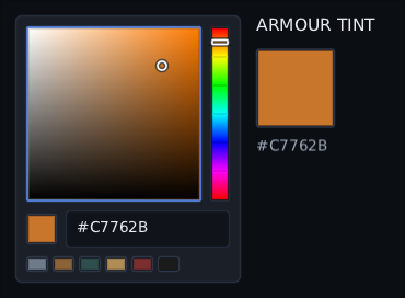
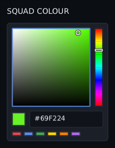
That picture is taken mid-drag, with the button still down: the ring is where the pointer is and the swatch beside it has already changed.
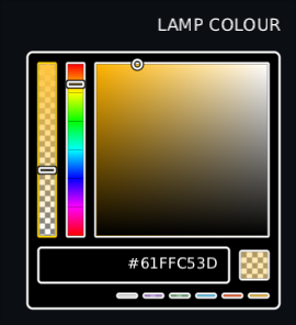
And that one with nothing but a pad: the right shoulder went down a second before the shutter and is still held, so the hue has turned all the way from red to green while focus stayed put on the square.
On a right-to-left screen the square mirrors: grey is on the right, and the arrows still move the marker the way they point.
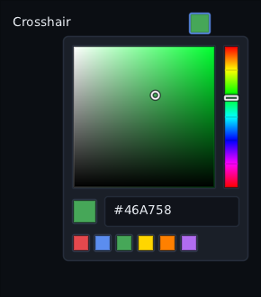
For a settings list, ColourPickerButton is a small swatch that opens the
picker under itself. It needs a PopupHost, like a dropdown:
PopupHost {
    ColourPickerButton(colour = crosshair, onColourChange = { crosshair = it }, alpha = true)
}
Focus goes to the square when it opens. Escape, East, Back, a press outside or
another press on the swatch closes it, and focus goes back to the swatch.
ColourSwatch(colour = tint, onClick = { ... }) is the plain swatch, if you
want to open something of your own. Without onClick it only shows the colour.
The colour maths is public too: Hsv(hue, saturation, value, alpha).toColour(),
Hsv.of(colour), colour.toHex() and Colour.fromHex("#FF8000").
Styles: "colourpicker" is the panel, "colourpicker.area" the frame round
the square and strips (hovered, focused, disabled), "colourpicker.marker" the
ring and bars (text colour for the ring, fill for its outline),
"colourpicker.checker" the checkerboard's two greys, "colourswatch" a
swatch's frame, and "field" the hex field.
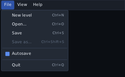
File, Edit, View along the top of an editor, and a menu that opens on an
inventory slot. Both are written in one scope — Item, CheckItem,
RadioItem, Submenu and Separator — so a list of items written once works
in either. Both drop through a PopupHost, so one has to be round the screen.
PopupHost {
    Column(Modifier.fillMaxSize()) {
        MenuBar(padButton = GamepadButton.Back) {
            Menu("&File") {
                Item("&New", shortcut = Modifiers.Primary + Key.N) { newLevel() }
                Item("&Save", shortcut = Modifiers.Primary + Key.S, enabled = dirty) { save() }
                Submenu("&Recent") {
                    recent.forEach { level -> Item(level.name) { open(level) } }
                }
                Separator()
                Item("&Quit") { quit() }
            }
            Menu("&View") {
                CheckItem("&Grid", checked = showGrid) { showGrid = it }
                Separator()
                RadioItem("&Wireframe", selected = mode == Wire) { mode = Wire }
                RadioItem("S&haded", selected = mode == Shaded) { mode = Shaded }
            }
        }
        LevelEditor()
    }
}
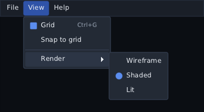
The bar is as wide as what holds it: the top of the screen, or the top of a
window. The menu scope is plain Kotlin, not composables. It runs every time the
bar is composed, so enabled = dirty greys Save out the moment nothing needs
saving, and a shortcut works while its menu is closed.
- Mouse. Click a title to open it; click it again to close it. While one is open, move onto another title to switch. Rest on a submenu's row to open it. Moving diagonally from that row towards the submenu does not close it, even across the rows in between.
- Keyboard. Alt on its own, or F10, puts focus on the bar. The arrows move, and Down, Enter or a title's letter opens a menu. Alt with a letter — Alt+F — opens that menu from anywhere. Alt held for anything else — Alt+Left in a field, Alt+click — does not. A click below the bar while it has focus gives focus to what was clicked. In a menu, Right opens a submenu and Left closes it; Left and Right with nowhere to go move to the next menu along. Escape closes one level at a time, and the last one gives focus back to wherever it was.
-
Shortcuts.
Modifiers.Primary + Key.Sis Ctrl+S, or Command+S on a Mac, and the menu writes it that way beside the item. It fires from anywhere on the screen while every menu is closed. It does not fire through an open dialogue, or when the focused widget used the key itself — a text field keeps its Ctrl+A. -
Pad.
padButtonputs focus on the bar and takes it away. The d-pad moves, South opens and chooses, the shoulders switch menus, and East closes one level throughOnBack. LeavepadButtonnull and a pad cannot reach the bar. -
Letters.
&marks the letter:"&File"underlines the F while the keyboard or pad is driving the bar.&&is an ampersand. A translated label marks its own letter —"&Fichier". - Right to left, the bar reads from the right, menus hang from a title's right edge, submenus open to the left, and Left opens a submenu.
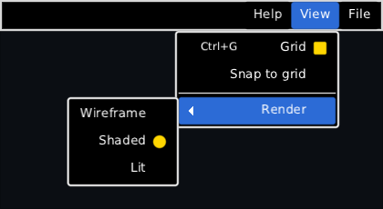
Items can be disabled (enabled = false), which greys them out, skips them on
the arrows and stops their shortcut. icon = { Image("icons/save", Modifier.size(16f)) }
puts a picture in the column before the label. A submenu with no room on its
side opens on the other side.
Styles: "menubar" behind the titles, "menubar.title" for a title and
"menubar.title.open" for the one whose menu is open. A menu is "menu", a row
"menu.item" ("menu.item.open" while its submenu is open), then
"menu.shortcut", "menu.separator", and "menu.check" and "menu.radio" for
the tick and the dot.
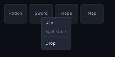
Box(Modifier.size(64f).contextMenu {
    Item("&Use") { use(item) }
    Item("S&plit stack", enabled = item.count > 1) { split(item) }
    Separator()
    Item("&Drop") { drop(item) }
})
It opens four ways:
-
Right-click — at the pointer. It wins over a button inside that only
clicks. A widget that takes the right button itself with
onPointerkeeps it, and so does a button that is not inside the menu's widget, like a HUD button drawn over a map. -
Long press — at the finger, after the same hold
onLongPressuses. Like a right-click it reaches past a button inside that only clicks, so on a touch screen a slot built as a button still opens its menu. The release is not a click. A widget's ownonLongPresswins. Only a pointer or a finger holds it open: a held Enter or South is still a click. A press that moves — a slider's thumb, a list scrolling — is not a hold. A quick tap still reaches a clickable around the menu's widget. - Shift+F10 — the menu of the focused widget, or of the nearest one around it with a menu, opens under the focused widget itself.
-
padButton(the pad's North unless you say) — the same, from a pad.
None of these reach past a dialog: a Dialog open over the menu's widget keeps
Shift+F10, the pad button and right-clicks on its own buttons to itself.
It hangs down and towards the end of where it opened, and flips back when it
would go off the screen. While it is open, focus is trapped in it. Escape, Back,
East and a click outside close it, and so does the widget it opened on leaving
the screen. While it is open it shows the items as the widget last composed
them. Its items' shortcuts are shown but do not fire; put the same item on a
MenuBar for that.
To share items, write them as an extension and call it in both:
fun MenuScope.editItems() {
    Item("Cu&t", shortcut = Modifiers.Primary + Key.X) { cut() }
    Item("&Copy", shortcut = Modifiers.Primary + Key.C) { copy() }
}

MenuBar { Menu("&Edit") { editItems() } }
TextField(notes, { notes = it }, Modifier.contextMenu { editItems() })LazyColumn(count = saves.size, spacing = 6f) { index -> SaveRow(saves[index]) }
LazyRow(count = 9, spacing = 4f) { slot -> HotbarSlot(slot) }
LazyVerticalGrid(count = shop.size, columns = GridCells.Adaptive(64f)) { index -> ShopTile(shop[index]) }
ScrollArea(Modifier.fillMaxSize()) { LongPatchNotes() }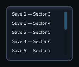
LazyColumn and LazyVerticalGrid measure only what is on screen; Layout
covers grids, and lists in sections whose headers stay at the top
(LazyColumn { stickyHeader { … }; items(…) { … } }). ScrollArea is for content that is
one piece and simply too tall.
Both remember how far they were scrolled when their screen is left and come
back to, as long as a SaveableStateHolder is above them — see
Saving state.
The bar sits over the contents rather than beside them, on the edge the lines end at: the right of an ordinary screen, and the left of a right-to-left one, where the text begins on the right. See Localisation.
A plane of interface the player drags around and zooms into: a world map, a skill tree, a tile board, a node editor, a diagram bigger than the screen.
val camera = rememberPanZoomState(
    zoom = 1f, minZoom = 0.25f, maxZoom = 3f,
    bounds = Rect(0f, 0f, 4000f, 3000f),      // world units; panning stops at the edges
)

PanZoomCanvas(
    state = camera,
    modifier = Modifier.fillMaxSize(),
    // World units, under the children. Remembered on what it draws, like any other draw here:
    // the canvas redraws when the lambda changes, so a fresh one each time asks for one each time.
    background = remember(links) { { visible -> drawLanes(links, visible) } },
) {
    skills.forEach { skill ->
        key(skill.id) {
            TalentIcon(skill, Modifier.worldPosition(skill.x, skill.y, anchor = Alignment.Centre))
        }
    }
}

camera.animateTo(centre = Offset(skill.x, skill.y), zoom = 1.5f)
val world = camera.screenToWorld(pointer)
A skill tree built on this — node states worked out from the graph, lines tinted
by what they join, the pad walking the branches — comes ready made as
SkillTree in composegl-game.
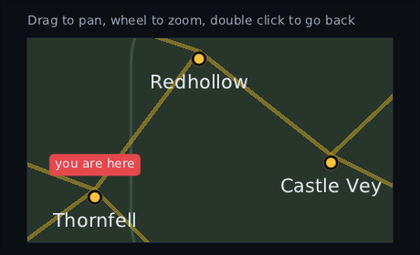
Three notches of the wheel and a drag, on the real thing. The names and the pin edges are drawn at the size they appear, so they are as sharp here as at their own size.
The children are laid out once, in world units, at their natural size, where
Modifier.worldPosition puts them. Pan and zoom are a transform the canvas draws them
through and the pointer finds them through, so moving the camera measures and composes
nothing — and a node at three times its size is drawn at three times its size rather
than stretched from a picture, so its edges and its letters stay sharp. Clicks, hover,
drags, tooltips, focus rings and boundsInRoot all work inside the plane with nothing
written for them.
This is what Modifier.scale cannot do: that is a captured picture magnified, soft past
about 1.15× and with a ceiling at 4096 pixels. A camera has neither.
- Drag empty space to pan, and a fast one flings on. A drag that starts on a button pans once it has moved further than a click would, and the button is not clicked; a slider inside keeps its own drag. Past an edge the world gives a little and springs back.
- The wheel zooms about the pointer, so what is under it stays under it. A sideways wheel pans.
- Pinch with two fingers zooms about their middle and pans with it.
-
Double click does
reset:PanZoomReset.Initialgoes back to where the camera started,PanZoomReset.Fitfits the whole world in view. -
The pad, while focus is on the canvas or inside it: the left stick pans, the right
trigger zooms in and the left one out, and
resetButton(R3 by default) resets. The d-pad walks focus from node to node — the toolkit's ordinary directional focus, so a neighbour up and to the right is reached the same way it would be anywhere else — and the camera eases to keep the focused node in view. A direction with nothing that way leaves focus exactly where it is, and focus never falls onto the canvas itself. With the canvas itself focused, a direction goes to the nearest node that way from the middle of the view, scored the same way, and pans a step when there is none. -
Keys, the same way:
=zooms in,-zooms out,0resets, and the arrows move focus as the d-pad does.
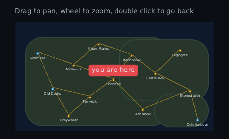
The same map, five notches of the wheel the other way: the whole coast at half size.
The red marker is the one thing that did not shrink, because it is placed with
scaleWithZoom = false.
Modifier.worldPosition(x, y, anchor, scaleWithZoom) is parent data, like layoutId:
anchor says which point of the child sits on the world point — Alignment.TopStart for
a tile board, Alignment.Centre for a node in a tree. With scaleWithZoom = false the
child follows the camera but keeps its own size on screen, which is what a label, a pin
or a player marker wants. A world is a picture rather than a line of text, so it is not
mirrored on a right-to-left screen.
The camera is plain state and can be driven from anywhere: screenToWorld and
worldToScreen, zoomAbout(point, zoom), panBy, snapTo, animateTo, fit(),
reset(), and visibleWorld for what is in view now. rememberPanZoomState keeps it
where the player left it when a screen comes back, under a SaveableStateHolder — see
Saving state.
A child entirely outside the view is neither drawn nor hit-tested, so a board of thousands draws the few dozen on screen. For a world too big to compose at all, the lazy form composes only what is near the view:
LazyPanZoomCanvas(
    items = tiles,                                                 // 40,000 of them
    area = { Rect.of(it.column * 64f, it.row * 64f, 64f, 64f) },
    state = camera,
    key = { it.id },
) { tile -> Tile(tile) }
Items are sorted into a grid of cells once per list, and the set composed changes only when the view crosses into different cells — so a pan inside one cell composes nothing.
Text is a picture made at one pixel size, so zoomed text is made again at the nearest of
a few steps (0.5, 0.75, 1, 1.5, 2, 3) once a gesture settles, and stretched between steps
while the camera is moving. The canvas's own look is the skin's "panzoom" style: the
backdrop behind the world, and a ring when the pad has focus on the canvas itself.
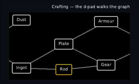
A crafting graph in the high-contrast skin on a right-to-left screen, on a pad: down then right walked focus from Ore to Ingot to Rod, and the camera came along to keep the ringed node in view, so Ore has gone off the left edge. The panel reads right to left; the graph does not, because a diagram is a picture rather than a line of text.
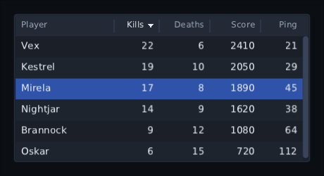
Rows with columns that line up, sort and resize: a scoreboard, a server browser, a list of items and their stats.
var picked by remember { mutableStateOf<Player?>(null) }

Table(rows = players, key = { it.id }, selected = picked, onSelect = { picked = it }) {
    column("Name", weight = 1f) { Text(it.name) }
    column("Kills", width = 64f, sortBy = { it.kills }) { Text("${it.kills}") }
    column("Ping", width = 64f, sortBy = { it.ping }, align = HorizontalAlignment.End) { Text("${it.ping}") }
}
A column is either width wide or shares out what the fixed ones leave by
weight (1 when it says neither), and never goes under minWidth. The header
stays put while the rows scroll under it, and the body is a LazyColumn, so only
the rows on screen are built.
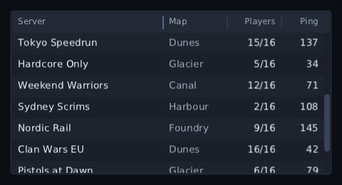
-
Sorting. Click a title with a
sortByto sort by it, lowest first; click again to turn it round. Enter or the pad's South on a focused title does the same, and Up from the first row reaches the titles.sortButton— the pad's North unless you say — cycles through the sortable columns from anywhere in the table. It is anInputBinding, so a controls screen can rebind it to a key (InputBinding.Keyboard(Key.S)) or a mouse button. The sort is stable, and the rows slide to their new places, which needs akey. A value read from state — a live distance — re-sorts the table as it changes. -
Resizing. Drag the divider between two columns and the edge follows the
pointer: the column before it grows as the one after it shrinks, so the last
column is resized from the divider at its start. A double click puts both back
to their declared widths.
resizable = falseon a column takes away the dividers on either side of it. -
Selection. Rows take focus, so the arrows and the d-pad walk them in the
order they are shown. A click, Enter or South on one calls
onSelect; the screen keeps the answer and hands it back asselected. - Right to left, the first column is on the right and a divider drags left to widen.
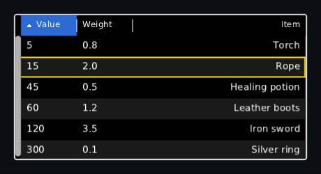
The sort, the dragged widths and the scroll live in a TableState. The one
rememberTableState() makes is kept by a SaveableStateHolder like a list's
scroll (see Saving state), and it can be read and set from outside:
val scores = rememberTableState(sortColumn = 1, descending = true)
Table(rows = players, state = scores) { … }

scores.sortBy(2)                          // by ping
scores.setColumnWidth(0, 180f)            // as if it had been dragged
settings.widths = scores.columnWidths     // to keep a layout between runs
empty = { Text("No servers found") } is what the body shows with no rows.
Every piece of it is the skin's: table round it, table.header and
table.header.cell for the titles (table.header.cell.sorted for the one sorted
by), table.divider for the handles — its padding is how far in the line is
drawn — table.row, table.row.alt for every other row and
table.row.selected, table.cell for the padding round each cell, and
table.empty. Pass style = "scores" to use scores.row and so on instead.
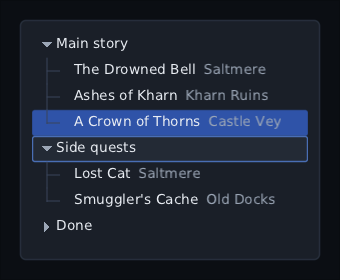
Nested rows that open and close: a scene hierarchy, a quest log, a codex, a file picker.
var selection by remember { mutableStateOf<SceneNode?>(null) }

TreeView(
    roots = scene.roots,
    children = { it.children },
    key = { it.id },
    modifier = Modifier.fillMaxSize(),
    selected = selection,
    onSelect = { selection = it },
) { node, expanded ->
    Text(node.name)
}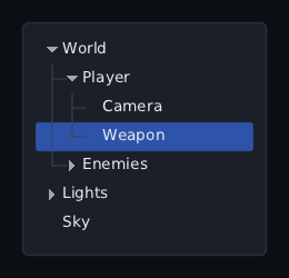
It is a LazyColumn underneath, so only the rows on screen are built, and a
tree of 10,000 nodes scrolls like a screenful. A node is asked for its
children only when it is open. To draw the arrow, the tree calls
hasChildren only for the rows it builds (and for the focused row when Left or
Right is pressed), so the default, which asks children, costs a screenful of
calls, not the whole tree. Pass something cheaper when finding children is
slow, like a folder on disk:
TreeView(
    roots = listOf(saveFolder),
    children = { folder -> folder.listFiles().orEmpty().sortedBy { it.name } },
    hasChildren = { it.isDirectory },
    key = { it.path },
    onActivate = { file -> load(file) },
) { file, _ -> Text(file.name) }-
Mouse — a click selects a row. A click on its arrow opens or closes it. A
double click opens it too, or calls
onActivateif you gave one. - Keyboard and pad — Up and Down move row by row, and past either end they leave the tree. Right opens a closed row, or goes into an open row's first child. Left closes an open row, or goes up to the parent. Enter or South selects.
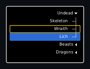
- Right to left — the indent comes in from the right, a closed row's arrow points left, and Left and Right swap.
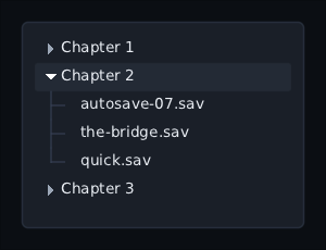
What is open is kept by key in a TreeState, so a row stays open when the list
is sorted. The default rememberTreeState() is saved like any rememberSaveable
(see Saving state). Make your own to open rows from code:
val tree = rememberTreeState("world")          // starts with "world" open

Button("Find the player", onClick = {
    tree.expandAll(listOf("world", "actors"))
    tree.scrollTo("player")
})
TreeView(scene.roots, { it.children }, { it.id }, state = tree) { node, _ -> Text(node.name) }
scrollTo waits one frame, until the rows have been worked out again, so it can
follow expandAll or collapse even when rows above the one you want have
moved; if the row still is not there, the scroll is dropped.
collapse, toggle, collapseAll and isExpanded are there too. If a row
closes while focus is on something under it, focus moves up to the nearest row
still showing. Keys must be unique across the whole tree; a repeated key fails
with the key in the message.
For something on the whole row, like a right-click menu, use rowModifier:
TreeView(
    roots, { it.children }, { it.id },
    rowModifier = { node -> Modifier.contextMenu { Item("&Delete") { delete(node) } } },
) { node, _ -> Text(node.name) }
Styles: "tree.row" for a row in each state and "tree.row.selected" for the
chosen one. "tree.toggle" and "tree.toggle.open" are the arrow: a triangle in
the style's text colour, or its picture if the style's background is one. In a
right-to-left screen a closed arrow's picture is turned to point left; a
nine-patch is flipped, which needs a canvas that can mirror layers.
"tree.guide" is the indent lines; give it "background": "none" to hide them.
style = "codex" reads "codex.row" and so on instead. indent, glyphSize
and spacing set the sizes.
NodeTree, in composegl-debug, is one of these over the interface itself: see
Debugging.
Image("portraits/sniper")                       // by name, out of the skin's atlas
Image(texture, Modifier.size(64f), tint = Colour.rgb(0x808080))
Image(icon, fit = ImageFit.Cover, alignment = Alignment.TopStart)
A name that is not in the atlas stops there and says so, rather than drawing nothing — because nothing looks exactly like a widget somebody has not written yet.
SceneView(state, modifier) { ... } lays out like a picture and shows your renderer's
scene inside it, redrawn only when you call state.invalidate(). Give it onPointer,
onKey or onPad to orbit, drag or pick: positions arrive in the picture's own pixels,
with (0, 0) at its corner. See Scene view.
Moved to Animation.
For "working, nobody knows how long": saving, loading, connecting, finding a match.
if (saving) Spinner(Modifier.size(24f))          // the turning arc in the corner
IndeterminateBar(Modifier.fillMaxWidth())        // a block sliding along a track

Spinner(Modifier.size(32f), clock = Clock.World) // stops when the game is paused
Spinner(rememberSpriteAnimation("spinner_", fps = 12f), Modifier.size(24f))  // frames from the atlas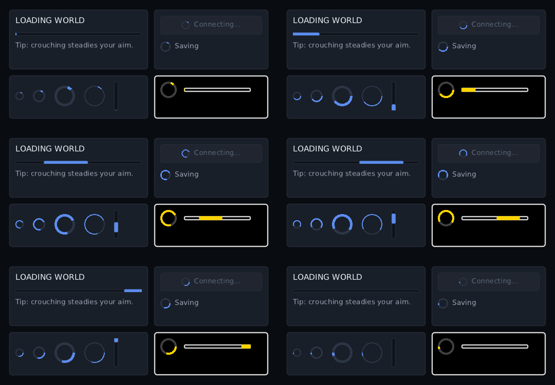
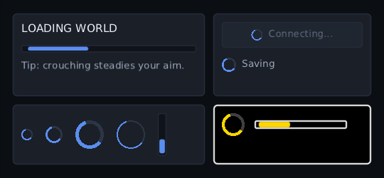
A Spinner is an arc that chases its tail round a circle, once every
revolutionMillis (1000 by default). It is 24 across unless you size it, and
thickness sets how wide the arc is. An IndeterminateBar is length long (160) and
thickness across (6) unless you size it; its block crosses the track every
sweepMillis and is cut off at the ends. orientation = Orientation.Vertical runs it
up from the bottom, and on a right-to-left screen a flat one runs right to left.
-
A named clock. Both run on
Clock.Uiby default, so they keep moving over a paused world. Passclock = Clock.Worldfor one that should stop with the game. -
Cheap. Only the drawing moves. Nothing recomposes and nothing is laid out again;
each frame the clock moves, the widget asks for a redraw and reads the time as it
draws. On a stopped clock it asks for nothing. A test's
settle()does not wait for one. - Scenery. Neither takes focus or clicks, so the pad and the mouse pass over them.
Their look is the skin's. The spinner's arc is the "spinner" style's text colour,
with that style's background behind it, and "spinner.track"'s text colour is a ring
under the arc when the skin names it. The bar draws "indeterminatebar.track" under
the whole bar (its padding insets the block) and "indeterminatebar.fill" as the block.
Pass style = to use other names. For a picture instead, such as a turning disc or an
hourglass, hand Spinner a looping SpriteAnimation; it plays it as an AnimatedImage.
TooltipHost {                       // once, around the screen
    Tooltip("Reloads faster when crouched") {
        IconButton(reloadIcon, onClick = { })
    }
}

PromptGlyph(Action.Interact)        // draws E or Ⓐ, depending on what the player is using
PromptGlyph changes the moment somebody picks up a pad, without anything being
reloaded.
Moved to Animation.
KeyBindButton(
    binding = binds[Jump],                    // a key, a mouse button or a pad button; null draws a dash
    onBind = { input ->
        binds[Jump] = input
        prompts.bind(Jump, input)             // every PromptGlyph(Jump) follows
    },
    cancelKey = Key.Escape,                   // and GamepadButton.Back on a pad
)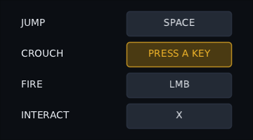
Click it, press Enter on it or press South on it, and it says PRESS A KEY. The next press of anything is the answer, and nothing else hears it: an arrow or the d-pad is bound instead of moving focus, East is bound instead of going back. The release of that press is swallowed too, so binding Enter or South does not start it listening again. Escape or the pad's Back gives up, and so does focus leaving it.
A mouse button counts when it is pressed on the button, which is where the cursor
already is. Sticks and triggers are not bindings. accepts = { it !is InputBinding.Mouse }
refuses a kind of press and keeps listening.
It never decides what a clash means. onBind gets the press either way, and
clashesWith says who else has it:
onBind = { input ->
    val clash = binds.clashesWith(input, ignoring = Jump)
    if (clash.isEmpty()) binds[Jump] = input else warning = "Already used by ${clash.first()}"
}
Pass a KeyBindState to read isListening from outside — a "press Esc to cancel"
line under the list — or to call listen() yourself.
Moved to Animation.
Moved to Animation.
Moved to Animation.
val line = rememberTypewriter(dialogue[at])
Typewriter(line, charactersPerSecond = 40f, onFinished = { showChoices = true })
Text that arrives a letter at a time, skipping to the end on a press. It measures
the whole string up front, so the box does not grow as the words appear. Sending
the same line back to the beginning with line.restart() types it out again,
even when the words have not changed.
For a whole conversation — a speaker, a portrait, answers, skip, auto and a scrollable log — see the dialogue box, which is built on this.
Bars, the reticle, damage numbers, world markers, cooldowns, the hotbar, the
minimap frame, the compass bar, the dialogue box, notifications, subtitles and
particles live in their own module, composegl-game. They have
their own page.
- Game widgets — bars, reticle, damage numbers, world markers, cooldowns, hotbar, minimap, compass bar, dialogue, subtitles, particles
- Skins — how all of these get their look
- Input — focus, pads, and keyboard
- Shaders — blurring, outlining or dissolving any of the above
- Animation — clocks, animated values, and panels that come and go