Layout
How things end up where they end up.
If you have used Compose's layouts, you already know this one: same two-pass model,
same Column/Row/Box, same weight and Arrangement. The
Compose layout basics
guide applies almost word for word.
This page is the differences and the things that are ours.
Column, Row, Box. There is no ConstraintLayout — these three plus
weight have covered every HUD and menu we have built. For inventories and
level selects there is Grid. When a row has to wrap, there is
FlowRow.
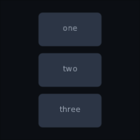
Column { Text("one"); Text("two") }   // downwards
Row    { Text("one"); Text("two") }   // across
Box    { Text("one"); Text("two") }   // on top of each other
The one change you have to make coming from Compose UI.
Modifier.width(280f)        // not 280.dp
Modifier.size(64f)
Modifier.fillMaxWidth(0.5f)
There is no density, no Dp, no LocalDensity. You design against one fixed
screen — say 1280×720 — and Viewport scales the whole interface to whatever it
actually lands on:
Viewport(
    design = Size(1280f, 720f),
    physical = Size(Gdx.graphics.backBufferWidth.toFloat(), …),
    policy = ScalePolicy.Fit,
)
So 280f is the same fraction of the screen on a phone, a laptop and a 4K
television, and there is nothing per-device to think about. That is the trade: you
lose "physically the same size everywhere" and gain "looks like the mock-up
everywhere", which is what a game wants.
Constraints work as you would expect — a parent offers a range, a child answers
with a size inside it — and Constraints has minWidth, maxWidth, minHeight,
maxHeight as floats.
A portrait, a minimap or a video thumbnail wants a flexible size and a fixed
shape. aspectRatio is width divided by height:
Image(portrait, Modifier.fillMaxWidth().aspectRatio(3f / 4f))  // height follows the width
MinimapFrame(Modifier.height(180f).aspectRatio(1f))            // width follows the height
Row(Modifier.fillMaxWidth()) {
    repeat(4) { Thumbnail(Modifier.weight(1f).aspectRatio(16f / 9f)) }
}
MinimapFrame here, and Bar and Reticle further down, are game widgets: they come
from composegl-game (import dev.wildware.composegl.game). See Game widgets.
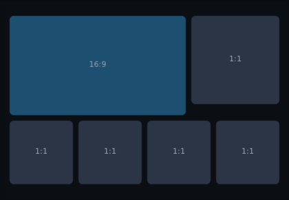
One rule: take the axis that is settled — by width, height, fillMax* or a
weight — work out the other, then clamp to what the parent allows. With neither
settled it takes the biggest shape that fits, widest first
(matchHeightConstraintsFirst = true tries tallest first).
If the shape cannot fit — full width in a slot too short for it — the settled axis is kept and the other is cut down. The node comes out the wrong shape instead of spilling over its neighbours. With nothing bounded at all, the content decides.
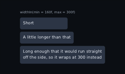
width says one number. Most panels want a range: a tooltip that grows with its
text but wraps before it crosses the screen, a dialogue that is never cramped and
never sprawls.
Panel(Modifier.widthIn(min = 200f, max = 400f)) { Text(briefing) }
Box(Modifier.widthIn(max = 320f)) { Text(hint) }     // grows, then wraps
Modifier.heightIn(min = 40f, max = 120f)
Modifier.sizeIn(minWidth = 64f, minHeight = 64f)
Between the two ends the contents decide. Leave an end out and the parent's own
stands. Both ends stay inside what the parent offers, the same as width: a
parent with 300 to give gets 300 from widthIn(min = 400f), not 400.
Three things differ from Compose, where the order of the chain decides everything:
-
A range holds wherever it is written.
widthandfillMaxWidthare measured inside it, sowidthIn(max = 400f).fillMaxWidth()andfillMaxWidth().widthIn(max = 400f)are the same panel: as wide as it can be, up to 400. A fill is a share of the range's maximum, not the parent's. - Written twice, the later bound wins, bound by bound. A later minimum above an earlier maximum carries the maximum up with it.
- A minimum above its own maximum throws, at the call that wrote it. So does an infinite minimum: under a scrolling parent it would make the node infinitely big.
defaultMinSize is the one a widget puts on itself. It is a smallest size that
only holds when nothing more definite has been said, which is what a touch target
wants — a button labelled "A" is still thumb-sized, and the screen using it can
still make it smaller:
Button(label, onClick, modifier.defaultMinSize(minWidth = 96f, minHeight = 48f))It gives way, on its own axis, to a minimum from the parent, a width, a
fillMaxWidth, or a widthIn(min = …). It never goes past the parent's maximum or
a widthIn(max = …).
Inside a Row or a Column, weight says "give me a share of whatever is left
after everybody else has taken what they need".
Row(Modifier.fillMaxWidth()) {
    Text("HP")                          // as wide as the word "HP"
    Bar(hull, Modifier.weight(1f))      // …and the bar takes the rest
}
Two weights split it between them, in proportion:
Row(Modifier.fillMaxWidth()) {
    Panel(Modifier.weight(2f)) { Text("map") }    // two thirds
    Panel(Modifier.weight(1f)) { Text("log") }    // one third
}
As in Compose, weight only means anything inside a Row or a Column.
Sometimes a layout needs to know how big a child would like to be before it decides how big to make it. A menu whose buttons are all as wide as the longest label:
Column(Modifier.width(IntrinsicSize.Max), verticalArrangement = Arrangement.spacedBy(8f)) {
    Button("PLAY", onClick = { }, modifier = Modifier.fillMaxWidth())
    Button("OPTIONS", onClick = { }, modifier = Modifier.fillMaxWidth())
    Button("QUIT", onClick = { }, modifier = Modifier.fillMaxWidth())
}
The column asks each button how wide it would be with all the room in the world, takes
the widest, and is exactly that wide. So fillMaxWidth inside it fills to "OPTIONS",
not to the screen.
A form whose label column fits its longest label, with the labels right-aligned against the fields:
Row(Modifier.fillMaxWidth(), horizontalArrangement = Arrangement.spacedBy(8f)) {
    Column(Modifier.width(IntrinsicSize.Max)) {
        Text("NAME", Modifier.fillMaxWidth(), align = HorizontalAlignment.End)
        Text("CALLSIGN", Modifier.fillMaxWidth(), align = HorizontalAlignment.End)
    }
    Column(Modifier.weight(1f)) { /* the fields */ }
}
And the other axis — a divider exactly as tall as the row it splits:
Row(Modifier.height(IntrinsicSize.Min)) {
    Text("HP")
    Box(Modifier.width(2f).fillMaxHeight().background(rule)) {}
    Text("SHIELD\nHULL")
}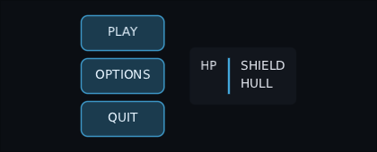
Max is how big it would be with unlimited room: a label on one line. Min is the
least it can be squeezed to: a label broken at every space, as wide as its longest word.
A width or fillMaxWidth on the same node wins over an intrinsic one.
What a child says it wants follows the same rules as measuring it: a widthIn range
holds its answer inside the range, a defaultMinSize lifts it, and a child keeping an
aspectRatio works out one side from the other.
Asking is not measuring, so it does not break the measure-once rule below. It does walk the subtree under the node that asked, every frame, so put it on the menu rather than round the whole screen.
Arrangement is what a Row or Column does with space it has left over.
Row(Modifier.fillMaxWidth(), horizontalArrangement = Arrangement.SpaceBetween) {
    Text("AMMO")
    Text("148")          // pushed to the far end
}
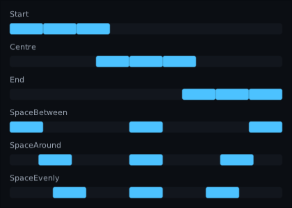
The full set:
| what it does | |
|---|---|
Start / Top
|
everything at the beginning, leftover space at the end |
End / Bottom
|
everything at the end |
Centre |
everything in the middle |
SpaceBetween |
first at the start, last at the end, gaps equal |
SpaceAround |
equal gaps, half-size gaps at the two ends |
SpaceEvenly |
equal gaps, including at the two ends |
spacedBy(12f) |
a fixed 12 between each, the rest left over |
spacedBy is the one you will use most — it is how you get a menu with breathing
room without putting spacers between things:
Column(verticalArrangement = Arrangement.spacedBy(10f)) {
    Button("CONTINUE", onClick = { })
    Button("OPTIONS", onClick = { })
    Button("QUIT", onClick = { })
}
All of them, doing the same three boxes:
Same idea as Compose, different type names — and British spelling throughout:
Centre, not Center.
Row(verticalAlignment = VerticalAlignment.Centre) { … }      // centred top-to-bottom
Column(horizontalAlignment = HorizontalAlignment.Centre) { … } // centred left-to-right
A Box uses both at once, so it takes a combined Alignment:
Box(Modifier.fillMaxSize(), contentAlignment = Alignment.Centre) {
    Text("PAUSED")
}
And any single child can overrule it:
Box(Modifier.fillMaxSize()) {
    Text("HP 100", Modifier.align(Alignment.TopStart))
    Text("12:04",  Modifier.align(Alignment.TopEnd))
    Reticle(reticle, Modifier.align(Alignment.Centre))
}
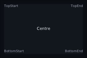
The nine you would expect: TopStart, TopCentre, TopEnd, CentreStart,
Centre, CentreEnd, BottomStart, BottomCentre, BottomEnd.
A row lining its children up down the middle, with two of them overruling it:
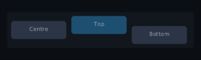
That last example is a whole HUD's worth of positioning, and it is three lines.
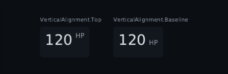
A big number next to a small unit looks wrong with its top lined up, and wrong centred too. What the eye wants is the letters of both standing on one line:
Row(verticalAlignment = VerticalAlignment.Baseline) {
    Text("120", textStyle = display)
    Text("HP")
}
- Each child's first line is what lines up. A paragraph stands on its first line.
- Anything with text inside counts, not just
Text: aButton, aTextField, aColumnof labels. A layout reports the first baseline of the text inside it. - A child with no text at all goes at the top.
- A child's own
Modifier.align(...)still wins. A single child can ask for the baseline in a row that does not:Modifier.align(Alignment(vertical = VerticalAlignment.Baseline)). - Only a
Rowor aFlowRowdoes this; aFlowRowlines up each of its lines on its own. In aBoxthere is nothing beside a child to line up with, soBaselineis the same asTop.
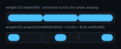
A weighted share, a fixed cell or a fillMaxSize parent forces its size on a
child, so a 24-pixel icon put in one is stretched to fill it. wrapContentSize
takes that minimum away: the child keeps its own size and sits inside the slot.
Row(Modifier.width(300f)) {
    Image(icon, Modifier.weight(1f).wrapContentSize(Alignment.Centre))   // a third of the row, icon centred
}
No extra Box round it. wrapContentWidth and wrapContentHeight do one axis each.
The row still reserves the whole slot, so nothing around it moves. The child's own
rectangle is the small box: that is what it paints, and where it takes clicks and
focus. A background on the same widget paints the icon, not the cell — put the
background on a parent to paint the cell. It reads what the parent offered before
size does, wherever it sits in the chain, and something too big for the slot is
still cut down to it.
It only acts on an axis the parent actually forces. A Row forces a weighted
child's width, not its height, so up and down are still the row's
verticalAlignment. A Box forces neither — use align there.
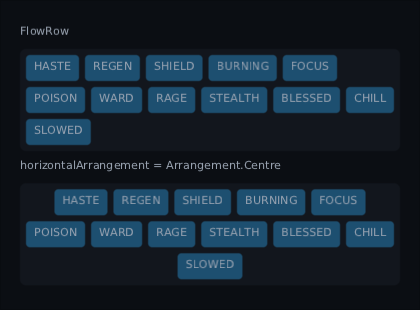
A Row never wraps. For things that come in a number you do not know in
advance — tag chips, the buffs under a health bar, a hotbar on a phone held
upright — use FlowRow. It puts children in a line until the line is full,
then starts a new line underneath.
FlowRow(horizontalSpacing = 4f, verticalSpacing = 4f) {
    buffs.forEach { BuffIcon(it) }
}
| what it does | |
|---|---|
horizontalSpacing |
the gap between neighbours on a line |
verticalSpacing |
the gap between one line and the next |
horizontalArrangement |
how each line spreads out, line by line — Centre centres the short last line on its own |
verticalAlignment |
where a child sits in a line taller than it; Baseline stands each line's words on one line; Modifier.align on a child still wins |
maxItemsInEachRow |
wrap after this many even when there is room — four across, like a grid |
FlowColumn is the same turned on its side: top to bottom, then a new column to
the right. It only fills up when something limits its height, so give it one.
A flow sized to its contents — Modifier.width(IntrinsicSize.Min) on a panel
around it — counts the wrapping: at its narrowest it is its widest child, one to a
line, and asked how tall it is at a width it answers with every line it would make.
Two things it does not do. weight means nothing inside a flow — there is no
"what is left" until the line is decided. And a child wider than the whole flow
gets a line to itself and is squeezed to the flow's width, rather than poking out
of the side.
Modifier.padding(12f)                        // all four sides
Modifier.padding(horizontal = 16f, vertical = 8f)
Modifier.padding(left = 28f, bottom = 28f)   // name the ones you want
There is no margin, and no Spacer in a typical chain. Space between things is
the parent's job: Arrangement.spacedBy.
A designer says "40 from the top of the panel to the title's baseline". Plain
padding measures to the top of the line box instead, which is off by the font's
ascent and so changes with the size. paddingFrom measures to the line:
Text("Title", Modifier.paddingFrom(Baseline.First, before = 40f))  // line 40 down
Text(body,    Modifier.paddingFrom(Baseline.Last, after = 16f))    // 16 below the last line
Text(body,    Modifier.paddingFromBaseline(top = 28f, bottom = 12f))  // both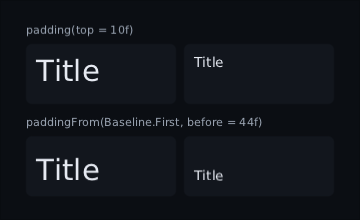
It only adds room: a line already further down is left alone. The room is part of the node, so a background paints across it. Something with no text inside gets no room at all.
An inventory, a level select, a wall of achievements: children in rows and columns. Write them as one flat list; the grid fills across, then down.
Grid(columns = GridCells.Fixed(6), spacing = 4f) {
    items.forEach { item -> key(item.id) { Slot(item) } }
}

Grid(columns = GridCells.Adaptive(minSize = 64f)) {
    levels.forEach { LevelTile(it) }
}-
Fixed(6)is six columns however wide the grid is. They share the width out equally, like sixweight(1f)s. -
Adaptive(minSize = 64f)fits as many columns as it can with each at least 64 wide, and shares out what is left. Make the screen narrower and it wraps. It needs a width to fit into, so it fails inside anything that scrolls sideways.
Inside something sized to its contents, like Column(Modifier.width(IntrinsicSize.Max)),
a Fixed grid wants its columns at its widest child. An Adaptive grid wants
cells of exactly minSize: one column at its narrowest, every child on one row
at its widest. Any wider and it would fit more columns and squeeze them.
Every row is as tall as its tallest child. A child smaller than its cell sits in
the top-left corner, or wherever contentAlignment or its own Modifier.align
says. horizontalSpacing and verticalSpacing set the two gaps separately.
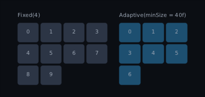
Because it is one list rather than rows of rows, the awkward parts of nested
Rows go away:
- Focus moves between cells with no wiring. Right goes to the next cell, down to the one straight below. At the end of a row focus stops rather than wrapping. Tab walks across and then down.
-
keyworks on each item. Reorder or remove items and each one's node, state and focus move with it.
Every cell is composed. That is fine for a bag of forty slots; a thousand-item catalogue wants a lazy grid. A cell cannot span several columns yet.
LazyColumn and LazyRow. The plain form takes a count and an item composable:
LazyColumn(count = saves.size, spacing = 6f) { index ->
    Row(Modifier.fillMaxWidth()) {
        Text(saves[index].name)
        Text(saves[index].date, Modifier.weight(1f), align = HorizontalAlignment.End)
    }
}
It scrolls, draws its own scrollbars, and only measures what is on screen plus a
couple either side. key and spacing do what you expect.
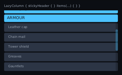
A list in groups — an inventory by kind, a quest log by chapter, names under
"A", "B", "C" — uses the block form. A stickyHeader stays at the top while the
rows after it scroll under it:
LazyColumn(Modifier.fillMaxSize()) {
    stickyHeader { Header("Weapons") }
    items(weapons, key = { it.id }) { WeaponRow(it) }

    stickyHeader { Header("Armour") }
    items(armour, key = { it.id }) { ArmourRow(it) }

    item { Text("That is everything.") }
}- One header at the top at a time. A header scrolls in like any row and stops when it reaches the top. The next header pushes it off as it arrives, rather than sliding over it.
- It is on top for the mouse too. A click on a pinned header does not reach the row hidden under it. A drag on it still scrolls the list.
- Focus is not hidden by it. Moving up onto a row under the header scrolls until the row is below the header.
-
Everything else is the same. Only what is on screen is built, keys keep
state with their rows, and
items(count) { index -> }works too. The block may read state; the list is rebuilt when that state changes. -
LazyListState.pinnedHeadersays which item is pinned, ornullbefore the first header. It is state, so a "you are in: Armour" label that reads it keeps up by itself.LazyRow { }takes the same block and pins at the left edge.
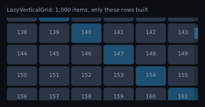
A shop catalogue, a sprite browser, an inventory of a thousand: LazyVerticalGrid
builds only the rows on screen, plus two spare either side.
val state = rememberLazyGridState()

LazyVerticalGrid(
    count = inventory.size,
    columns = GridCells.Fixed(8),
    state = state,
    key = { inventory[it].id },
    spacing = 4f,
) { index ->
    Slot(inventory[index])
}

state.scrollToItem(120) // brings the row item 120 is in to the top-
Columns work as in
Grid.Fixed(8)shares the width between eight;Adaptive(minSize = 56f)fits as many as it can. Resize an adaptive grid and it reflows, keeping the item at the top where it was. -
It scrolls like a
LazyColumn. The wheel, a drag, a flick and its scrollbar all work. Each row is as tall as its tallest cell. - Focus works with no wiring. Arrows and the d-pad move to the neighbouring cell, Tab walks across then down, and moving onto a row below the fold scrolls it into view.
A grid of slots is not the same thing as a bag with rules in it. When the items
stack, split, or take up more than one square,
InventoryGrid in composegl-game is that,
lazy rows included.
LazyHorizontalGrid(count, rows = GridCells.Fixed(2)) is the same lying down: it
fills down, then across, and scrolls sideways.
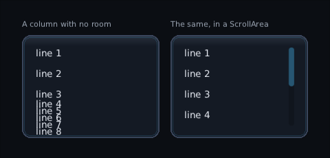
A line hands out the room it has, top to bottom, and whoever asks after it has run out gets none. That child reports no height — and draws itself anyway, because nothing here cuts a widget down to the size it agreed to.
So a column with more in it than it has room for does not get neatly cut off at the bottom. It gets printed on top of itself, which looks like a bug somewhere else entirely. It is worth knowing the shape of it, because the usual way to meet it is a phone keyboard taking two thirds of the screen away from a menu that used to fit.
The answer is a ScrollArea. It offers its contents as much room as they like,
takes only the room it was given, and clips once around the whole thing:
ScrollArea {
    Column(verticalArrangement = Arrangement.spacedBy(16f)) {
        // …as long as you like
    }
}
The same eight lines in the same too-short panel, without and with:
It is the same size as before when the contents fit, so wrapping a menu in one costs nothing on a screen where it was never a problem. Moving focus to a child that is off-screen scrolls it into view, which is what makes a text field usable with a keyboard over it.
A widget is never measured twice. Compose UI tolerates it; we do not. Ask a child its size twice in one pass and you get an exception naming the widget:
Panel was measured twice in one pass.
It is an error rather than a warning because measuring twice doubles the cost of everything underneath, and two of them nested squares it. At 60 frames a second that is the difference between a HUD costing nothing and a HUD costing the frame.
Measure once, keep the Placeable, place it. If you need a child's size before
deciding what to offer it, ask with maxIntrinsicWidth and friends — asking is not
measuring.
In a right-to-left screen — Arabic, Hebrew — every layout here is its own mirror image:
a Row's first child is on the right, Arrangement.Start packs right, a Column's
Start children hug the right, and Modifier.paddingRelative(start = …) pads the right.
padding(left = …), offset and custom layouts are left alone, and Tab order does not
change.
ProvideLayoutDirection(LayoutDirection.Rtl) { OptionsScreen() }ProvideLocale sets it for you from the language. See Localisation.
- Modifiers — the full list, and what the chain order does
- Widgets — what you put inside these layouts
-
Custom layouts — writing your own
MeasurePolicywhen the three are not enough