Skins
A skin is a JSON file. It holds every colour, corner, border, padding and piece of art in your interface, and nothing in your Kotlin names any of them.
Save the file while the game is running and the screen changes on the next frame.
defaults is what every style starts from. styles is a flat map of name to look.
Comments are allowed — it is a file people edit by hand.
A widget asks for a style by name. Button asks for "button", Text for
"label", Panel for "panel".
Button("LAUNCH", onClick = { }, style = "button.primary")
Text("CHAPTER ONE", style = "label.title")A name falls back one dot at a time:
button.primary.small → button.primary → button → nothing
So a skin that has not been written yet is not broken — a missing style is a plain widget, not a crash. Anything that is written is used whole; there is no merging of a style with its parent.
Two consequences worth knowing:
-
Invent your own names freely.
"button.abandon"needs no support from the toolkit. If nobody writes it, it looks like"button". - Failures are loud at load time and quiet at draw time. A typo in the file is reported with its line; a name nobody wrote is silently plain.
Plain means nothing: no fill, no border, no corner, no padding, and — this is the one that catches people — no highlight for hovered, focused, pressed or selected.
So a skin with no "tree.row.selected" draws a chosen row exactly like an unchosen
one, and a skin with no "tree.row" loses the ring that shows a pad player where
they are. The widget works perfectly; nobody can see what it is doing.
It costs nothing to fall back while you are still writing the file. It costs a lot
once somebody is playing. Before you ship, walk the list on Widgets and
write a style for every widget you actually use — especially the .selected,
.open and .active ones, because those are the states a fallback erases.
Four of them, and a style names the ones it cares about:
"button": {
"background": { "fill": "#232A35", "corner": 5, "border": "#2C3545", "padding": [14, 8] },
"hovered": { "background": { "fill": "#39445A", "corner": 5, "border": "#4A5670" } },
"focused": { "background": { "fill": "#2A3342", "corner": 5, "border": "#5B8DEF" } },
"pressed": { "background": { "fill": "#1A1F28", "corner": 5 }, "contentOffset": [0, 1] },
"disabled": { "textColour": "#5E6B7E", "tint": "#A0FFFFFF" }
}contentOffset moves what is inside without moving the frame — a pressed button's
label drops a pixel while its border stays put. It is the cheapest convincing thing
in a game interface, and it belongs in the file rather than in a widget.
corner is one radius for all four corners, or a radius per corner — four numbers
clockwise from the top-left, or an object naming only the rounded ones:
"tab": { "background": { "fill": "#232A35", "corner": { "topLeft": 8, "topRight": 8 } } },
"tab.docked": { "background": { "fill": "#232A35", "corner": [12, 0, 0, 12] } }There is no two-number form: two radii could mean top and bottom or left and right, so the reader stops and says so rather than guessing.
Say gradient where you would say fill. The key is which way it runs, and the
value is its two colours:
"sky": { "background": { "gradient": { "vertical": ["#3A6EA5", "#1B2A41"] }, "corner": 6 } },
"health": { "background": { "gradient": { "horizontal": ["#4CD964", "#FF3B30"] } } },
"sheen": { "background": { "gradient": { "linear": ["#FFFFFF", "#00FFFFFF"], "angle": 45 } } },
"vignette": { "background": { "gradient": { "radial": ["#00000000", "#C0000000"] } } },
"tab": { "background": { "gradient": { "vertical": ["#5B8DEF", "#232A35"] }, "corner": { "topLeft": 8, "topRight": 8 } } }angle is degrees clockwise from pointing right, and only linear takes one.
corner (one radius or one per corner), border, borderWidth and padding work as they do on a fill. A state's
tint reaches both colours, so a disabled button fades its whole gradient.
A style can name a region of your atlas instead of a fill, and cut it into a nine-patch here rather than in code:
"panel": {
"background": { "patch": "panel", "slice": 16, "padding": [20, 18] }
},
"heading": {
"background": {
"patch": "ribbon",
"slice": [8, 10, 8, 10],
"padding": [14, 5, 14, 6],
"edges": { "centreAcross": "tile" } // keep the hatch's pitch instead of smearing it
}
}slice is how far in the stretchable middle starts — one number for all four
sides, or four. padding is the gap between the art's frame and its contents, so
changing the picture changes the gap and no layout code moves.
If your atlas is mipmapped you may see a faint line across the middle of a panel at small sizes: the stretched band is taken from a rectangle inside one texture, and a coarser mip level averages it together with whatever the packer put next to it. Name the nine pieces separately and the band can be a single texel, which no mip can reach past:
"frame": {
"background": {
"patch": {
"topLeft": "frame/tl", "top": "frame/t", "topRight": "frame/tr",
"left": "frame/l", "centre": "frame/c", "right": "frame/r",
"bottomLeft": "frame/bl", "bottom": "frame/b", "bottomRight": "frame/br"
},
"padding": 9
}
}There is no slice here and writing one is an error: the pieces already say how
thick each border is. Every piece is optional — bar the last one, since an empty
"patch": {} is nine nothings and a load error — and one you leave out means that
row or column has no slice at all, so a scrollbar track is three pieces:
"track": { "background": { "patch": { "left": "bar/cap", "centre": "bar/fill", "right": "bar/cap" } } }Two rules, both checked at load. Pieces down the same side must agree on how thick
they are, because that thickness is the slice. And two pieces that both tile
along the same axis must be the same size, or they repeat at two different pitches
and the pattern down one side drifts out of step with the other — pieces that
stretch are free to differ, which is what lets the middle be one texel.
In Kotlin the same thing is NinePatch.of(NineRegions(topLeft = …, top = …, …)).
These nine handles are not a picture: hand them to Image, to a skin's image
background, or to any of this toolkit's canvases and you get told so, by name.
val skin = ReloadingSkin(
source = FileSkinSource(Path.of("assets/ui/game.skin.json")),
art = ArtAtlas.of(atlas.regions.associate { it.name to GdxTexture(it) }),
fonts = fonts,
onProblem = { console.log("skin: ${it.message}") },
)
host.setContent { ProvideSkin(skin.skin) { Hud(state) } }Then once a frame:
skin.reloadIfChanged()That is one look at the file's modified time, and nothing at all until the time
moves. skin.skin is Compose state, so anything reading it recomposes by itself
when the file changes.
A bad save does not stop the game. Half a file — which is what a file looks
like for the instant an editor takes to write it — and a file with a typo both
leave the last working skin on screen and report through onProblem. The first
load is different: a game whose skin was already wrong before it started should say
so and stop, so that one throws.
Ship the file inside the jar and read it from disk when it is there, which is how the demo does it:
val source = if (Files.exists(onDisk)) FileSkinSource(onDisk) else PackagedHigh contrast, a colourblind palette, light and dark — each of those is a skin, and
the player picks it from the options screen while the options screen is open. Keep
the choice in state and hand it to ProvideSkin:
val skins = listOf(Skin.Default, Skin.HighContrast)
var skin by remember { mutableStateOf(skins.first()) }
ProvideSkin(skin) {
Game()
// on the options screen:
Stepper(options = skins, selected = skin, onSelect = { skin = it }, label = { it.name })
}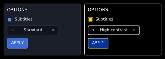
The frame after the player moves the stepper is drawn entirely in the new skin: every background, border and text colour, and text measured again if the new skin's sizes or fonts differ. Nothing the player did is lost. What they typed, the boxes they ticked, where focus is and what the pointer is over all stay put, because a skin change restyles the widgets rather than building them again.
Skin.HighContrast ships with the toolkit: black surfaces, white text and edges,
two-pixel borders, and focus in yellow. It names every style the default does, in
the same sizes, so switching between the two moves nothing on the screen — the
stepper the player just used is still under their thumb.
A skin file can say what it is called, which is what it.name shows:
{ "name": "Colourblind", "styles": { … } }Your own skins work the same way. A ReloadingSkin can be one of the choices —
pass reloading.skin when it is the chosen one — and an artist's saves still reach
the screen while it is. A SkinOverride inside the game is laid over whichever skin
the player chose.
If your game's skin has styles of its own, lay the high-contrast skin over it rather
than swapping it in, so those styles are still there:
remember(mine) { mine.overriddenWith(Skin.HighContrast) }. Every style the toolkit
names turns high contrast, and your own keep their look.
None of these is a crash, a warning or a broken layout. Each of them is a screen that draws perfectly and that somebody cannot read.
Most widgets sit on your screen colour, so a dark widget on a dark screen is obviously wrong and you fix it the first time you look. A few bring their own backdrop with them — a radial menu dims the world behind itself, a dialogue has its scrim — and there the trap is that both halves came from the same palette. Black slices on a black backdrop is a wheel nobody can see:
"wheel.backdrop": { "background": { "fill": "#E6000000" } }, // the dim over the game
"wheel.slice": { "background": { "fill": "#F2606060" } }, // has to be a step away from it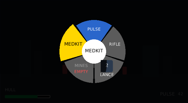
An indeterminate bar draws its moving block inside its track's padding. A track with a two-pixel edge and no padding is a track whose edge the block rubs out every time it slides past:
"indeterminatebar.track": {
"background": { "fill": "#000000", "corner": 3, "border": "#FFFFFF", "borderWidth": 2, "padding": 2 }
}The rule is padding at least as thick as the border. A plain Bar is different —
its fill is a separate piece laid over the whole track — so there the track's edge
is simply covered when the bar is full, which is what a full bar should look like.
A style's text colour and the fill behind it are usually in the same block, so they
stay in step. Trouble starts when they are not: menu.shortcut is written on
menu, a compass pin's distance is written under the pin on the compass, and the
label on a wheel's lit slice is the same style as the label in the hub. Change one
of those fills and the words somewhere else stop reading.
Two numbers, both from the web's accessibility guidelines, both worth holding yourself to:
- 4.5:1 between text and whatever is behind it.
- 3:1 for anything with no words — a tick, a knob, a caret, a selected row's fill, and an edge against either its own fill or the screen behind it.
The second one is the one people miss. A navy selection on a black list is comfortably readable as text and still leaves the player unable to see which row is chosen. The same goes for a dark grey edge on a black box: an unticked checkbox that nobody can find.
The toolkit's own Skin.HighContrast is measured against both, in
HighContrastSkinTest, so if you copy it as a starting point you are starting from
something that passes.
SkinOverride(dangerSkin) { WarningPanel() }Everything under it gets the overriding skin's styles and the outer skin's for whatever it does not name. Useful for a corrupted-terminal screen, an enemy faction whose interface is red, or a tutorial that dims everything but one panel.
Widgets do it like this, and so can yours:
@Composable
fun Chip(text: String, style: String = "chip") {
val interaction = remember { InteractionState() }
val resolved = rememberStyle(style, rememberStates(interaction))
Box(Modifier.styled(resolved).interaction(interaction)) {
Text(text, colour = resolved.textColour)
}
}rememberStyle resolves the name and the states into one ResolvedStyle;
Modifier.styled wears it. (There are two styled extensions — this one takes the
resolved style, and dev.wildware.composegl.ui.skin.styled takes the name and resolves it for
you. Import whichever suits.) A widget written this way contains no colour, no corner
radius and no texture name, which is the whole point.
There is one, it is dark and neutral, and it needs no atlas and no artist. It is an
ordinary skin file — default.json,
read by the same loader your file goes through. Nothing in the toolkit's code knows
what colour a button is: if the default needed a special case, the skin system would
not be finished.
Start from it and replace styles one at a time.
{
  "defaults": {
    "textColour": "#E8ECF2",
    "text": { "font": "default", "size": 16 }
  },

  "styles": {
    "panel": {
      "background": { "fill": "#1A1F28", "corner": 6, "border": "#2C3545", "padding": 12 }
    },
    "label.title": { "text": { "size": 22 } }
  }
}