Inventory Views
The same inventory can be shown in different ways depending on what you're doing — browsing visually, scanning a dense list, or working spreadsheet-style. Gubbins offers three view densities, plus grouping, sorting and a favourites filter.
Where to find it: the More menu on the Inventory screen → View (and Group by / Sort by).
Rich cards with photos, status and quick actions — the most scannable, best for browsing and for photo-heavy collections.
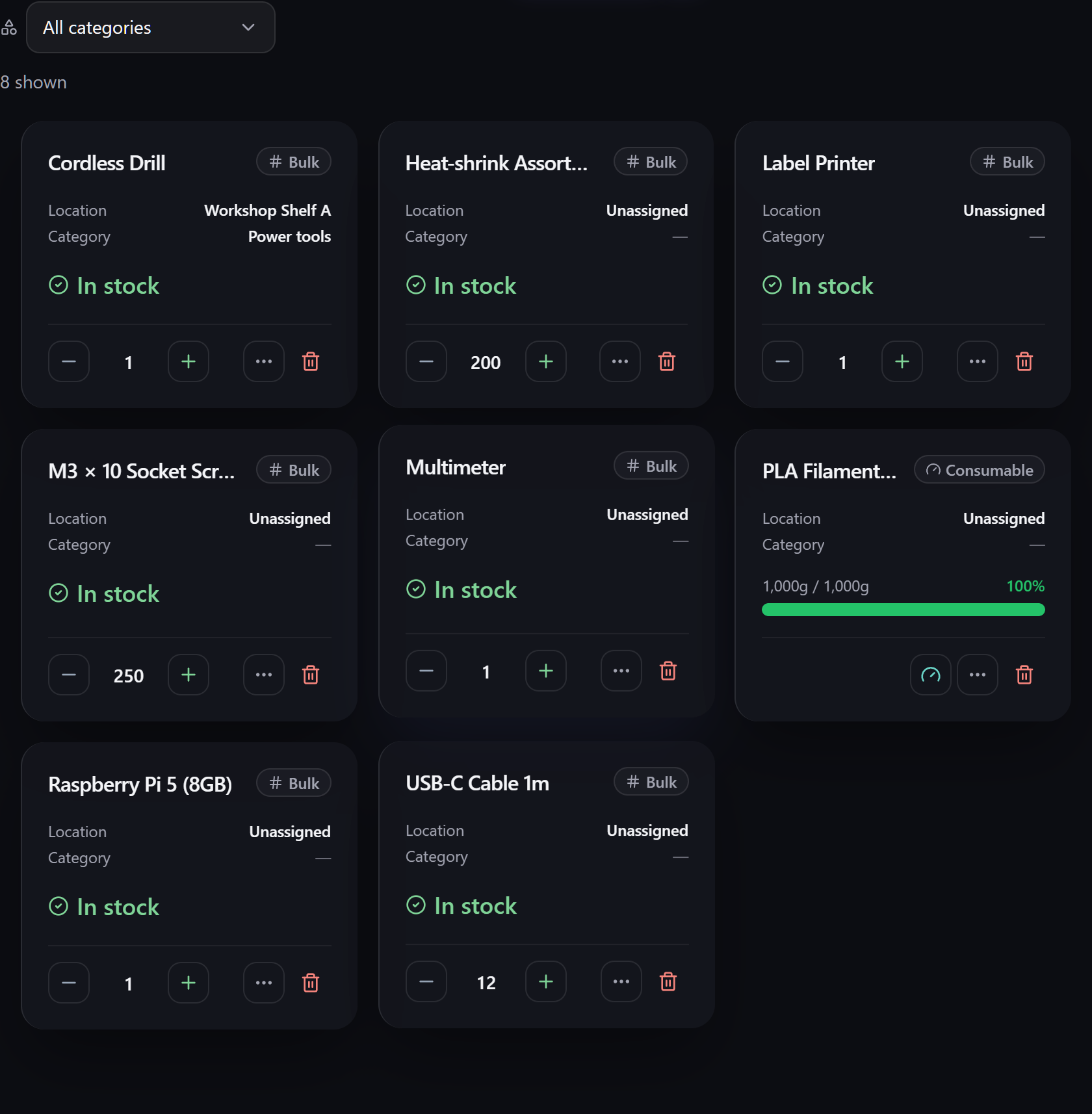
A compact one-line-per-item list — more items on screen, less visual weight. Good for working through a lot of items quickly.
A columned table — Name, Location, Category, Stock and more — for a spreadsheet-style overview where you can compare rows at a glance.
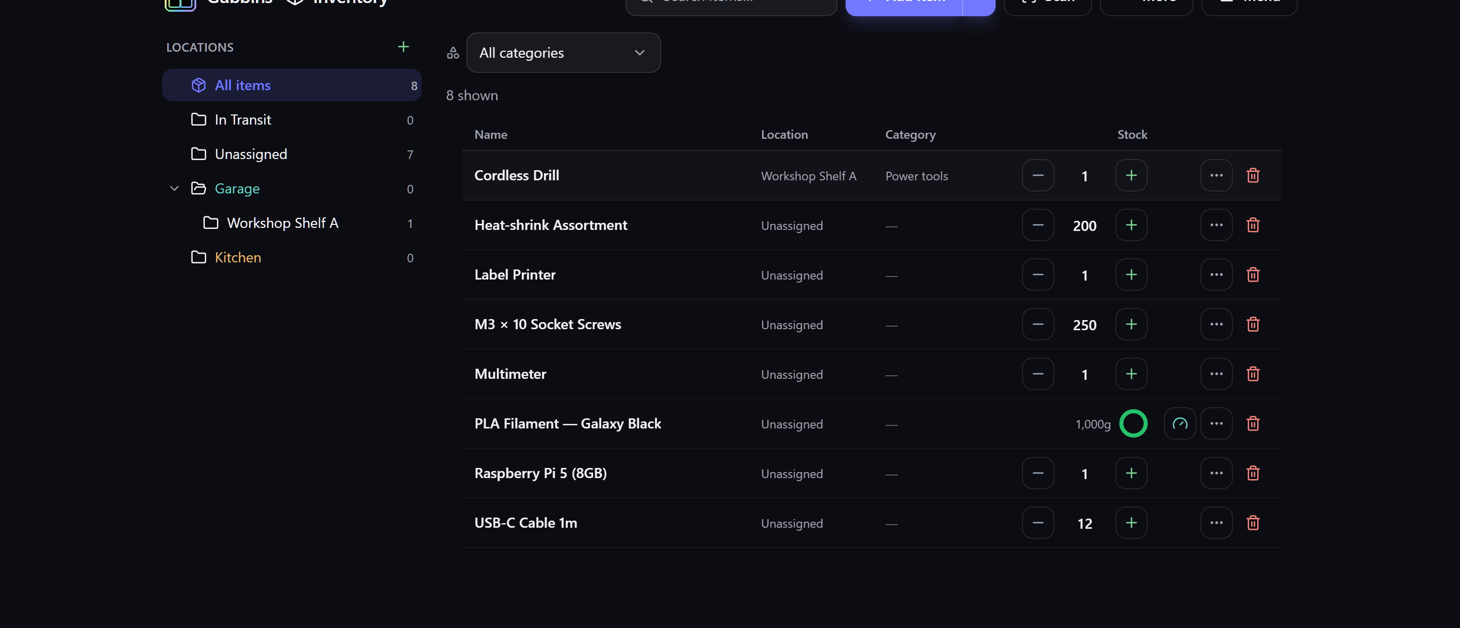
💡 Tip Pick the density that matches the task: Card to browse, Data to skim, Table to compare. It's a per-device preference, so your phone and desktop can differ.
Group by clusters the list into sections — by location, category, or other axes — so a long inventory breaks into meaningful chunks instead of one endless list.
Sort by sets the order the list is shown in. By default Gubbins leads with your favourites and then runs alphabetically by name; pick any of these instead:
| Sort by | Useful for |
|---|---|
| Name | Straight alphabetical order. |
| Quantity | What you hold most — or least — of. |
| Unit cost | Your most and least expensive items. |
| Manufacturer | Keeping one brand's items together. |
| MPN | Working through a manufacturer's part numbers. |
| Serial number | Individually-tracked items in serial order. |
| Date added | What you've catalogued most recently. |
| Last updated | What you've touched most recently. |
Choosing a field applies the order that usually makes sense for it — names run A → Z, while quantities, costs and dates start largest or newest first. Underneath the field list sit the two directions, named for the field you picked (A → Z / Z → A, Newest first / Oldest first), so you can flip it either way. Choose Default to go back to favourites-first.
Where to find it: the More menu → Sort by.
In the Table view you can sort straight from the header — click Name, Stock, or Last updated to order by that column. An arrow marks the column you're sorted by and which way it's running. Clicking the same column again reverses it, and a third click returns to the default order, so you're never stuck in a sort you didn't want.
Columns that come from elsewhere — Location, Category, Tags, and your own custom fields — aren't sortable and stay as plain labels.
💡 Tip Sort by Unit cost, highest first, for a quick look at where the value in your inventory actually sits — or by Last updated to pick up wherever you left off.
ℹ️ Note Sorting is a per-device preference and sticks between visits. Like the view density, it only changes the order items are shown in — never your data, and never which items match your current search, location and status filters. Your favourites always lead the list, whichever sort you pick — the sort then orders everything below them.
By default a long list loads more items as you scroll (an endless list). If you'd rather step through it in fixed pages, turn on Paginate list — a page control then appears at the foot of the list with Previous / Next, numbered pages, and an editable per-page box where you can pick a preset (10, 25, 50, 100) or type your own number.

Where to find it: the More menu → Paginate list, or Settings → Inventory → Lists, where you can also set the default Items per page. The per-page box on the control changes the same shared setting, so whatever you pick sticks everywhere.
ℹ️ Note Pagination is an app-wide preference: it applies to the Inventory list, the Activity log feed and your Contacts dictionary alike. It only changes how a list is presented — never your data, and never which items match your current search and filters. The page control only appears when there's more than one page to show, and it doesn't apply to the grouped view or the location map / value treemap.
Turn on Fullscreen to stretch Gubbins across your whole display, hiding the browser's own toolbars and tabs for a distraction-free, data-dense view. Choose it again to return to the normal windowed view — or just press Escape, which always leaves fullscreen.
Where to find it: the More menu → Fullscreen. A tick beside it shows when fullscreen is active.
ℹ️ Note Fullscreen is handled by your browser, so it's offered only where the browser supports it, and it applies to the whole app, not just the Inventory screen. It changes nothing about your data.
Pin the items you reach for most as favourites (the gold star on a card) and use the favourites filter to show just them. See Saved searches & favourites.
Above the list sits a row of status chips — one-tap filters for the things that usually need your attention. Choosing more than one widens the result rather than narrowing it: you see items matching any chip you've selected, so Low stock + On order shows both, not just items that are somehow both at once.
| Chip | Shows |
|---|---|
| Low stock | Items at or below their reorder point. |
| Out of stock | Items that have run down to zero on hand. |
| On order | Items with stock inbound on an open purchase order — ordered, but not yet arrived. |
| Expiring | Perishables past or nearing their expiry date. |
| Warranty | Assets whose warranty has expired or expires soon. |
| On loan | Items currently checked out to a contact. |
| Overdue | Items checked out and past their due date. |
| Maintenance due | Items with a service or calibration now due. |
Each chip carries a count of how many items it would show, and chips that currently match nothing are hidden — so the row only ever offers filters that would actually do something. Chips are additive to whatever location and search you already have applied.
💡 Tip Low stock and On order answer the same question from opposite sides: what's running out, and what's already on its way. An item that's low and already ordered still appears under Low stock — the alert tracks what's on the shelf, not what's in the post — so pairing the two chips is a quick way to separate "still needs ordering" from "already handled".
ℹ️ Note A chip only appears when the feature behind it is switched on. On order needs Purchase orders; Expiring, Warranty, On loan and Maintenance due each need their own module. See Modular UI.
Card view itself is configurable — which fields show, count pills, and more — under Settings → Dashboard / Inventory. See Appearance & theming and Dashboard & widgets.
In Card view, each item card has one large detail slot. The ± stepper already shows the on-hand quantity, so this slot shows a genuinely useful second signal instead of repeating the number. Point it at whichever matters most to you:
- Stock health — a colour-coded reorder status (In stock / Low / Out), from the item's reorder point (the default).
- Total value — unit cost × quantity.
- Last updated — how long ago the item changed.
- Condition — its tracked state (Mint / Good / …).
- Manufacturer — the item's maker / brand.
Pick a fallback too. If the chosen detail has nothing to show for a particular item — say you've set Manufacturer but an item has no maker recorded — the fallback is shown for that one item instead. So Manufacturer with a Stock health fallback shows the maker where you've entered one and the reorder status everywhere else. Leave the fallback on None to keep a plain dash for those items.
Where to find it: Settings → Inventory → Item cards → Visual card details (and Detail fallback). It's a per-device preference. Gauge, serialised and untracked cards are unaffected — their detail already shows something meaningful.
ℹ️ Note When an item has a manufacturer recorded, it's also shown as a small subtitle directly under the item's name on its card — a quick brand cue, independent of the detail slot above.
Every item card and row shows a small badge in its top-right corner — by default the item's tracking mode (Bulk / Serialised / Consumable / Untracked). You can point that slot at something else instead:
- Tracking mode — the tracking pill (the default).
- Unit price — the cost of a single unit.
- Total value — unit cost × quantity.
- Condition — its tracked state (Mint / Good / …).
- Nothing — leave the corner empty.
Pick a fallback too. If the chosen badge has nothing to show for a particular item — say you've set Unit price but an item has no price — the fallback is shown for that one item instead. So "Unit price" with a "Tracking mode" fallback shows the price where you've entered one and the tracking pill everywhere else.
Where to find it: Settings → Inventory → Item cards → Item card badge (and Badge fallback). It's a per-device preference and applies to both the Card and Data views.
💡 Tip Set the badge to Total value with a Nothing fallback to see stock value at a glance while browsing, without cluttering cards for items you haven't priced yet.
ℹ️ Note The view density only changes how items are drawn — it never changes your data or which items match your current search, location and status filters.
If an item's category has a glyph (an emoji such as 🔋 or 📖), its Visual card shows that glyph as a large, faint greyscale watermark in the bottom-right corner — a quick cue for what kind of thing each card is. Set a category's glyph from Categories & schemas, and turn all watermarks on or off under Settings → Inventory → Item cards → Category watermarks (on by default; the Data and Table views never show it).
- Search overview — narrowing which items are shown.
- Locations & stock — the tree that filters the list.
- Bulk edit & clone — acting on many items at once.