Repository navigation
Style Lollipop
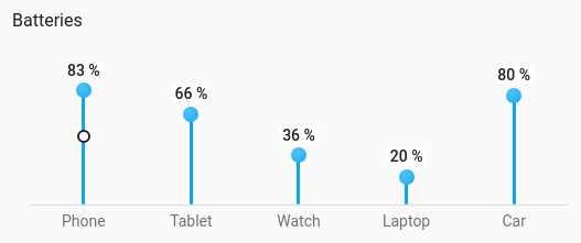
A stem with a dot at the value for each entity: lighter than a bar, so many values fit without the chart looking heavy. Upright in columns over a shared baseline (value above, name below), or across in rows. A target shows as a hollow ring on the stem's line. It draws from the entities' current values, so no history is involved.
Five to fifteen values of the same kind, such as every battery in the house.
type: custom:chartdeck-card
style: lollipop
title: Batteries
entities:
  - entity: sensor.phone_battery
    name: Phone
  - entity: sensor.tablet_battery
    name: Tablet
  - entity: sensor.watch_battery
    name: Watch
  - entity: sensor.car_battery
    name: Car
    target: 80
To use this style, set style: lollipop (or pick Lollipop under Comparisons in the editor's Style section). The chart options are in the editor's Chart section.
- Direction: upright columns.
- Colours: each dot takes the colour of its current band.
orientation: vertical # vertical (default) or horizontal-
orientation: horizontaldraws rows across instead of columns. - Each entity uses its own
minandmax, as the bar styles do, so with a negativeminvalues below zero grow below (or left of) the zero point. -
targetcan be a number or an entity (Limits section in the editor).show.target: falsehides the target rings.
In the editor: Direction (Upright or Across).
Unavailable and missing entities keep their place but draw no dot or target, and say what is wrong where the value goes.
Every lollipop is the entity's own element, with tap_action, hold_action and double_tap_action (more-info by default), and a meter role for screen readers.
Stems grow in like the bar styles. Animation is off when animate: false is set or the browser asks for reduced motion.
Layout: one chart for the whole card. Every shared option is described on the Options page.
Previous: Bullet · Next: Slope · All styles