Repository navigation
Style Battery
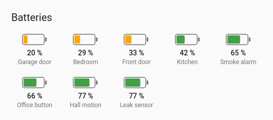
A grid of battery outlines, one per entity, each filled from the left to its level, with the value and name under it. Below 20 % a battery is red, below 40 % amber, above that green, so the ones to change stand out.
Every battery in the house on one card, with an include rule so new devices appear by themselves.
type: custom:chartdeck-card
style: battery
title: Batteries
sort: ascending
include:
  device_class: battery
Or with the batteries listed:
type: custom:chartdeck-card
style: battery
title: Batteries
sort: ascending
entities:
  - entity: sensor.front_door_lock_battery
    name: Front door
  - entity: sensor.hall_motion_battery
    name: Hall motion
  - entity: sensor.smoke_alarm_battery
    name: Smoke alarm
To use this style, set style: battery (or pick Battery grid under Bars in the editor's Style section). Picking it in the editor also sets Sort to smallest first, when no sort is set, so the emptiest battery comes first.
-
Fill runs from
mintomax, 0 to 100 unless you change them. -
Colours: red below 20, amber below 40, green from 40, when the card has no colour bands of its own. Set
severityand the bands are used instead. - Tiles: as many 88 px tiles across as fit the card.
-
Order: as listed, unless
sortis set. A card written in YAML withoutsortkeeps the listed order, as every other style does; only the editor fills it in.
There are no options of its own. The card's own ones do the work:
-
sort: ascendingputs the emptiest first;descendingthe fullest first. Unavailable batteries go to the end. -
columnssets how many tiles sit across, at most. Tiles never get narrower than 76 px, so a narrow card uses fewer. -
severityreplaces the red, amber and green defaults, for the card or one entity. -
show.value: falseandshow.name: falsehide the value or name under each battery. -
include,exclude,hide_unavailableandlimitpick which batteries appear: see Options.
An unavailable or missing entity draws a dashed, empty outline with its status ("Unavailable", "Entity not found") under it, even with show.value: false.
Each tile is the entity's own element, so tap_action, hold_action and double_tap_action work as on the other styles (more-info by default).
Batteries fill in from empty when the card appears and move to a new level when it changes. Animation is off when animate: false is set or the browser asks for reduced motion.
Layout: one chart for the whole card. Every shared option is described on the Options page.
Previous: Chord · Next: Spiral · All styles